Transform
ABAO Bilbao Ópera
Una identidad para la ópera del S.XXI

Cuando cambiar consiste en poner en valor tu esencia
La Asociación Bilbaína de Amigos de la Ópera nació como la unión de un grupo de personas apasionadas ante la idea de impulsar un proyecto de ópera para la ciudad de Bilbao. Casi 70 años después la ópera es un activo con gran arraigo en la oferta cultural de la ciudad. ABAO la sigue impulsando a través de un gran número de proyectos más allá de la temporada de ópera de cada año.
Para el desarrollo de la nueva identidad nuestro objetivo fue preservar la esencia bajo la idea central de “Todos somos ABAO”. Una idea de comunidad renovada que pone todo su empeño en la participación activa y en que la ópera siga impulsándose en la ciudad de Bilbao.
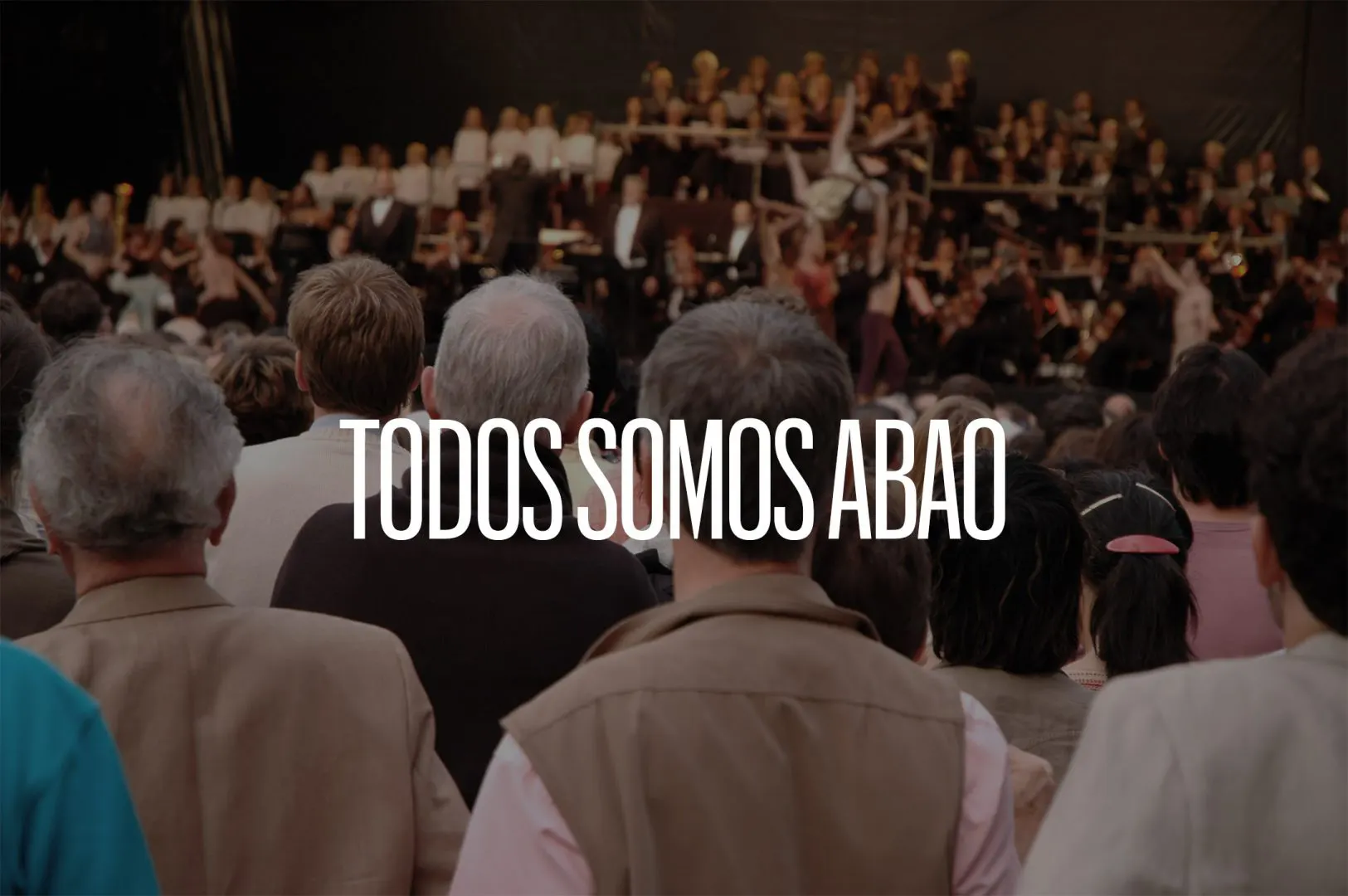
Un sentimiento de comunidad para toda una ciudad
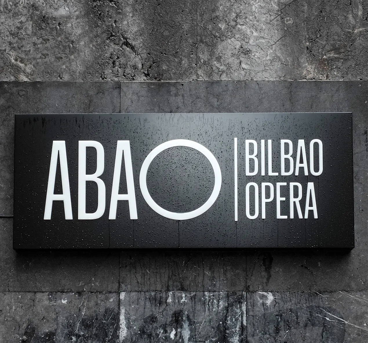
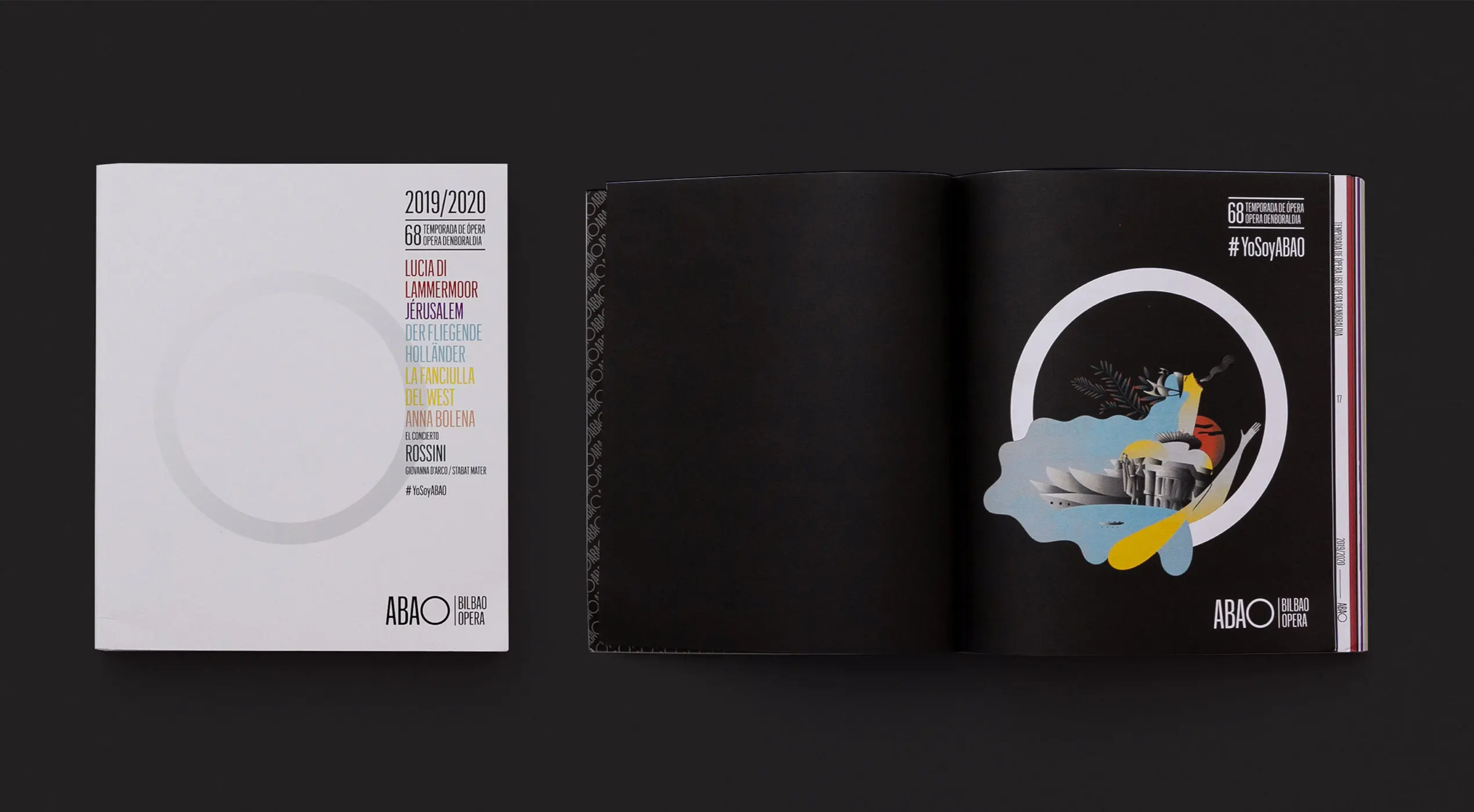
La figura geométrica que mejor representa el sentimiento de pertenencia a un grupo o comunidad es el círculo. Para trasladar el mensaje “Todos somos ABAO” a un concepto gráfico, transformamos la O de ópera para un círculo, pudimos crear una metáfora gráfica que incluye la ciudad y la sala de conciertos, fusionando ambas.
Además, el dinamismo del círculo nos permitió aportar el ritmo de la música y las artes escénicas. Dado que el logotipo es un monograma que no está confinado dentro de límites gráficos, siempre que el formato lo permita, podemos jugar con él. Lo que crea una identidad dinámica que se ajusta a la perfección en el mundo digital.

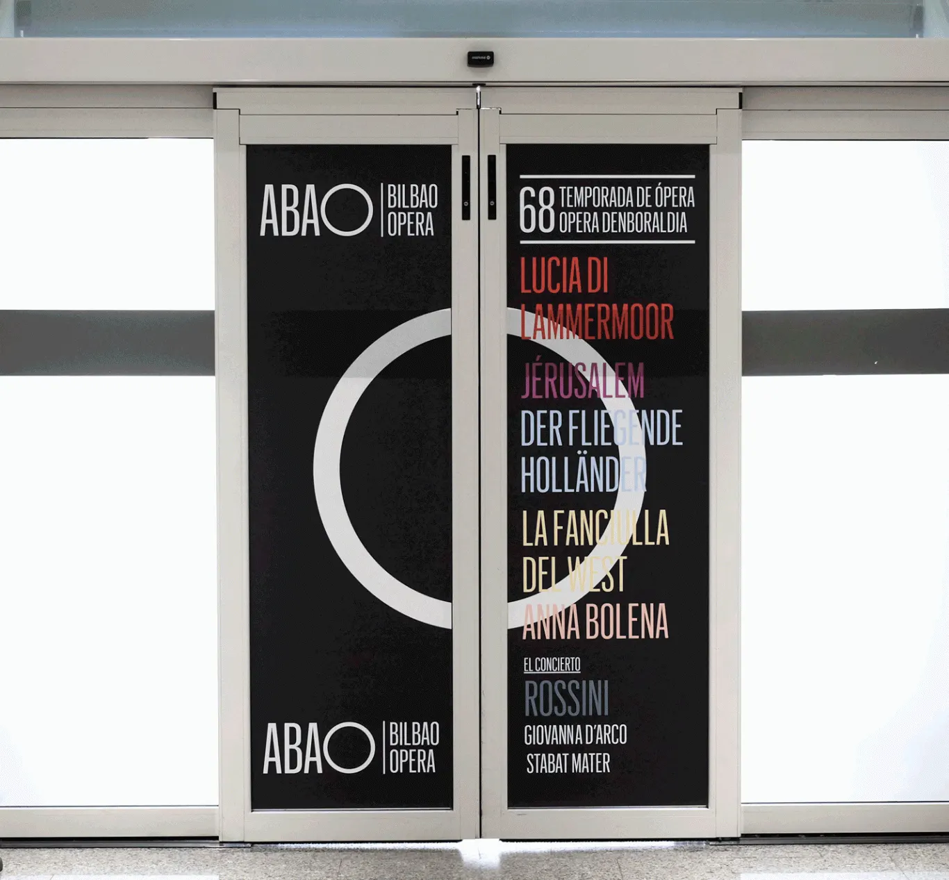
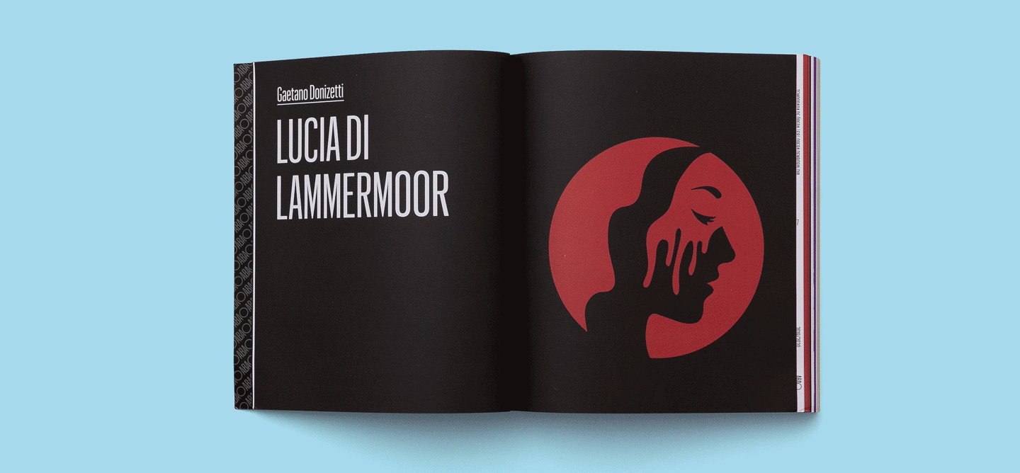
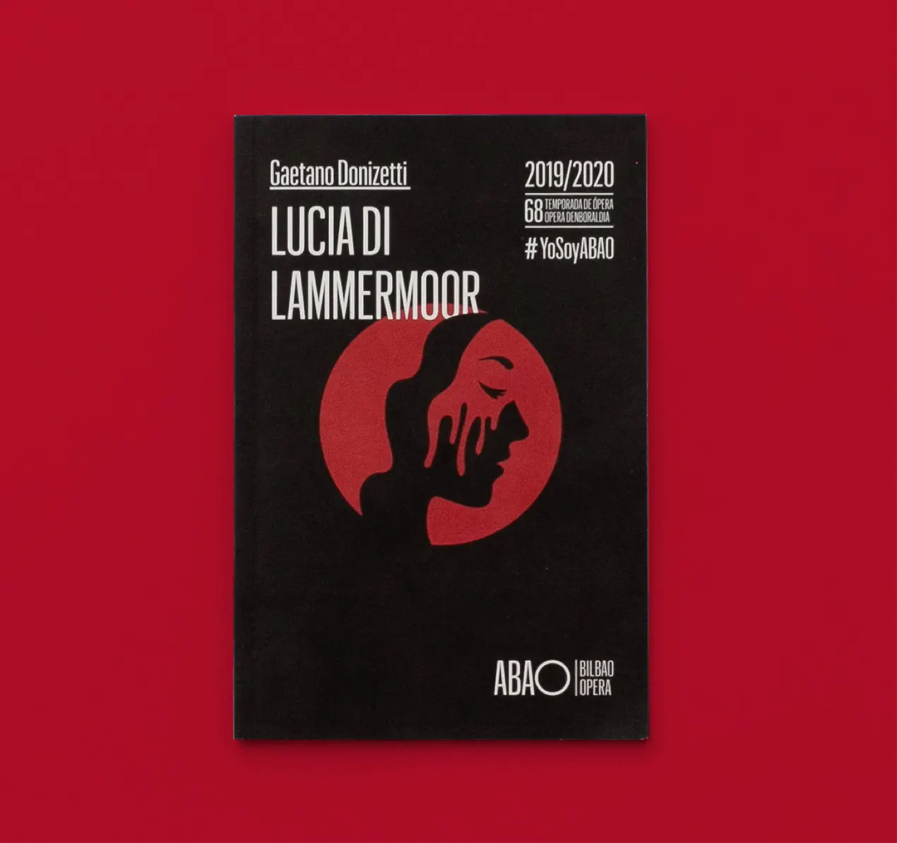
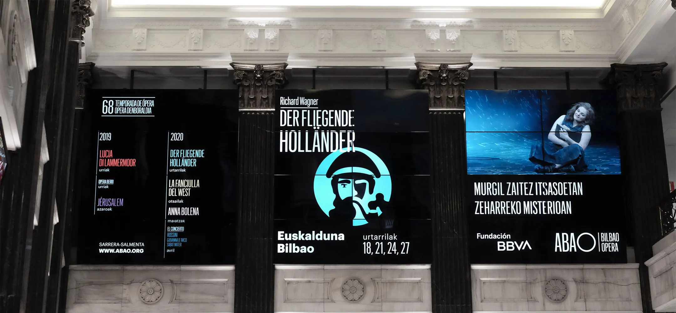
La sofisticación de la ópera llevada al color
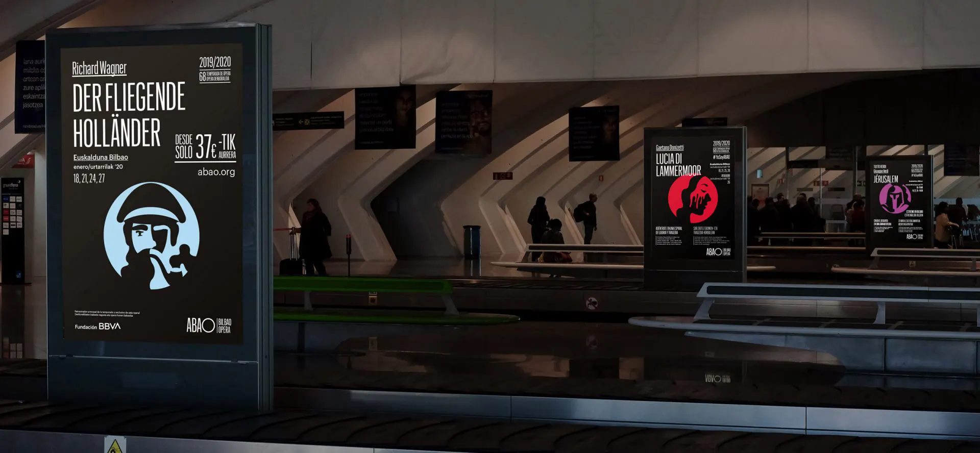
Reservamos el uso del color para el contenido porque una ópera no es solo música, es un escenario que va de estar oscuro a estar lleno de color a medida que representación avanza. Queríamos reflejar este paralelismo en la combinación de colores. Por lo tanto, ABAO siempre se representa en blanco y negro, mientras que los títulos de las actuaciones se muestran en color.
Así, creamos una amplia paleta de colores para que cada título de la temporada esté relacionado con un color. Esto vincula cada título a una metáfora ilustrada y a un color que lo representa.

El círculo es el centro del sistema de comunicación
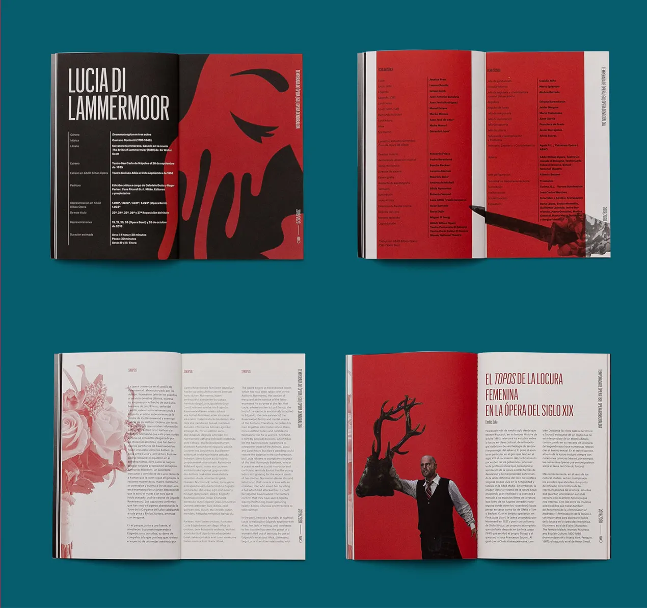
Desarrollamos un sistema de comunicación que conecta coherentemente todas las piezas, ya sean digitales u offline. Dentro de este sistema, el círculo es un activo importante que se utiliza para cada comunicación. Es una mirilla que permite a los usuarios asomarse al espectáculo.
El resto de los elementos encontrados en las comunicaciones son explosiones de información que transmiten la pasión por la música de ópera a través de: color, profundidad, tipografías y formas. Estos se muestran en un sistema organizado pero dinámico y flexible.
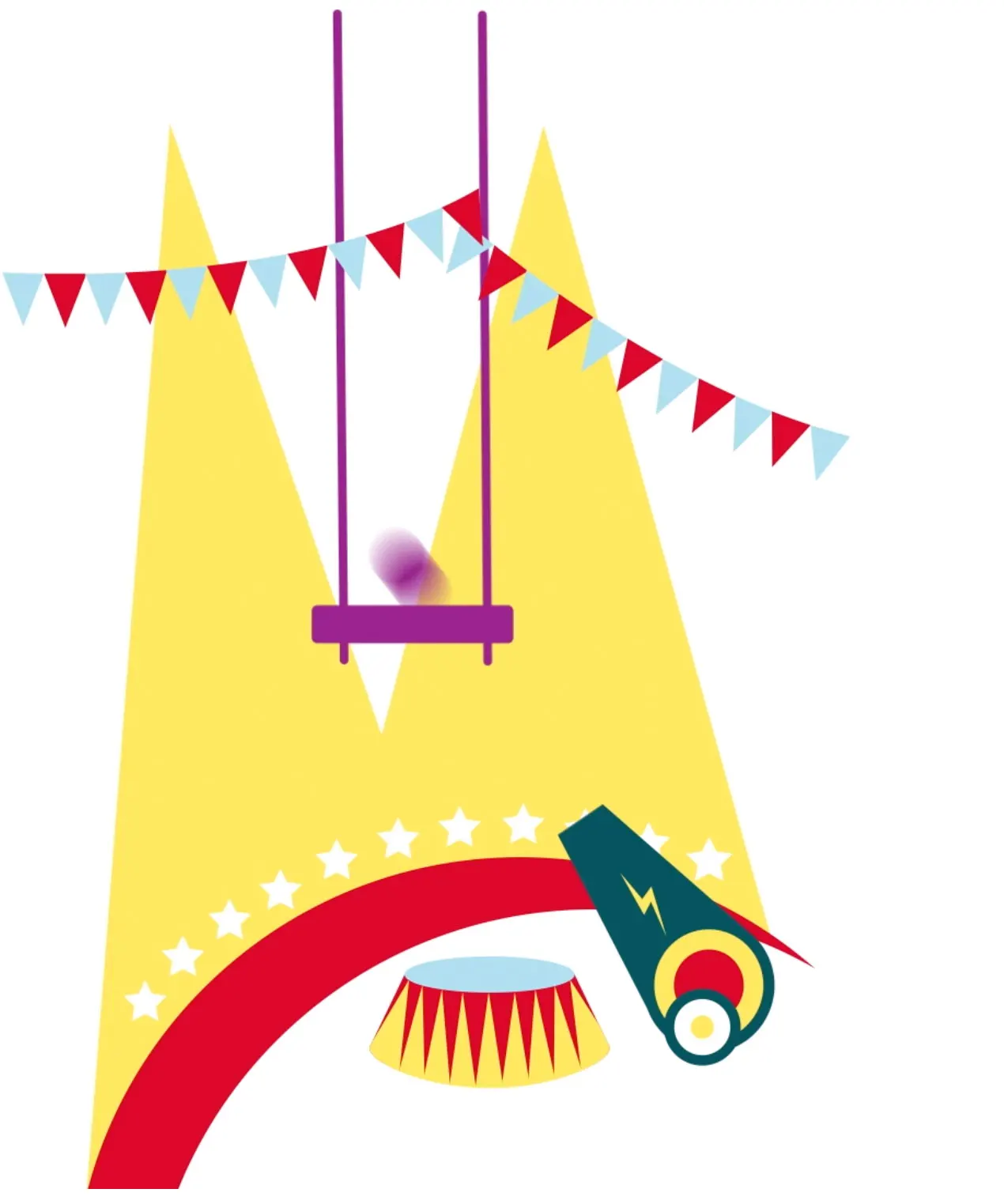
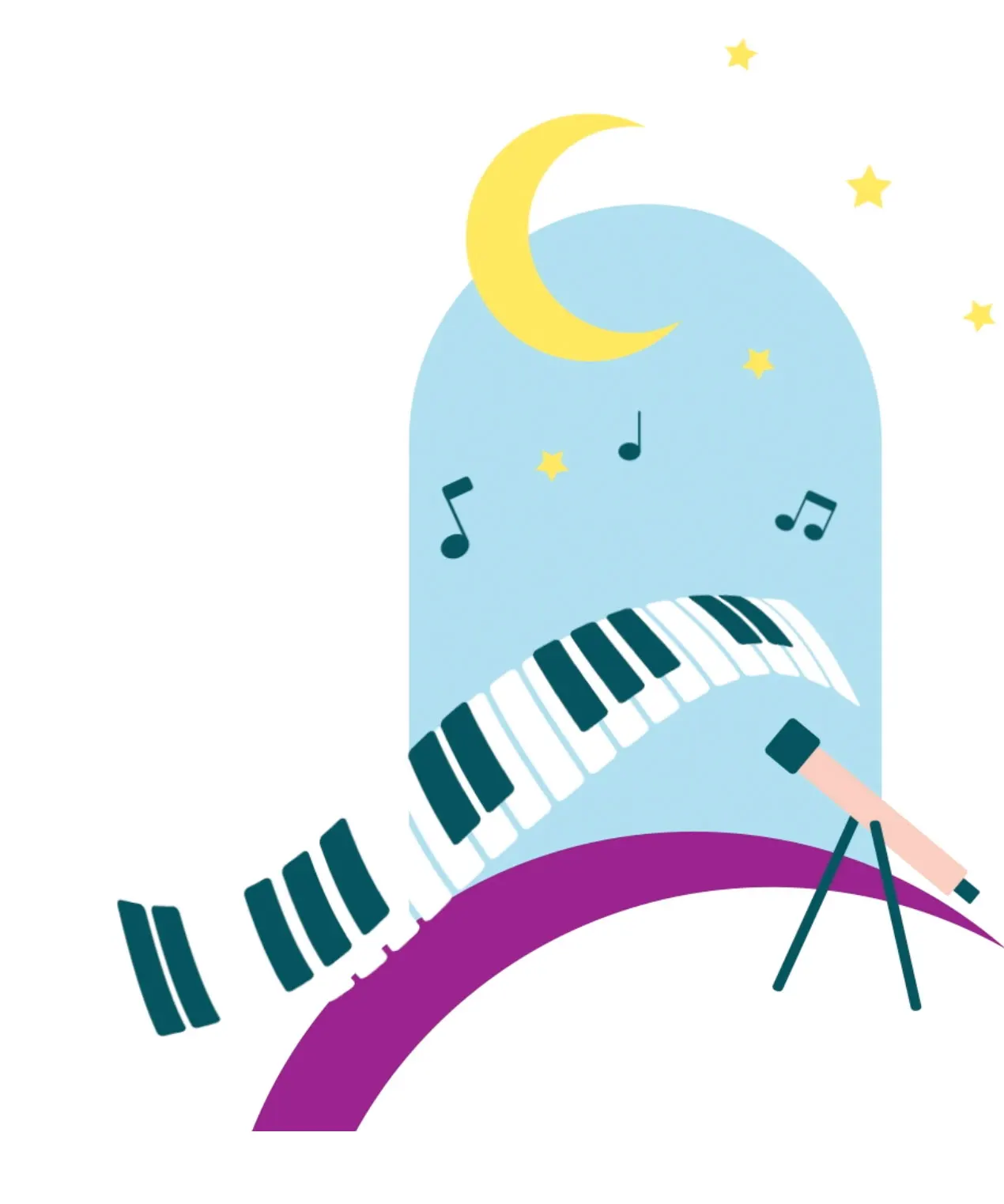
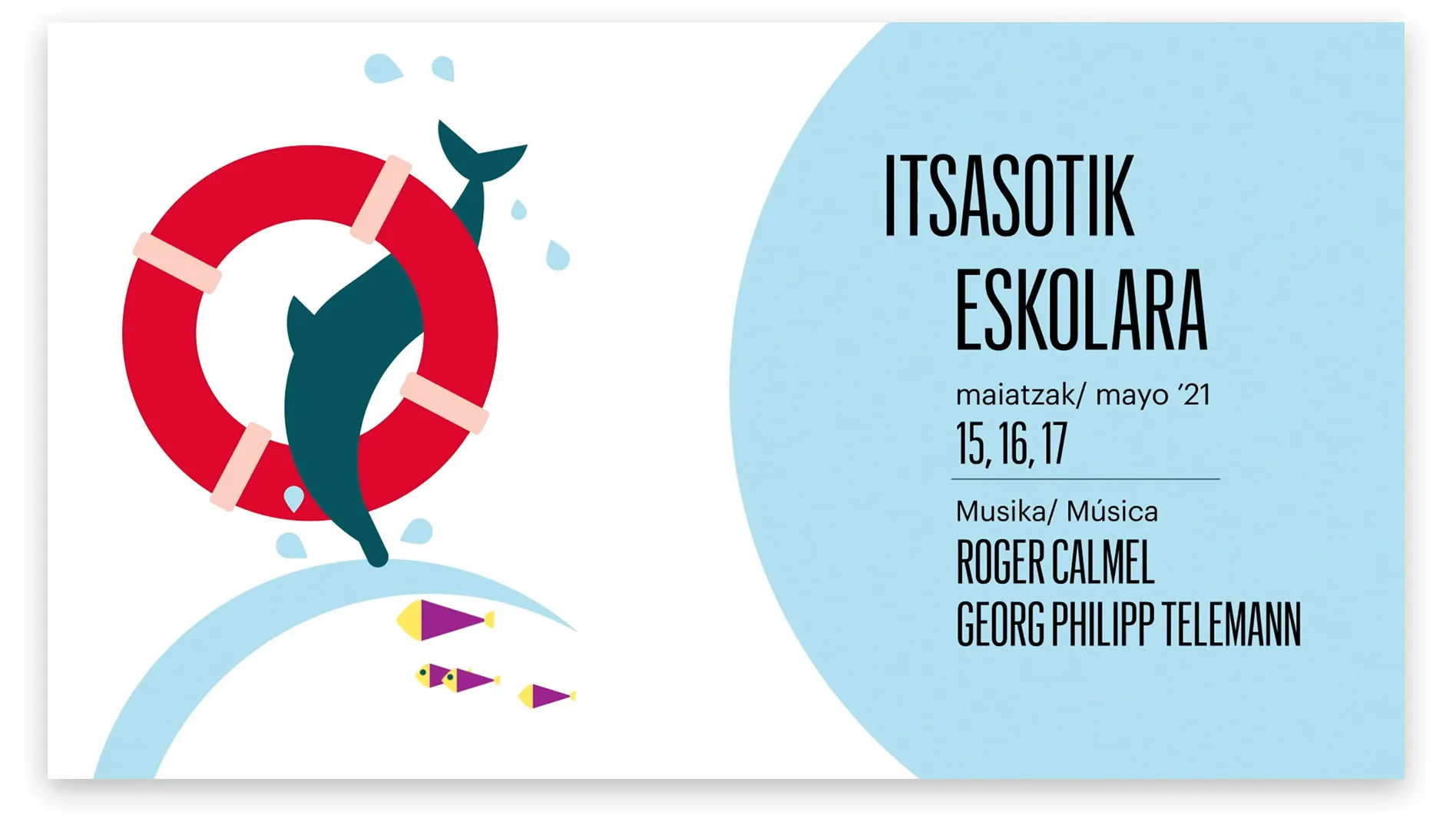
La ópera es para todos y habla el idioma de cada uno
Finalmente, la identidad de los programas dedicados a los más pequeños también se transformó para conectar directamente con ellos. En este caso, el mundo de la ilustración se vuelve más relevante y juguetón, ampliando los márgenes de la imaginación. Acercamos la ópera a los niños al hablar su idioma y al transformarla en un juego.
Servicios realizados

Brand Strategy
- Brand audit
- Consumer Insights and Category Analysis
- Brand Architecture
- Relato de marca: razón de ser y posicionamiento
Brand Experience
- Communication Strategy
Brand Identity
- Visual identity
- Identidad digital
Digital Branding
- Video manifiesto
- Website
- Branded Content
Brand Awareness
- Branding campaigns
- Brand guardian/advisor
Let's create
the right mood.