Differenciate
L’Artisan Givré
Cómo una marca de helados francesa enamoró a los españoles

El relato de cómo una marca de helados francesa enamoró a los españoles
L’Artisan Givré mezcla su amor por la pureza y la frescura de los ingredientes con el mimo y el savoir faire de la elaboración artesana para crear helados con texturas, colores y sabores auténticos en su obrador de los Pirineos franceses.
Una vez encontrado su lugar en el mercado francés la marca se propuso un nuevo reto: ampliar sus fronteras para incorporarse al mercado español.
Así, L’Artisan Givré acudió a nosotros para identificar qué elementos de la marca iban a ser fundamentales para encajar en un mercado maduro con competidores asentados y con las distintas motivaciones y necesidades de un nuevo público.

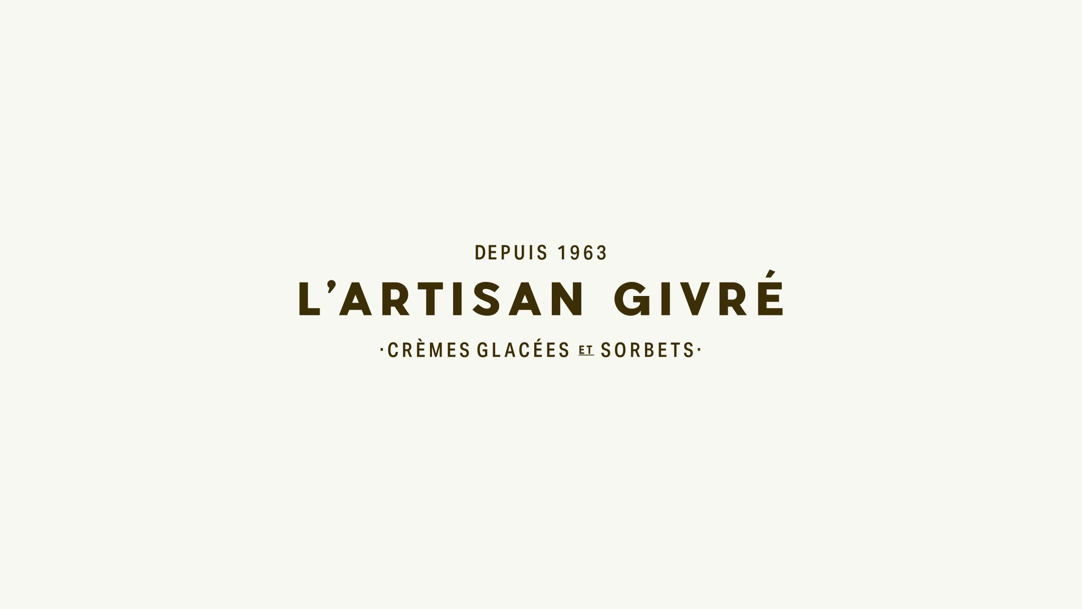
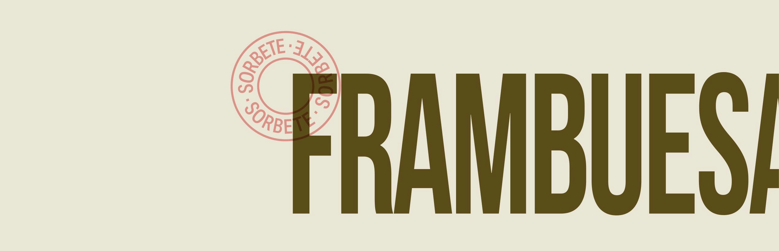
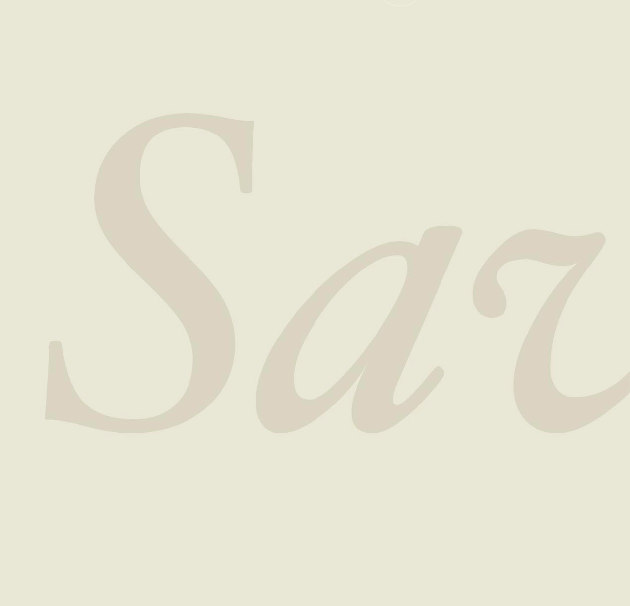
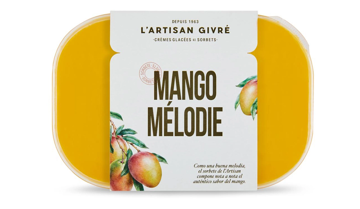
Un logotipo inspirado en la cartelería clásica francesa
A raíz del trabajo de investigación, llegamos a la conclusión de que teníamos que replantear la identidad por completo para comunicar correctamente los significados de artesanía en este nuevo mercado. Así, para resaltar el amor por una forma de elaboración tradicional, poner en valor el origen de la marca y transmitir la sensibilidad del artesano a la hora de trabajar, nos inspiramos en la cartelería clásica francesa de finales del siglo XIX para comenzar a dar forma a la nueva identidad a través del logotipo.
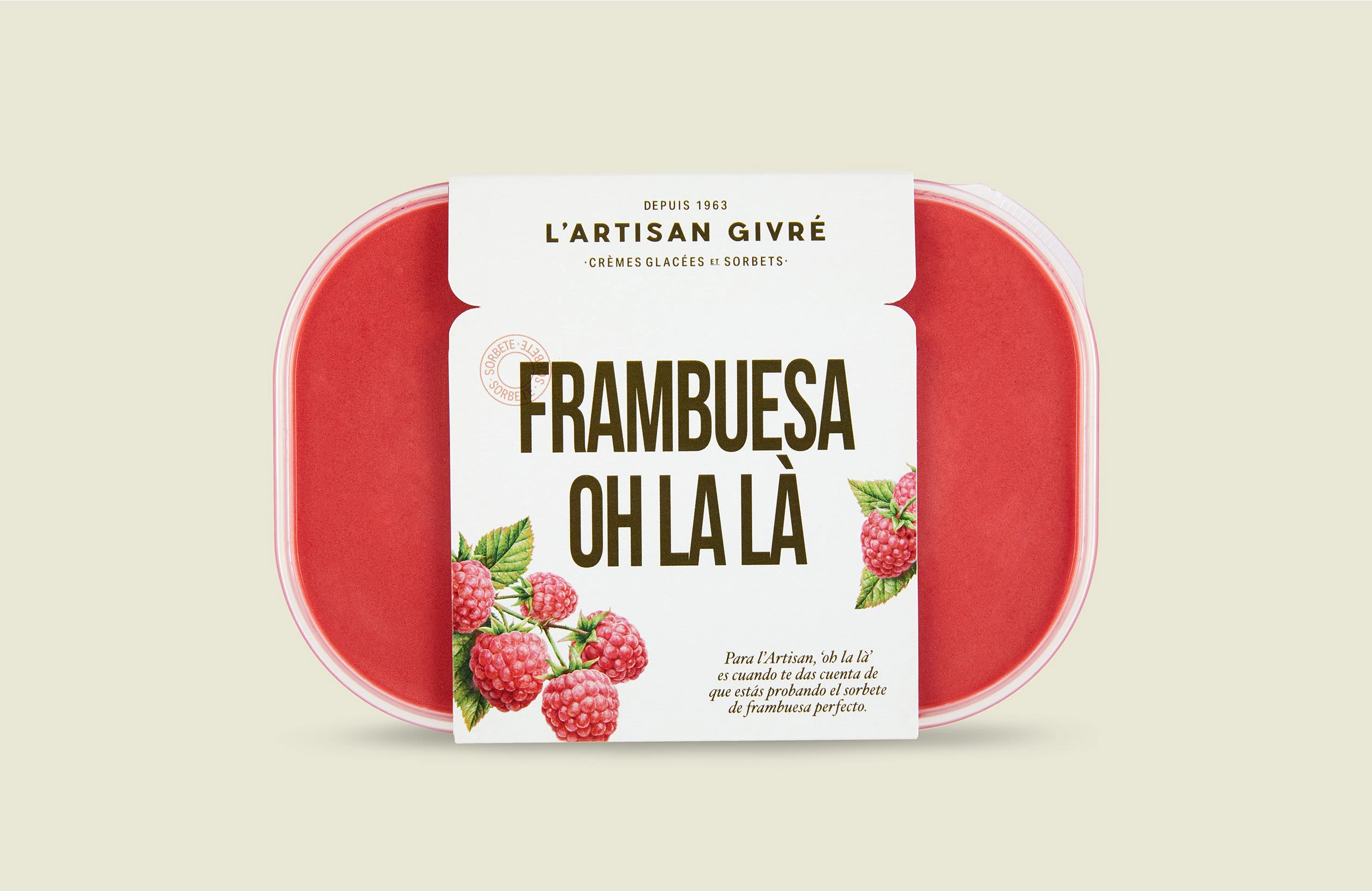
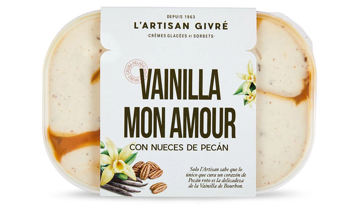
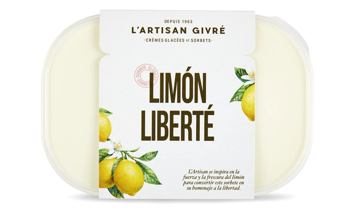
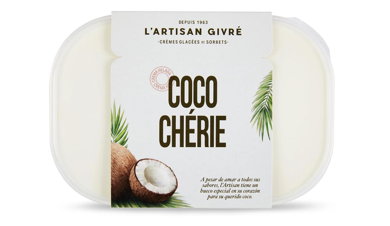
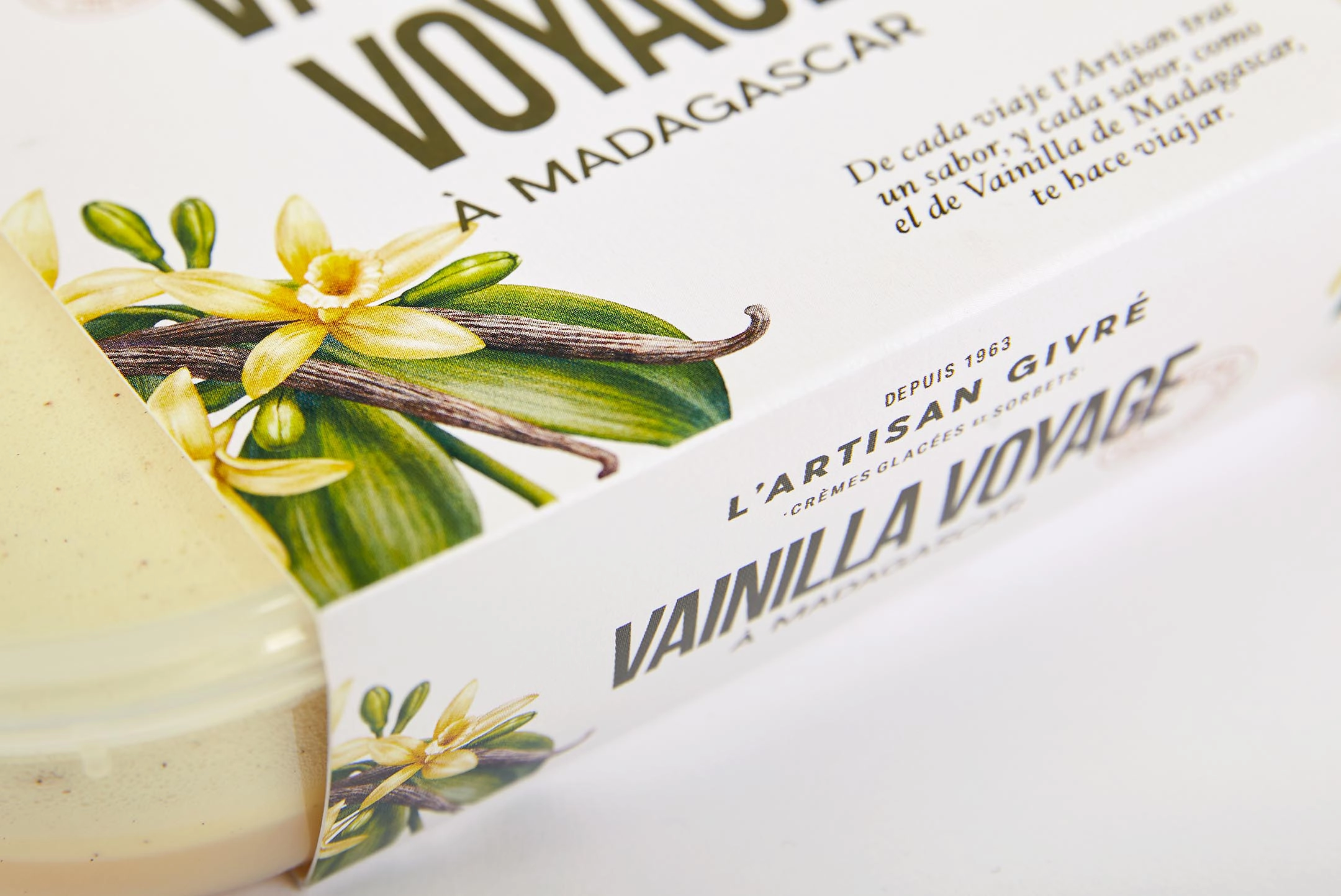
Transmitiendo la relación del artesano con sus ingredientes mediante historias líricas
El verdadero artesano es un apasionado de su trabajo y su relación con los ingredientes; y su elaboración se vuelve una auténtica historia de amor. Partiendo de este hecho, desarrollamos una serie de nombres en francés para trasladar el savoir faire de la marca y conectar fonéticamente con cada uno de los sabores. A continuación los desplegamos mediante la creación de microrrelatos líricos.

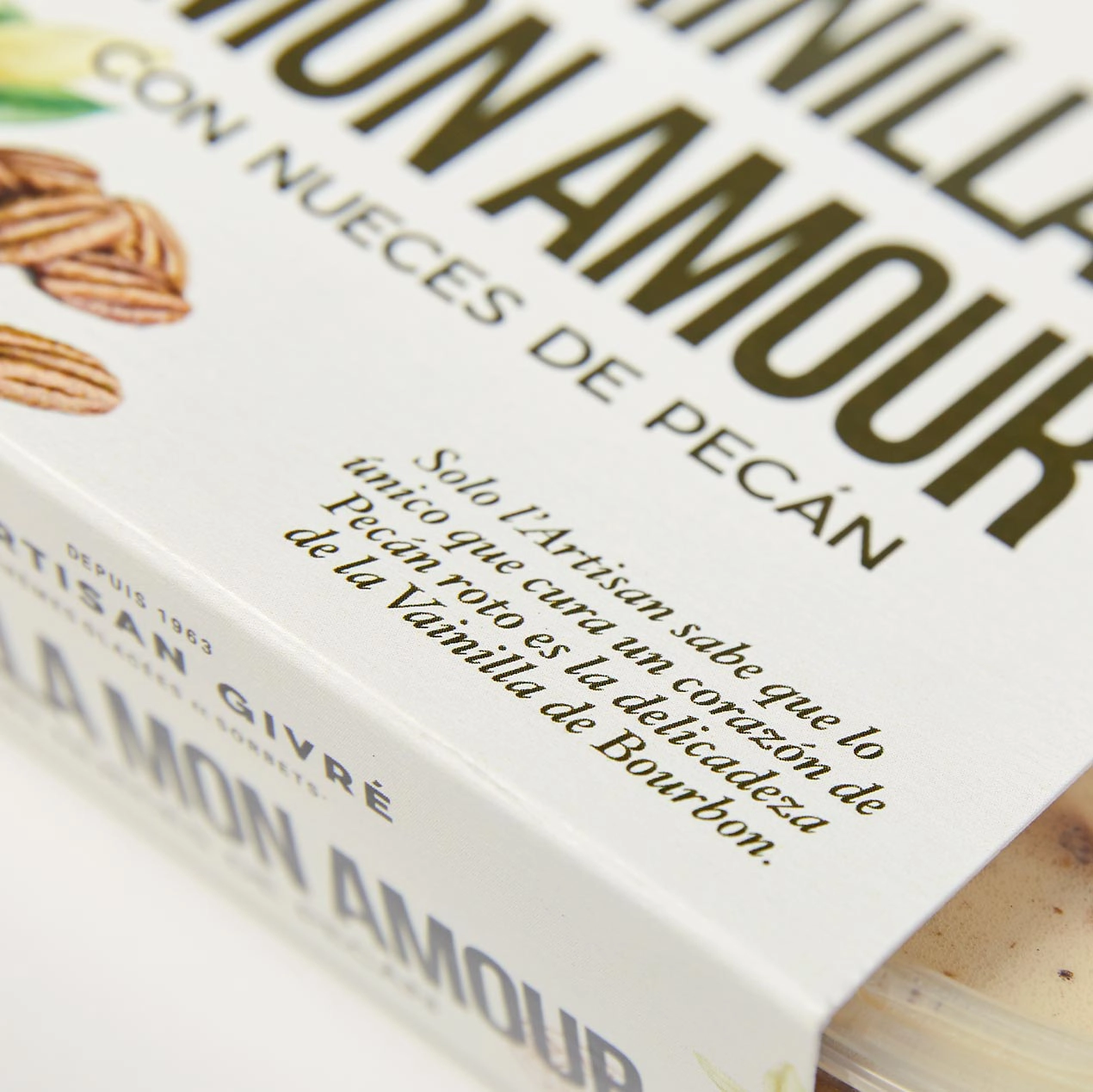

Historias y nombres que cobran vida gracias a las tipografías
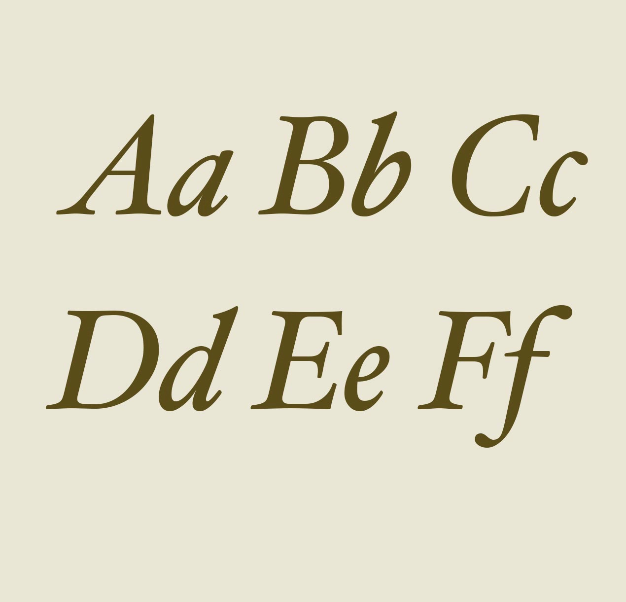
Estas historias no serían lo mismo sin una voz tipográfica que nos ayudara a darle un punto romántico a su contenido. En ese sentido, elegimos una tipografía itálica con un carácter ornamentado, inspirada en otras centenarias como la Garamond o la Janson, para darle un aire clásico y elegante a los microrrelatos. Para equilibrar los pesos, la combinamos con una condensed de palo seco, que convive perfectamente con el logotipo y se adapta muy bien al espacio disponible en pack para mejorar el impacto en el lineal.
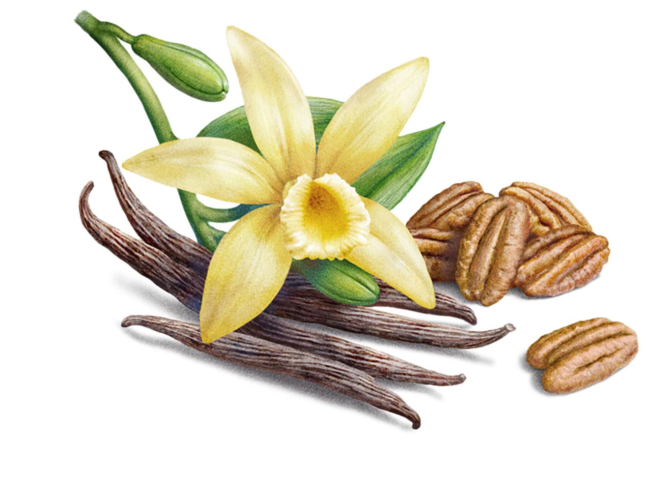
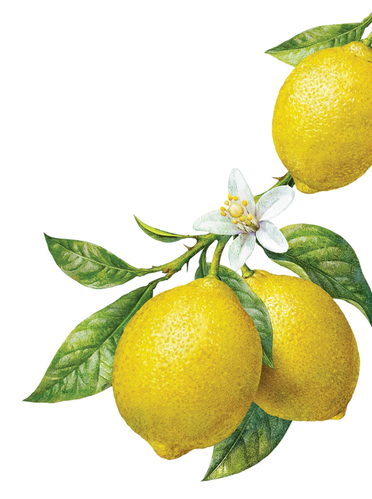
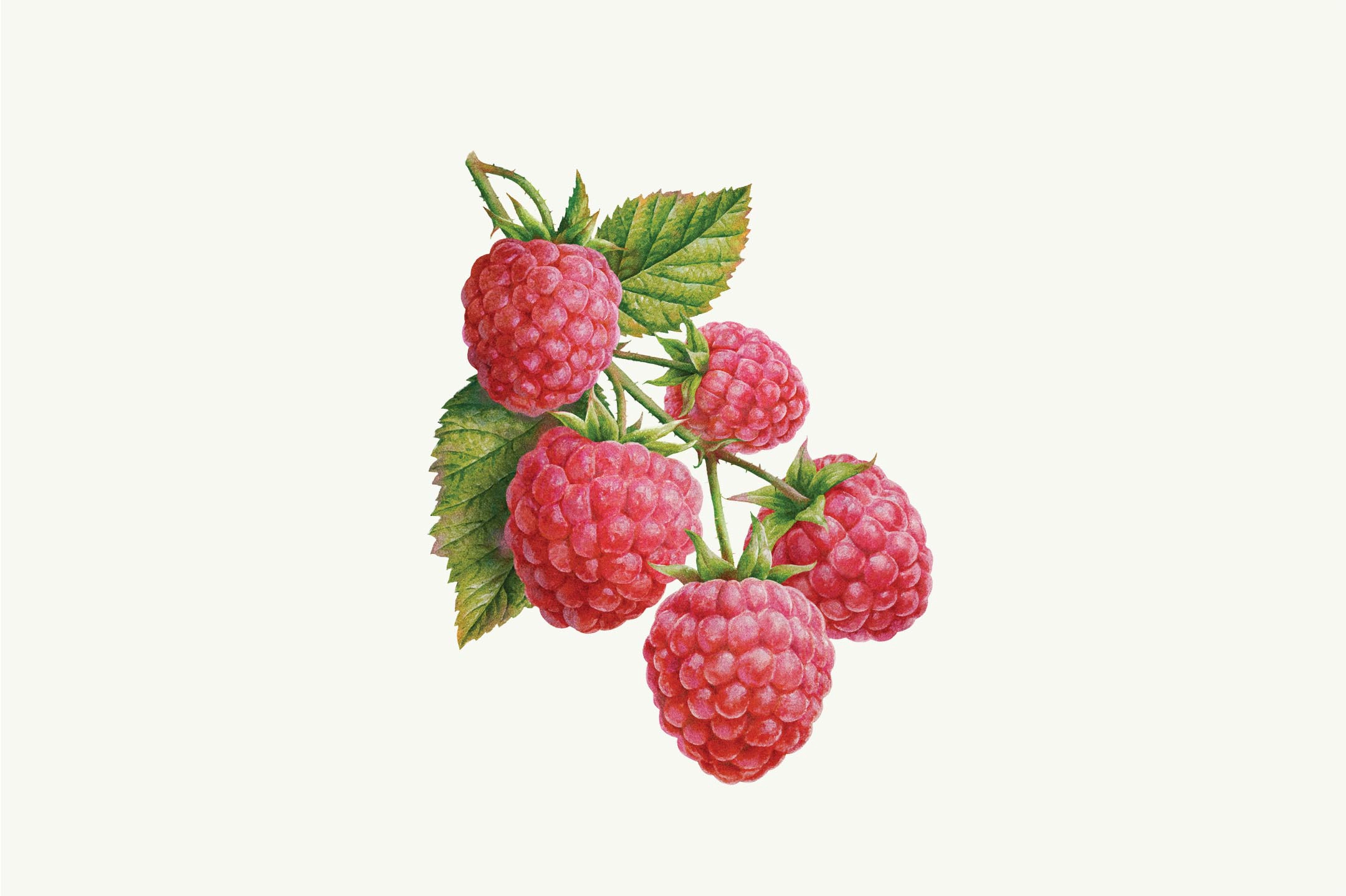
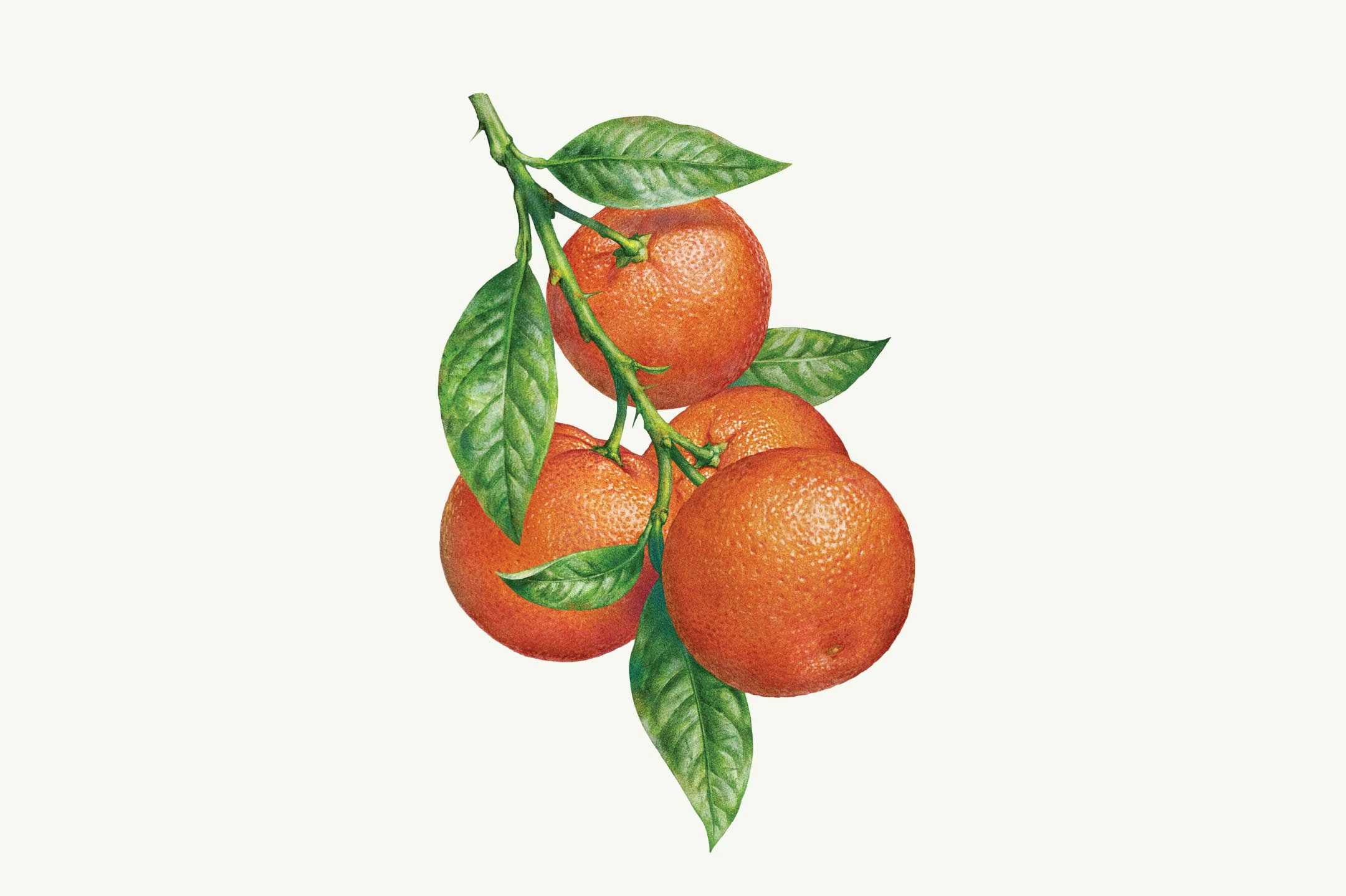
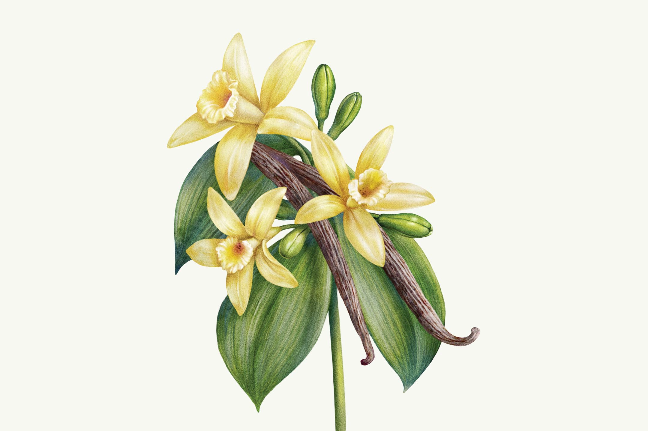
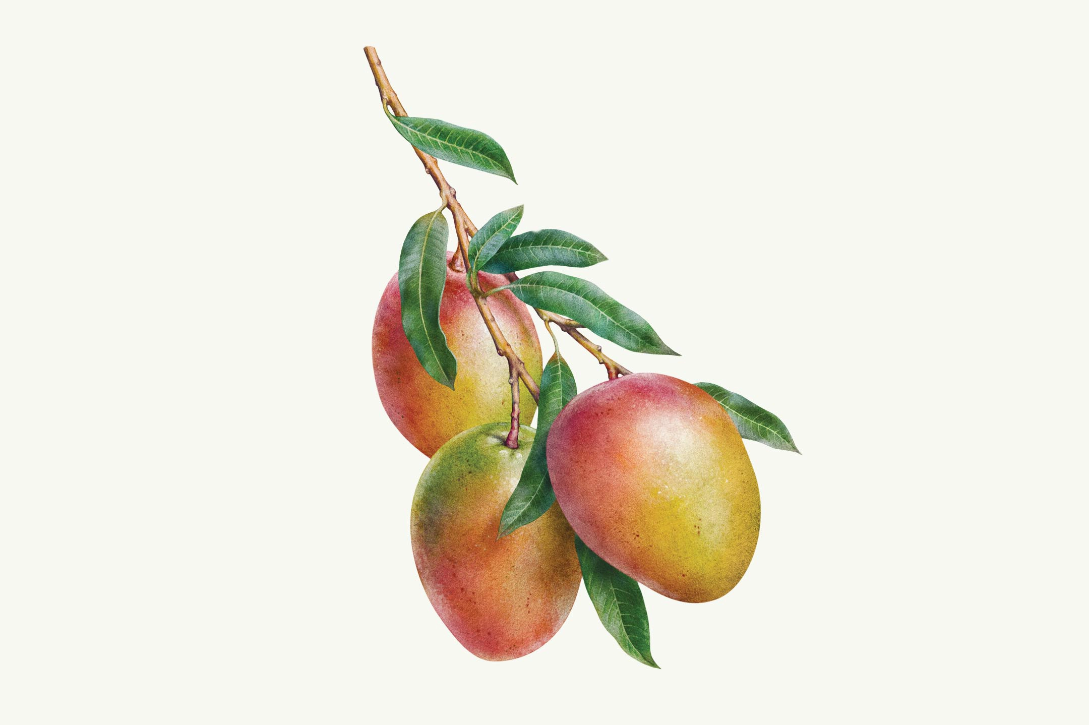
Elevando los ingredientes a arte a través de la ilustración
A la hora de mostrar los ingredientes, para transmitir su naturalidad y su nobleza, quisimos hacerlo de tal manera que pudiéramos destacar su estado más natural. Para hacerlo, desarrollamos un estilo de ilustración realista junto al estudio Inorama en el que elevamos los ingredientes a arte para conectar con la artesanía que irradia la marca.
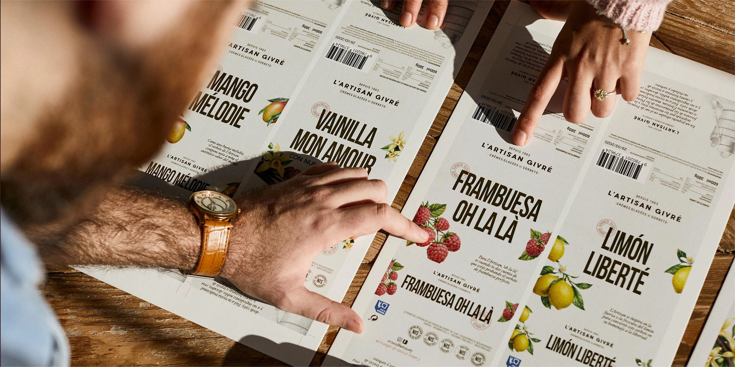
Un packaging lleno de buen sabor y savoir faire
Un packaging que aglutina todos los elementos de la identidad y que conecta con los insights recogidos a través de los Focus Group y los cuestionarios online a más de 400 consumidores de helado. Así, el pack permite al consumidor ver la esencia del producto sin distorsionarla y le ofrece una alternativa artesana en los lineales de los supermercados dominados, tradicionalmente, por marcas industriales.
Servicios realizados

Brand Strategy
- Brand audit
- Consumer Insights and Category Analysis
- Relato de marca: razón de ser y posicionamiento
Brand Experience
- Communication Strategy
Brand Identity
- Naming
- Verbal Identity
- Visual identity
- Packaging
Let's create
the right mood.