Launch
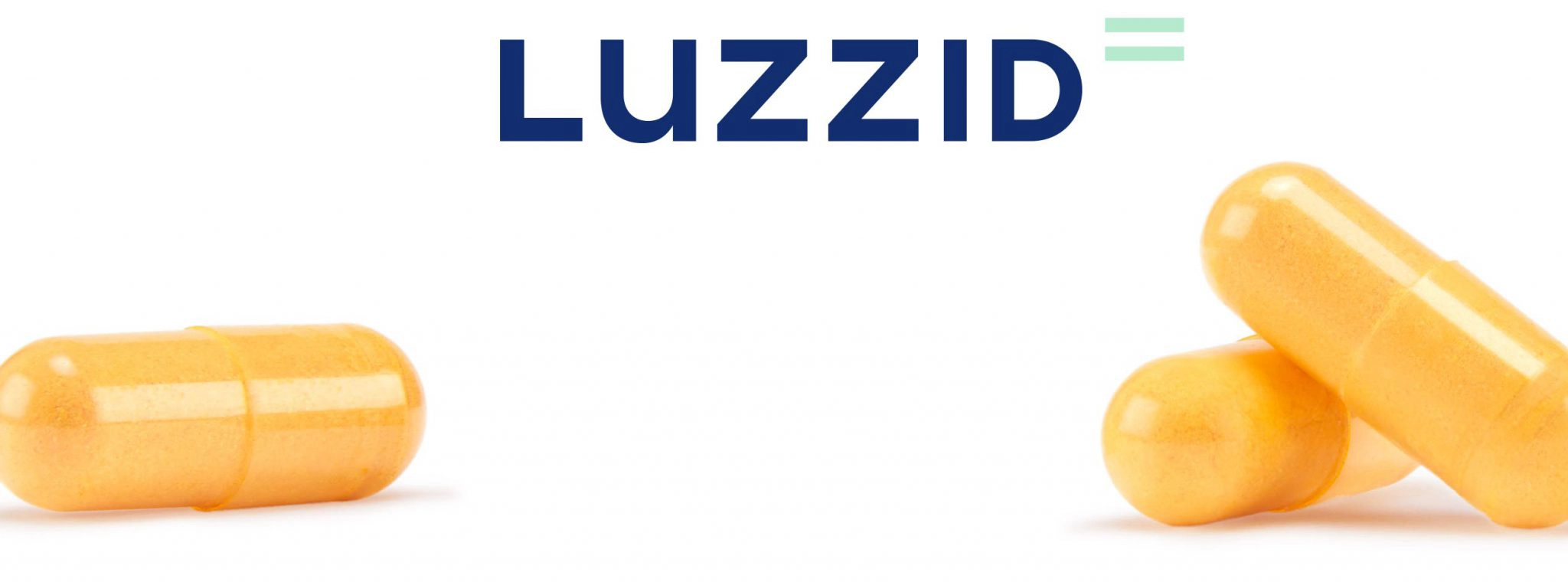
Luzzid
Generando un futuro sin resacas para que cada día sea un buen día

Generando un futuro sin resacas para que cada día sea un buen día
Luzzid son complementos alimenticios naturales creados e impulsados por un equipo médico-científico que actúan contra los efectos nocivos del alcohol ayudándote a recuperar tus facultades mentales y físicas más rápido.
Estos productos innovadores necesitaban una marca que pudiera transmitir fielmente su propósito de ayudar a las personas a disfrutar el lado positivo del alcohol sin tener que lidiar con la resaca del día siguiente. Porque con Luzzid no hay días perdidos, solo días buenos.

Un logotipo que te eleva para que puedas ir a por todas
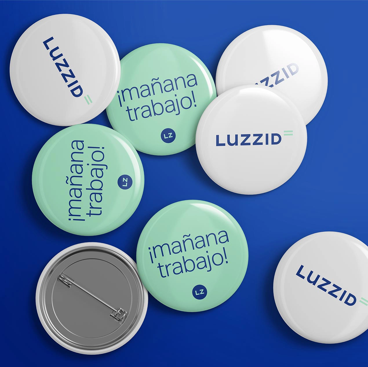
Un logotipo inspirado en el equilibrio entre la credibilidad y la frescura. Por un lado, mediante la combinación de la rigidez de las mayúsculas con la suavidad de la “u” minúscula. Por el otro, combina la sobriedad del azul y el punto desenfadado del verde.
Además, el símbolo del igual nos ayuda a trasladar la idea de que, gracias a Luzzid, puedes seguir disfrutando de hoy y de mañana de la misma manera.
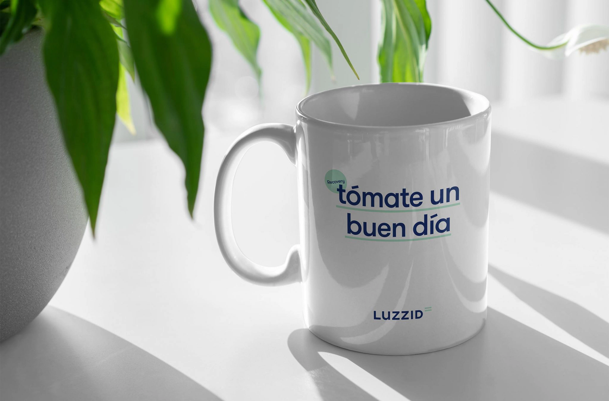
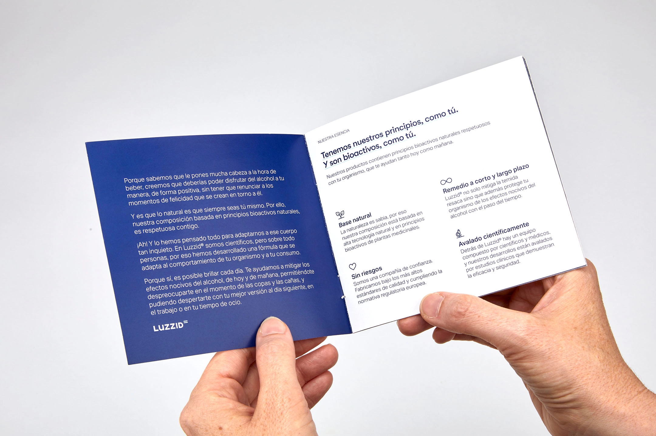
Transmitiendo ciencia y cercanía mediante las tipografías y los recursos
Con la elección de las tipografías pudimos hacer justicia al aval científico que existe detrás de la fórmula sin perder, en ningún momento, el lado próximo y optimista que respira la marca.
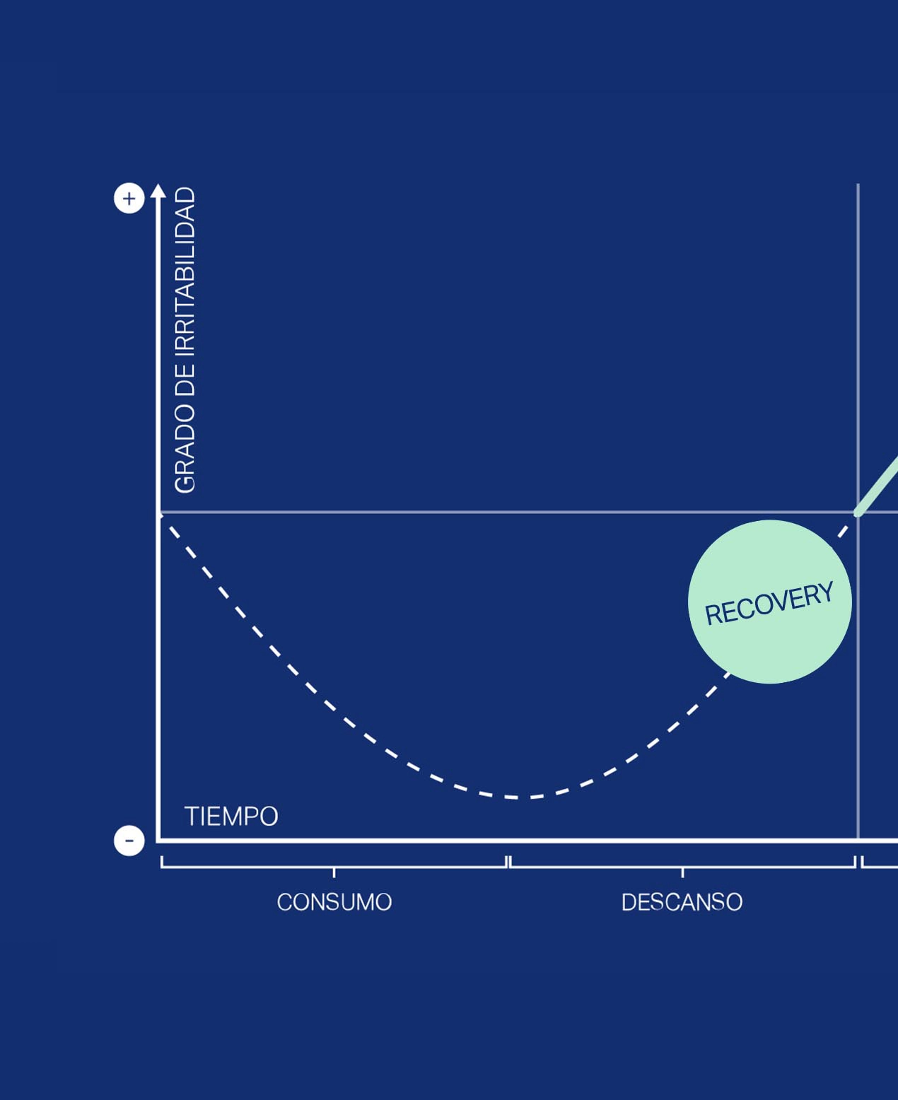
Esta voluntad se tradujo también en la manera en la que utilizamos recursos como superíndices, gráficos, tablas, iconos e ilustraciones.

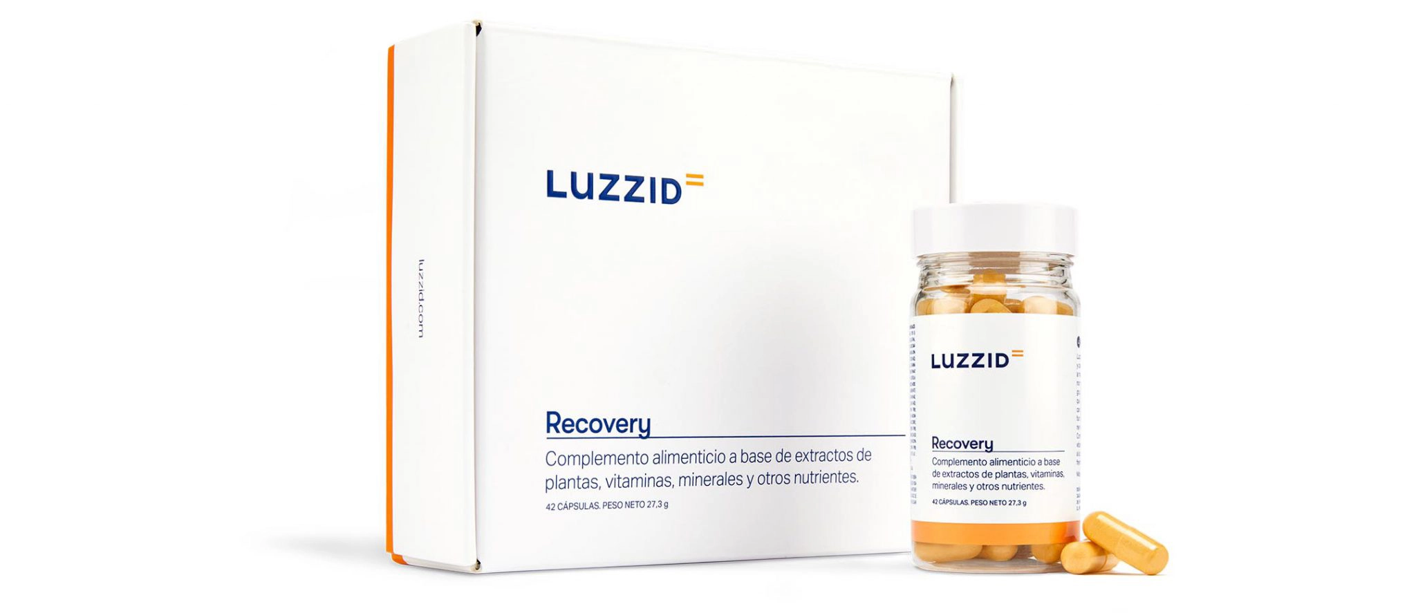
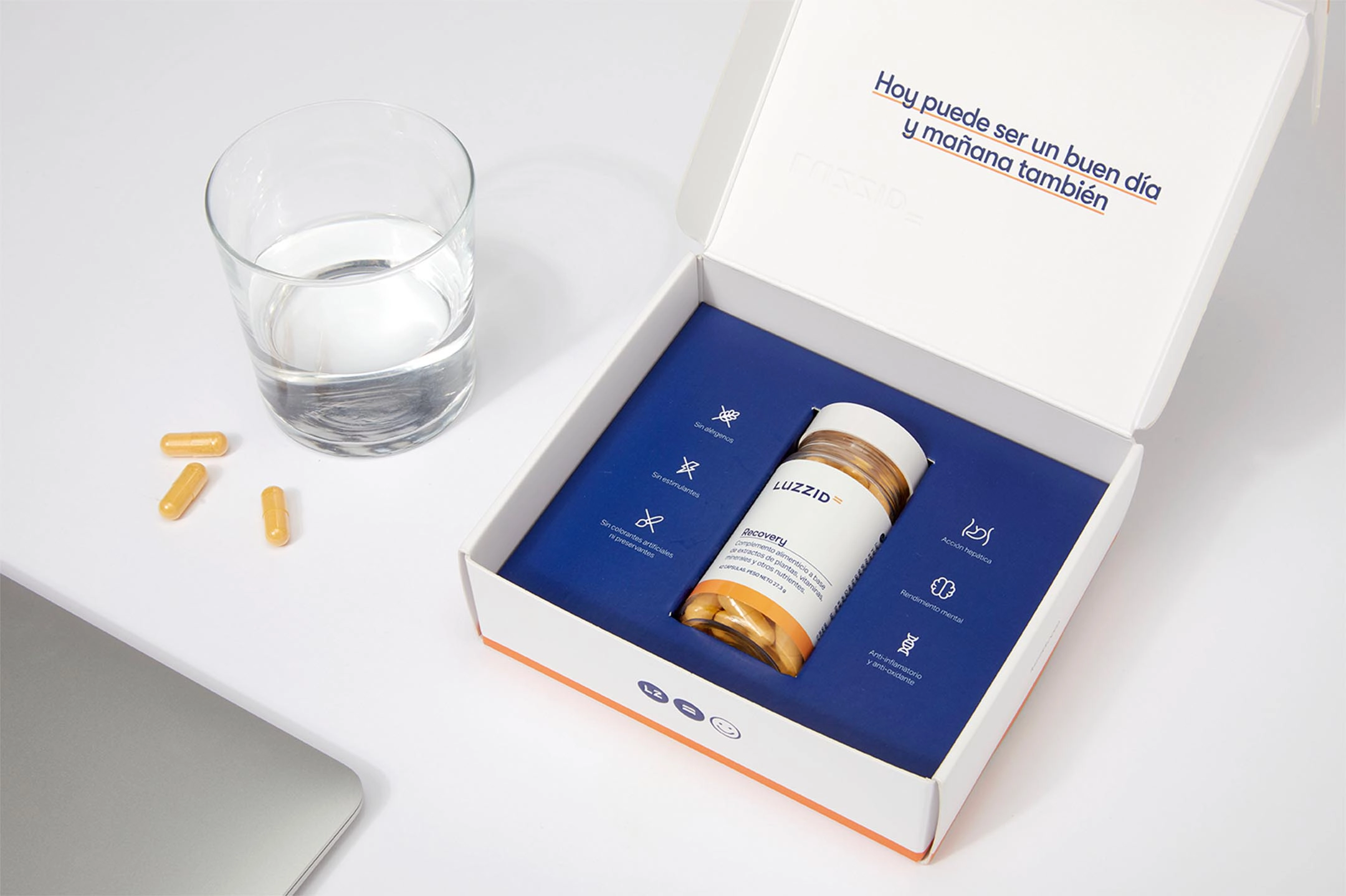
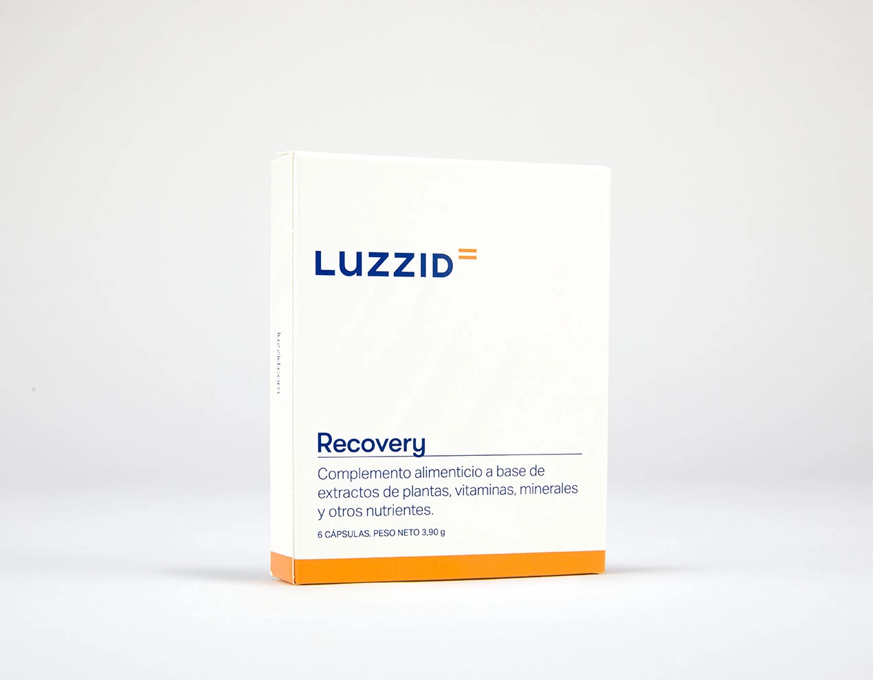
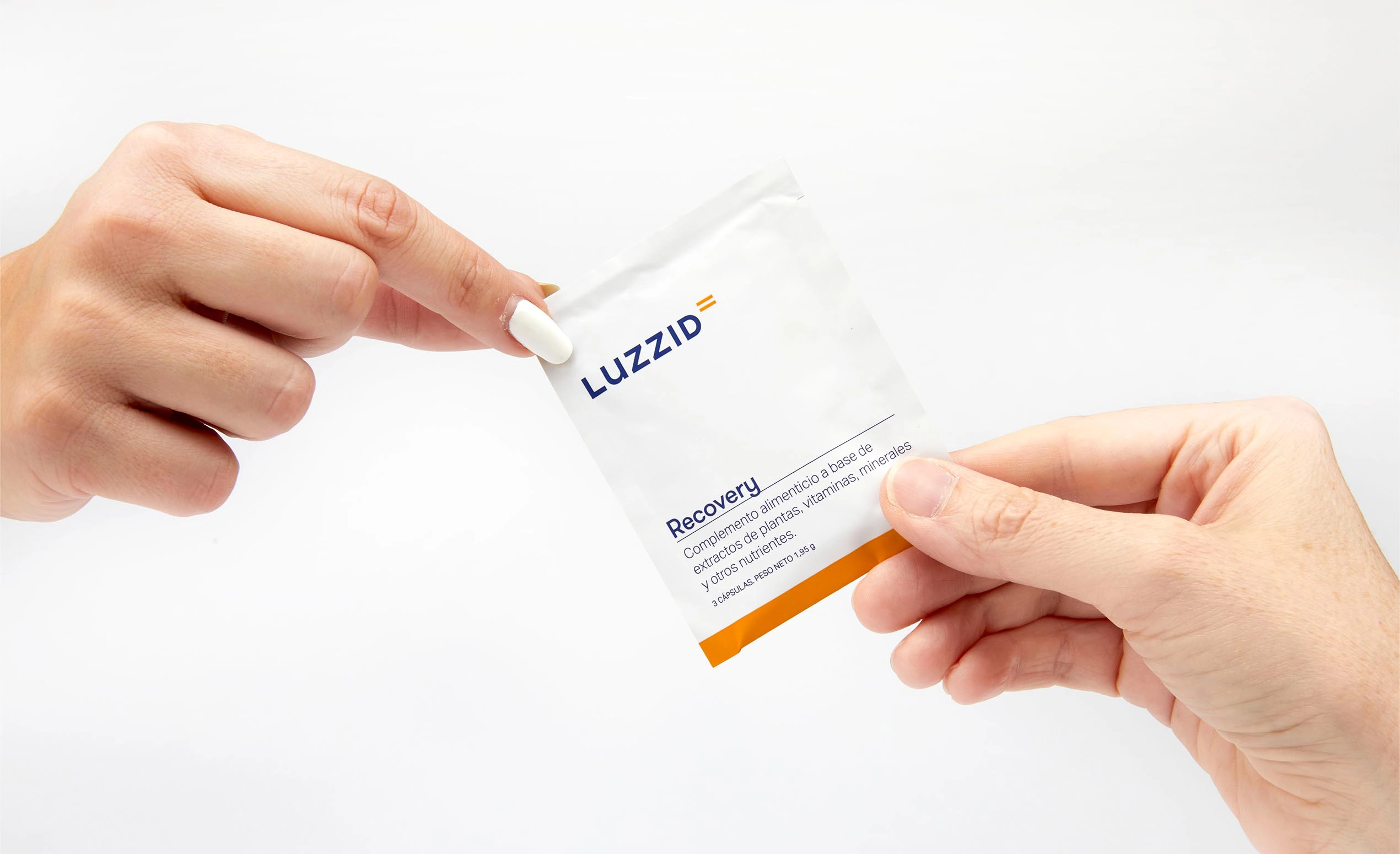
Un packaging para vestir una fórmula única
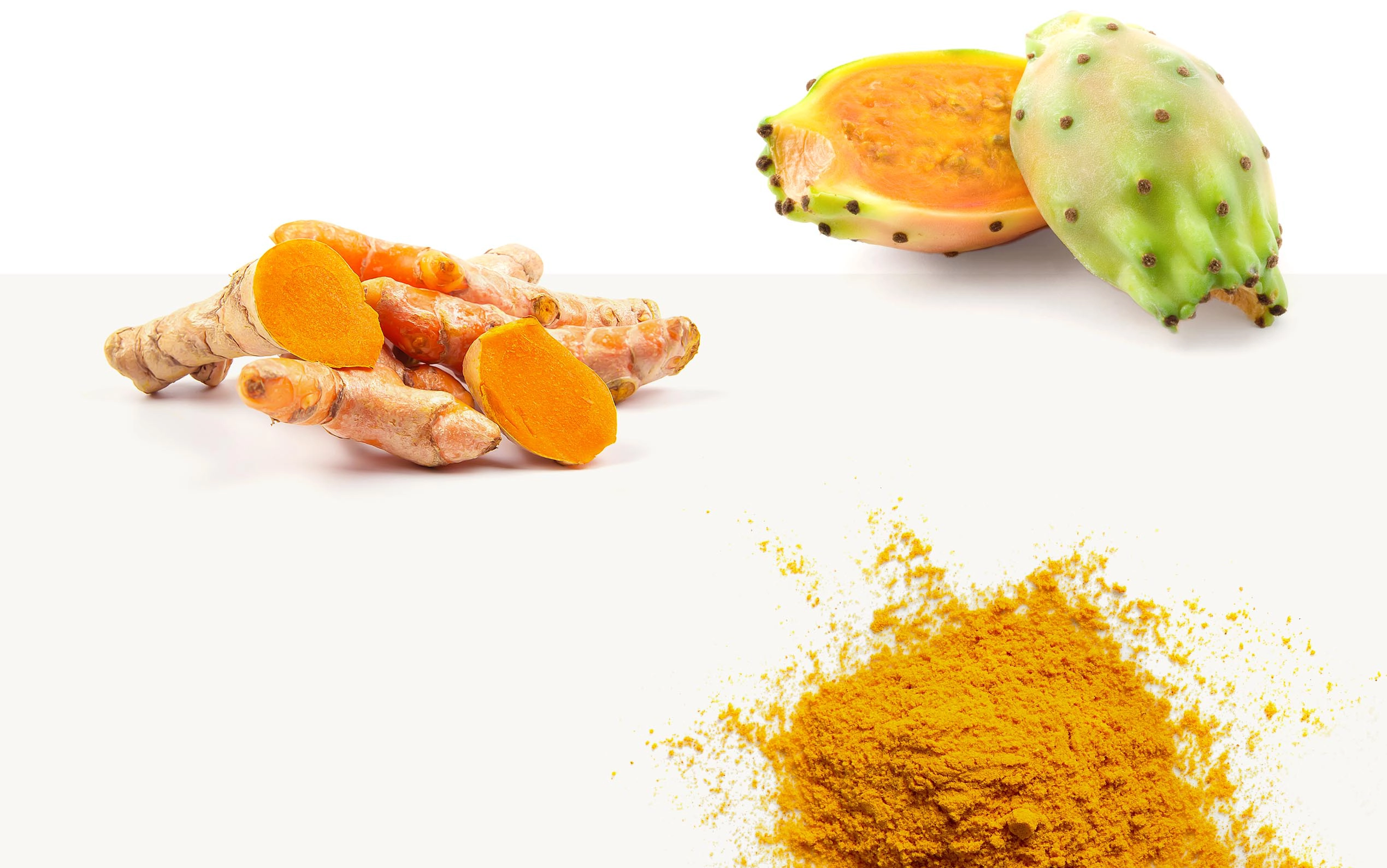
A la hora de idear el packaging de Luzzid Recovery aglutinamos todos los elementos visuales y verbales definidos hasta el momento y añadimos a la ecuación el color naranja ya que es el color que se encuentra en el polvo de la cápsula.
Este color nos ayuda a diferenciar este producto de los otros complementos alimenticios que la marca incorporará a su gama de productos: Luzzid Hydrate enfatiza más en recuperar los niveles de hidratación y Luzzid Focus en concentración.
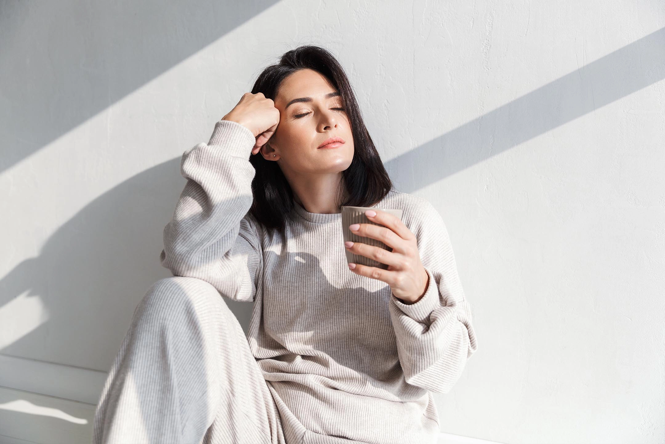
Optimismo y luz para dar vida al estilo fotográfico
Luzzid te hace brillar. Y eso es precisamente lo que quisimos transmitir mediante un estilo fotográfico centrado en la luminosidad, la limpieza y la harmonía. Un mar de naturalidad y felicidad para destacar los componentes y los beneficios del producto. En este caso, para darle vida, contamos con nuestro fotógrafo colaborador habitual: Israel Fernández.

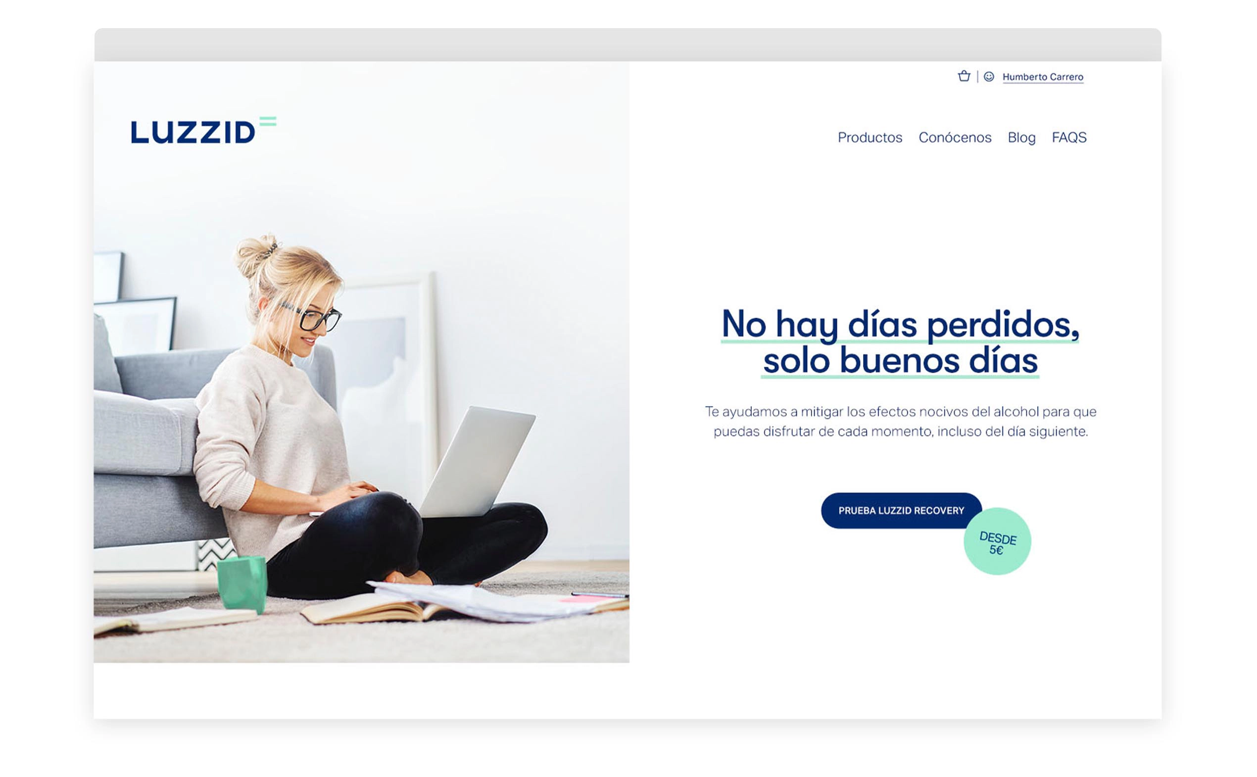
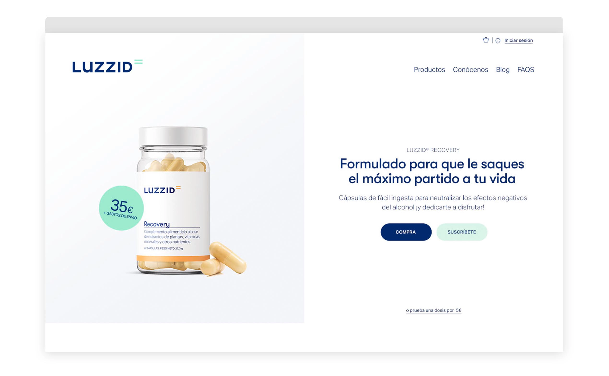
Una web que constituye el principal punto de venta de los productos anti-resaca
A la hora de plantear la estructura, los contenidos y el diseño de la web, nos marcamos como reto ser capaces de encontrar un equilibrio perfecto entre dos puntos fundamentales. Por un lado, reflejar la vertiente científica de la marca con un lenguaje entendible para todo el mundo y, por el otro, estresar al máximo el carácter comercial que requería un e-commerce de este tipo.

Comunicación didáctica y atractiva para una nueva categoría de producto
Luzzid, abre una nueva categoría de productos al mercado europeo y la sociedad debe saberlo.
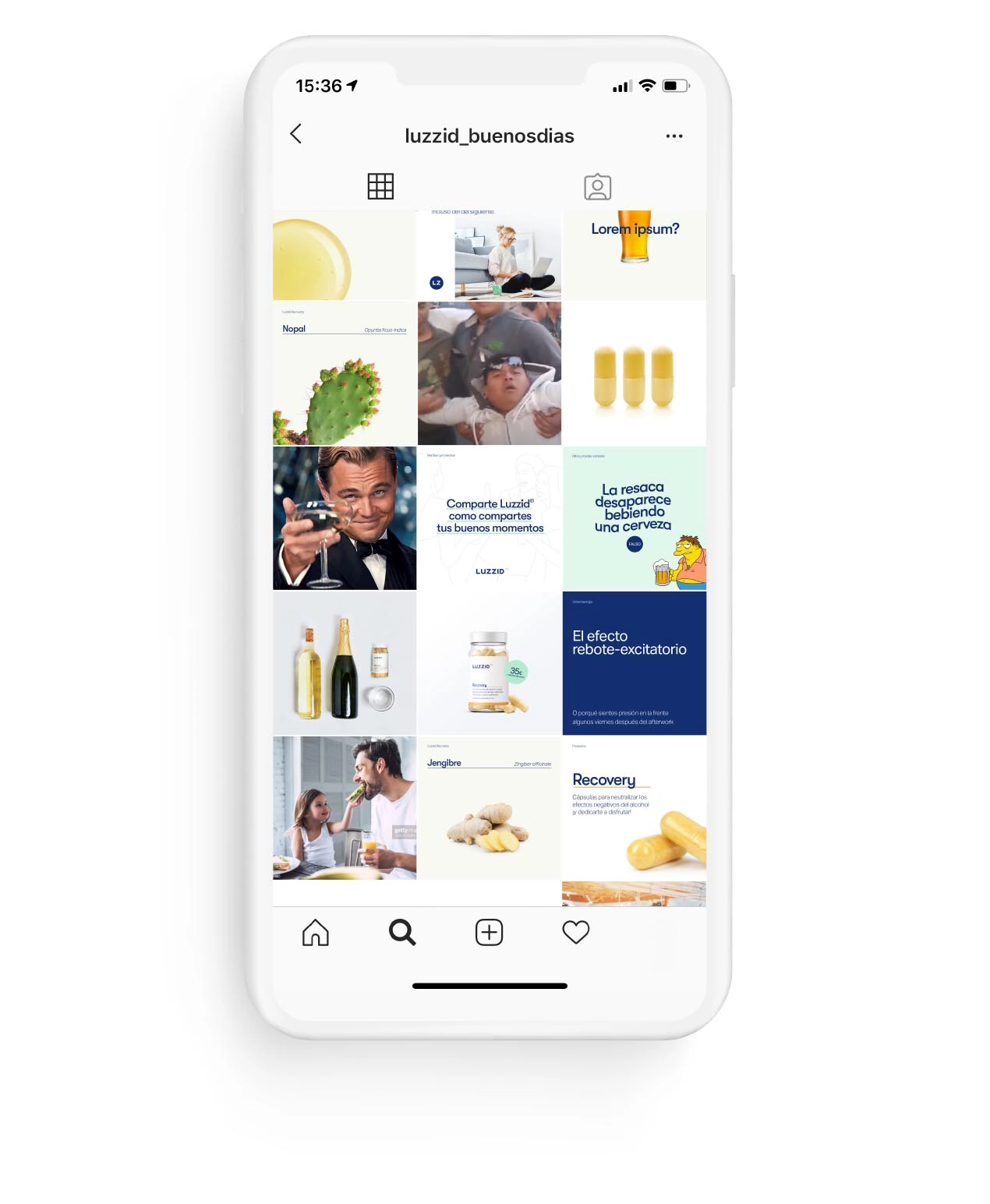
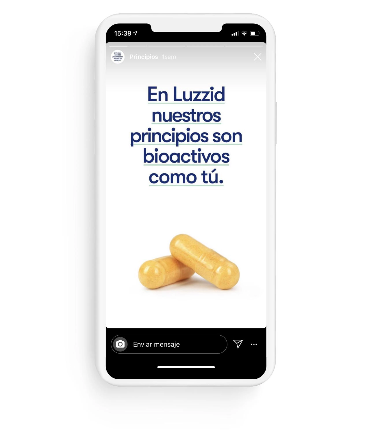
Para activar la marca y transmitir todas las virtudes del producto nos centramos inicialmente en las redes sociales. «Con una clara tipología de publicaciones y diferentes formatos basados en el producto, sus principios activos, ingredientes, los efectos del alcohol, la posología, los momentos de consumo… conseguimos acercarnos al público objetivo e interactuar con ellos. Ejemplificamos los efectos positivos de Luzzid siendo fieles a la idea de marca “Buenos días” manteniendo su lado educativo.
Servicios realizados

Brand Strategy
- Consumer Insights and Category Analysis
- Relato de marca: razón de ser y posicionamiento
Brand Experience
- Experiencia de usuario (cliente/empleado)
- Communication Strategy
Brand Identity
- Naming
- Verbal Identity
- Visual identity
- Packaging
Digital Branding
- Website
Brand Awareness
- Branding campaigns
Let's create
the right mood.