Transform
ABAO Bilbao Ópera
An identity for 21st-century opera

When change means highlighting your essence
The Bilbao Association of Friends of the Opera was born from a group of passionate individuals driven by the idea of bringing an opera project to the city of Bilbao. Almost 70 years later, opera has become a deeply rooted cultural asset within the city’s artistic offering. ABAO continues to promote opera through a wide range of projects that go well beyond the yearly opera season.
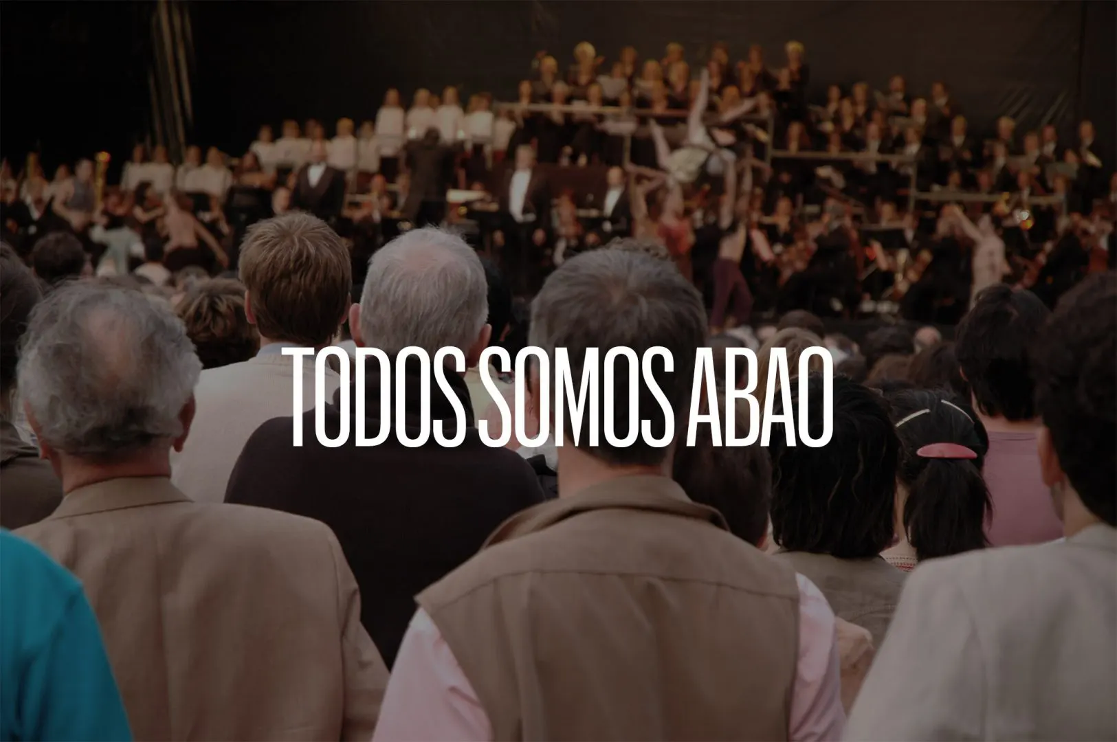
In developing the new identity, our goal was to preserve this essence under the central idea “We Are All ABAO.” A renewed sense of community centered on active participation and on ensuring that opera continues to thrive in Bilbao.
A feeling of community for an entire city
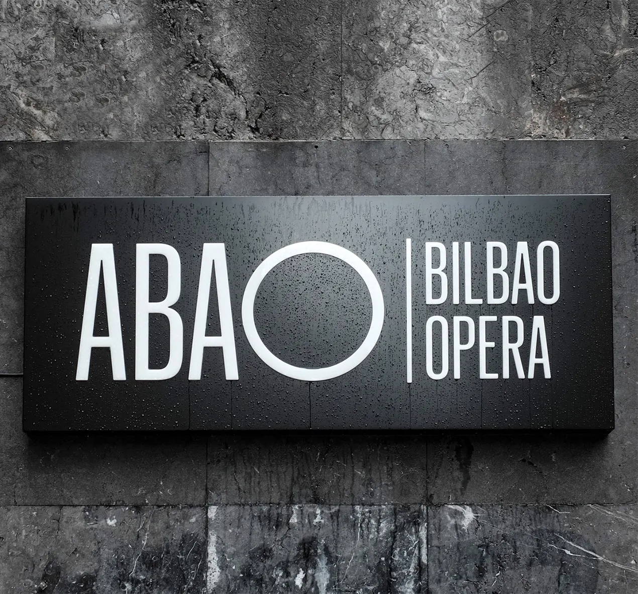
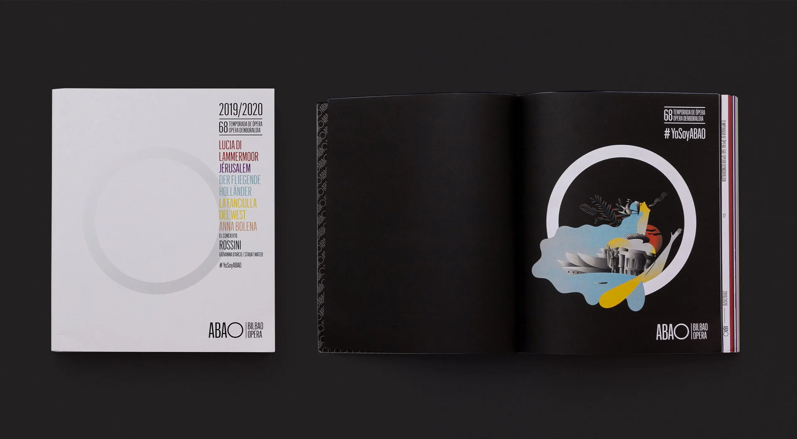
The geometric shape that best represents belonging to a group or community is the circle. To translate the message “We Are All ABAO” into a visual concept, we transformed the O of “ópera” into a circle, creating a graphic metaphor that includes both the city and the concert hall, merging the two.
Additionally, the circle’s inherent dynamism allowed us to convey the rhythm of music and the performing arts. Since the logotype is a monogram not confined within graphic boundaries, we can play with it whenever the format allows. This creates a dynamic identity perfectly suited to the digital world.

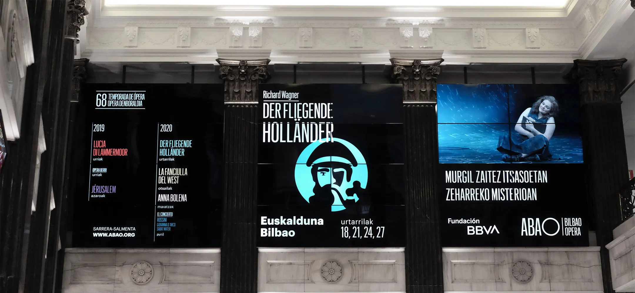
Bringing opera’s sophistication into color
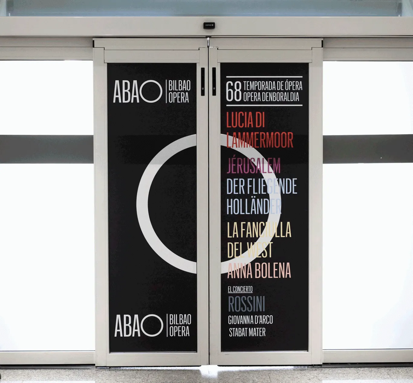
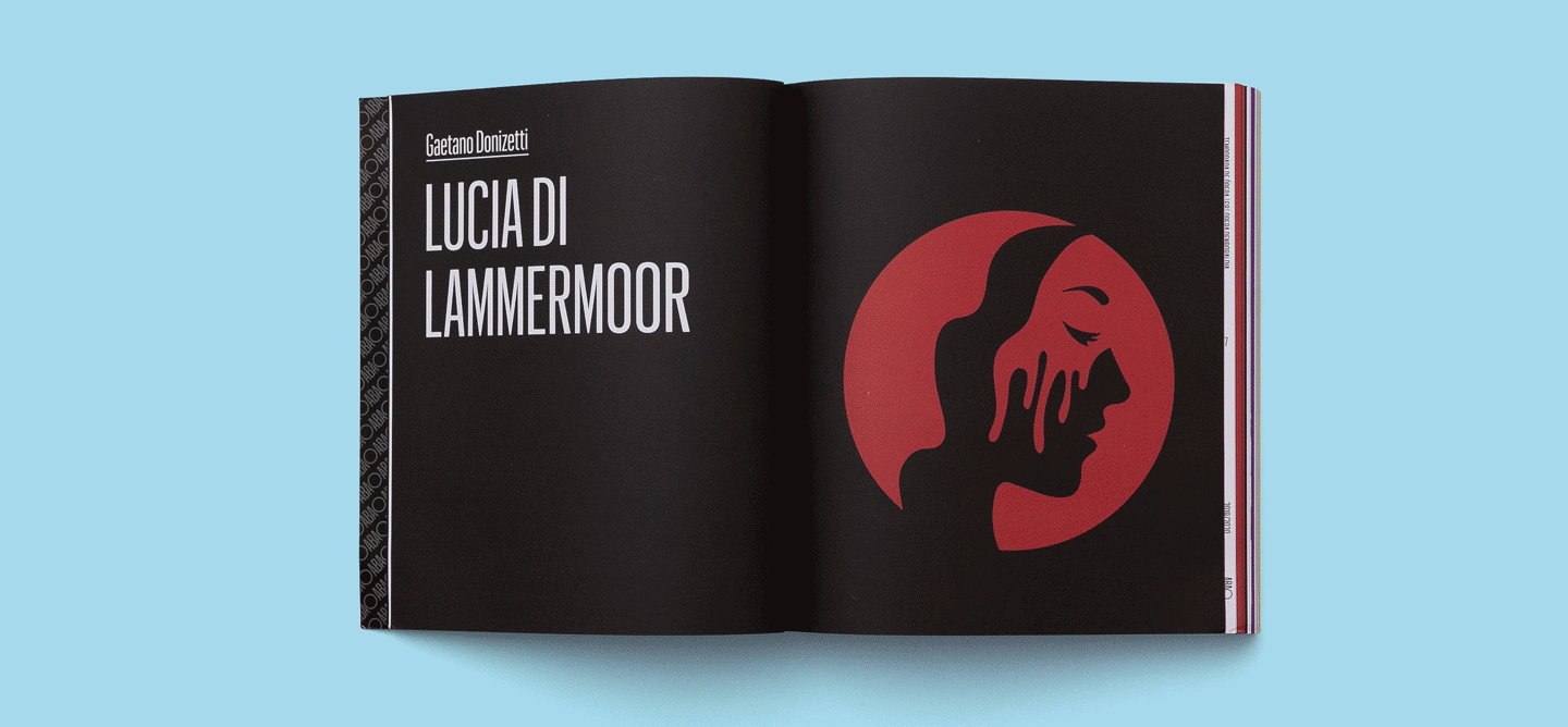
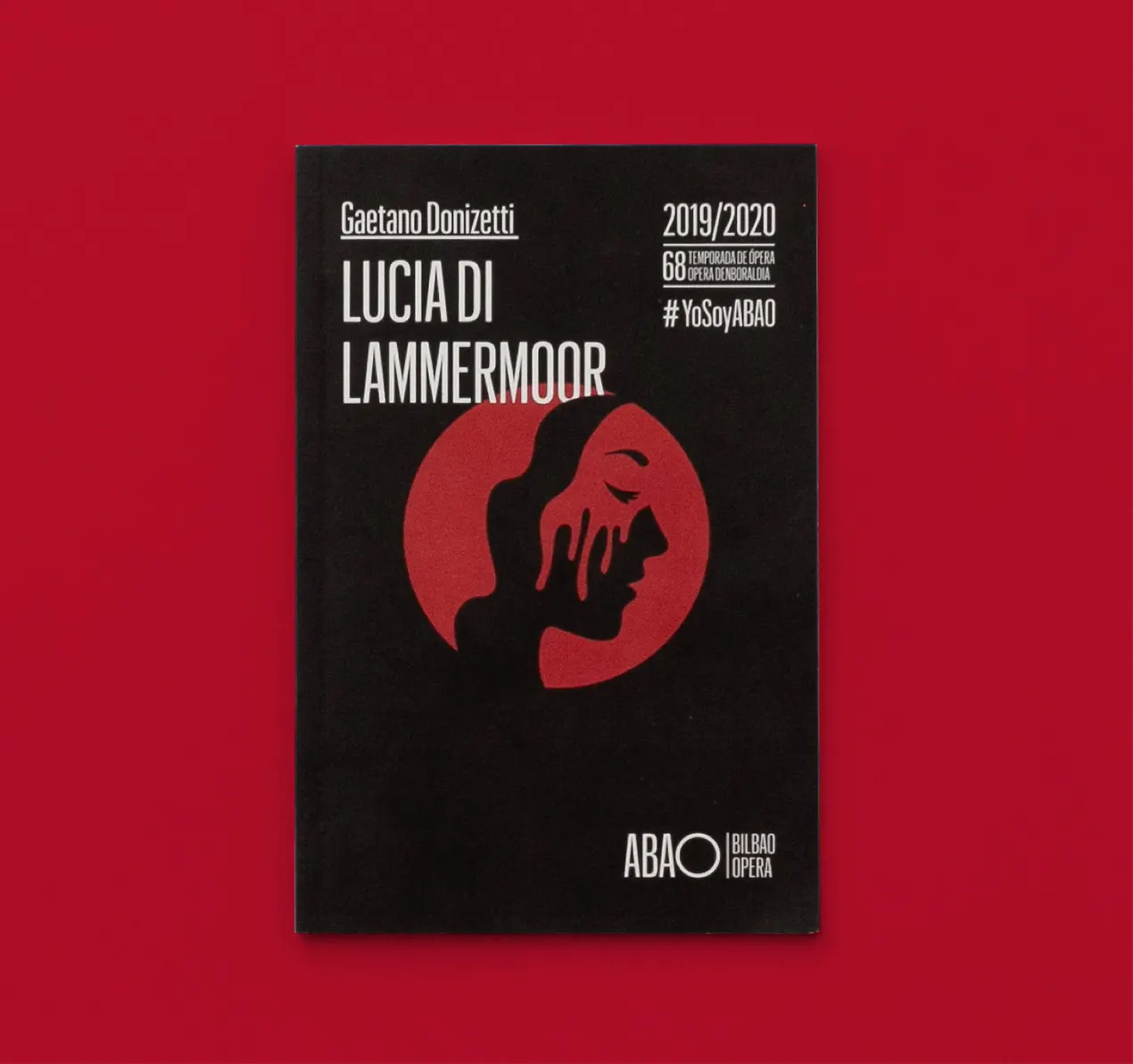
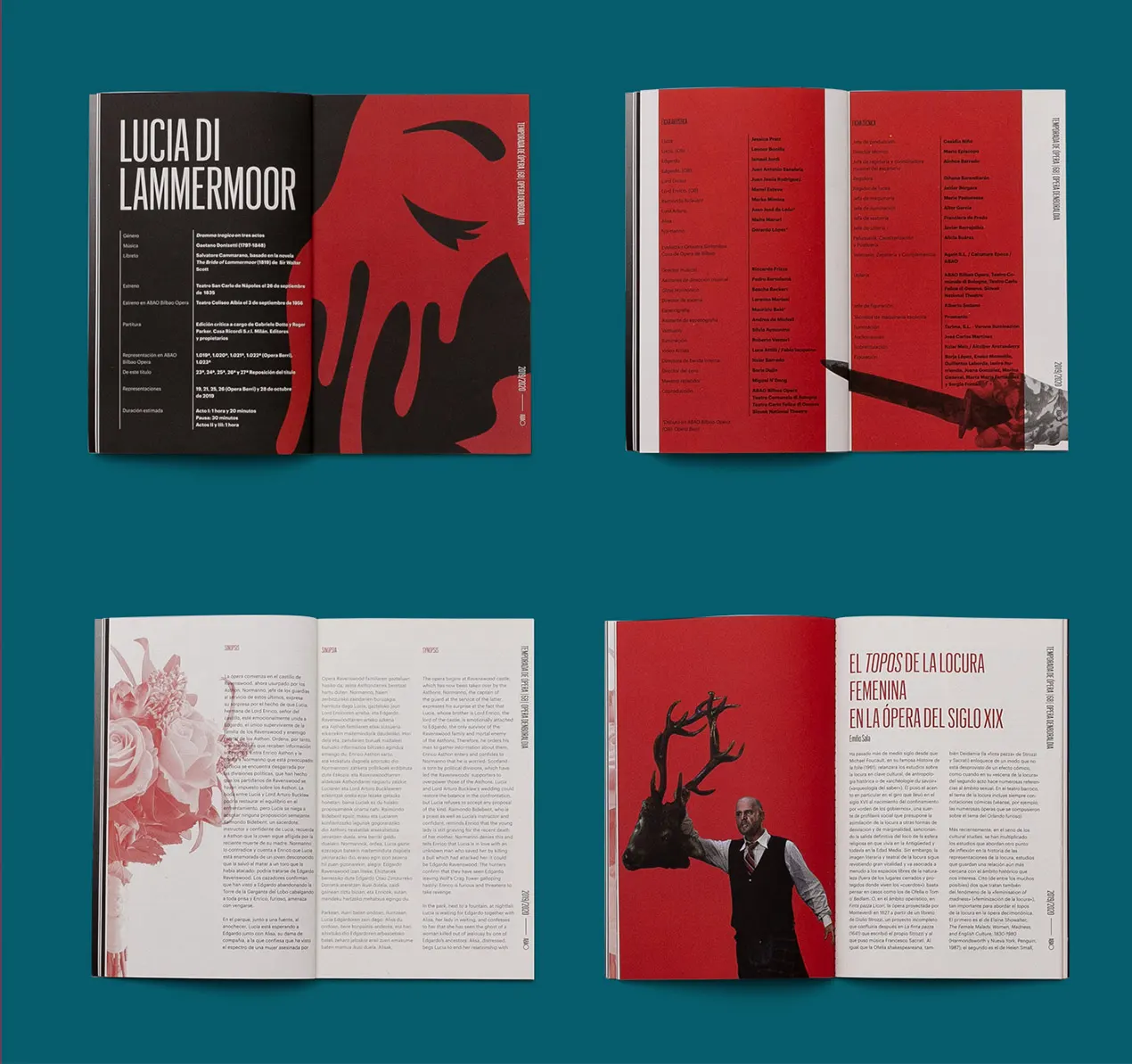
We reserved the use of color for content because opera is not only music — it is a stage that moves from darkness to full color as the performance unfolds. We wanted to reflect this parallelism through the color system. Therefore, ABAO is always represented in black and white, while the performance titles appear in color.
We created a broad color palette so that each title in the season is associated with its own color. This links every production to an illustrated metaphor and to a color that represents it.

The circle at the heart of the communication system
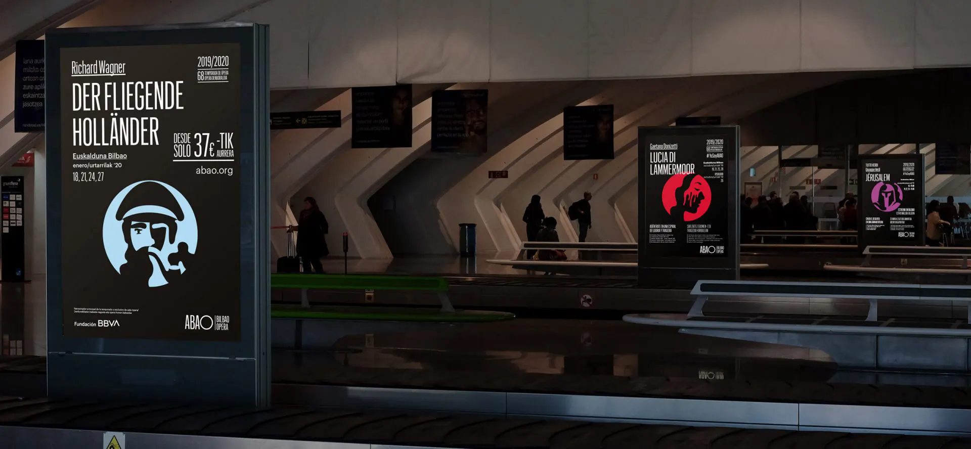
We developed a communication system that coherently connects every piece, whether digital or offline. Within this system, the circle is a key asset used across all communications. It functions as a peephole that invites audiences to look into the spectacle.
The rest of the elements found in the communication pieces are bursts of information that convey the passion for opera through color, depth, typography, and shapes. These are presented in an organized yet dynamic and flexible system.
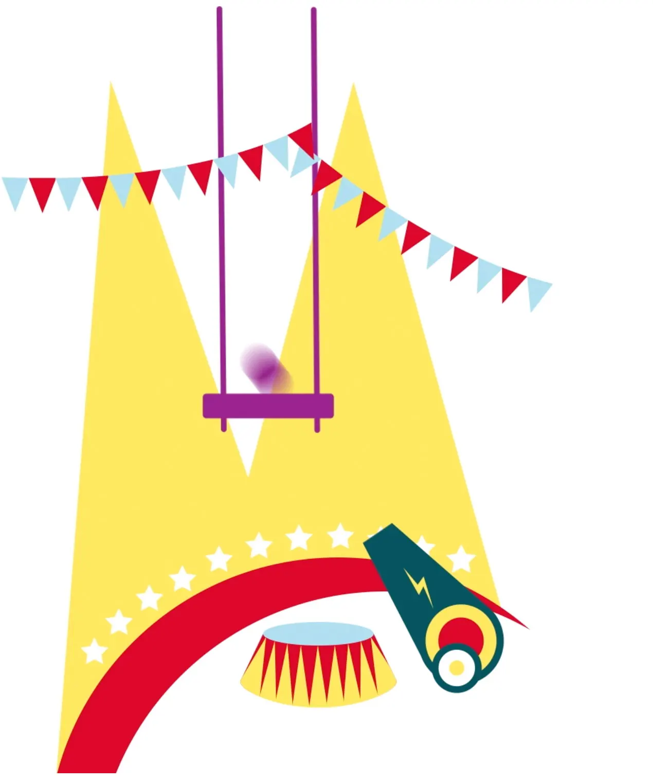
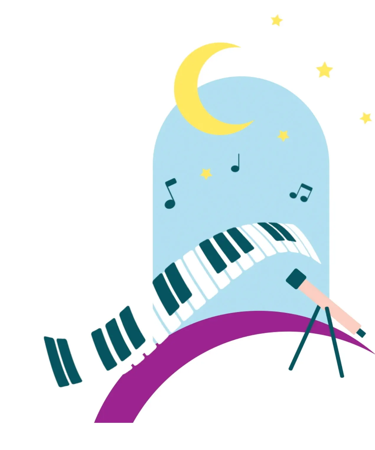
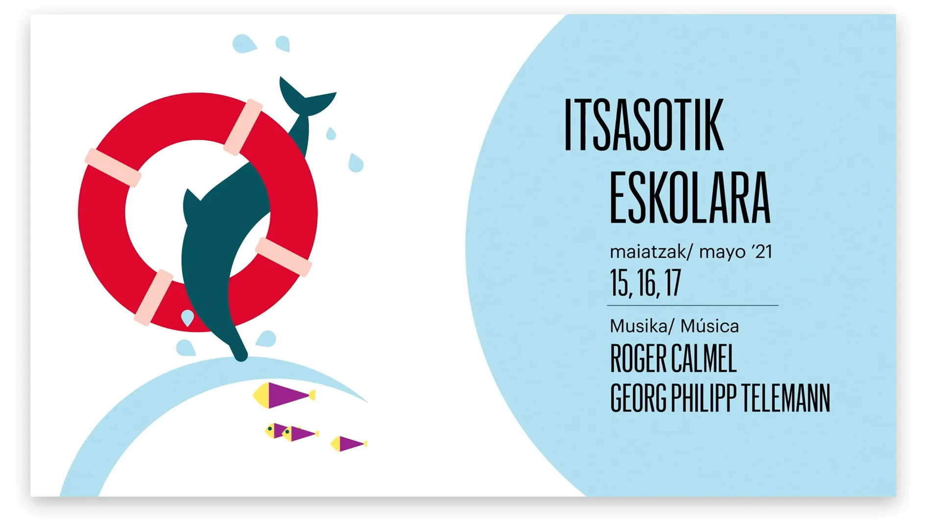
Opera is for everyone, and it speaks everyone’s language
Finally, the identity of the programs dedicated to children was also transformed to connect directly with them. Here, illustration becomes more playful and prominent, expanding the boundaries of imagination. We bring opera closer to children by speaking their language and turning it into a game.
Services provided

Brand Strategy
- Brand audit
- Consumer Insights and Category Analysis
- Brand Architecture
- Brand Narrative: Purpose and Positioning
Brand Experience
- Communication Strategy
Brand Identity
- Visual identity
- Digital Identity
Digital Branding
- Video manifesto
- Website
- Branded Content
Brand Awareness
- Branding campaigns
- Brand guardian/advisor
Let's create
the right mood.