Differenciate
L’Artisan Givré
The story of how a French ice cream brand won over the Spanish market

The story of how a French ice cream brand won over the Spanish market
L’Artisan Givré blends its love for the purity and freshness of ingredients with the care and savoir faire of artisanal craftsmanship to create ice creams with authentic textures, colors, and flavors in its workshop in the French Pyrenees.
Once the brand found its place in the French market, it set itself a new challenge: expanding its borders to enter the Spanish market.
So, L’Artisan Givré approached us to identify which brand elements would be essential to succeed in a mature market with established competitors and with the diverse motivations and needs of a new audience.

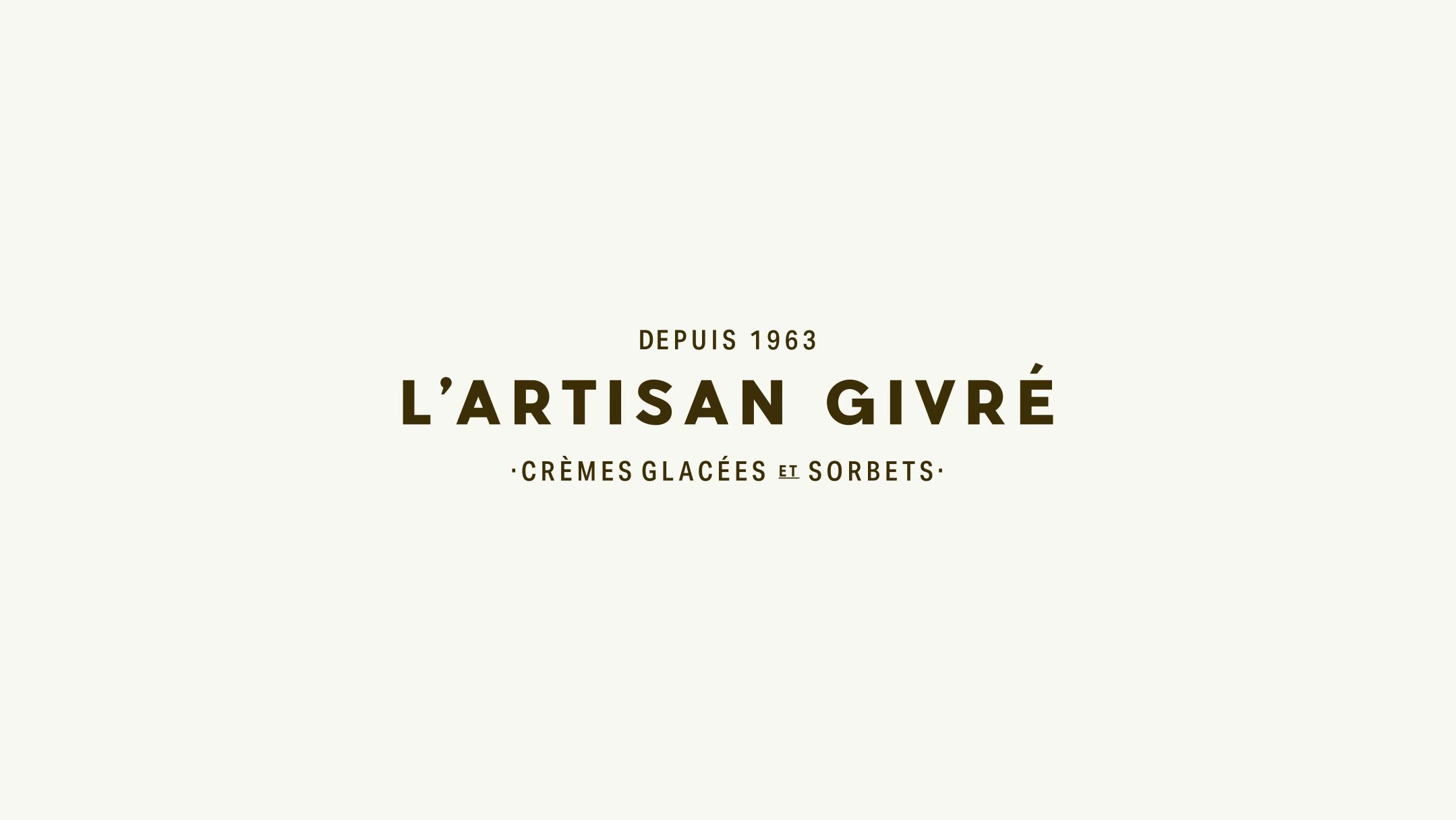
A logotype inspired by classic French signage
Based on our research, we concluded that the identity needed to be completely reconsidered in order to properly communicate the brand’s artisan meanings in this new market. To highlight the love for traditional craftsmanship, emphasize the brand’s origin, and convey the artisan’s sensitivity in their work, we drew inspiration from late-19th-century classic French signage to begin shaping the new identity through the logotype.
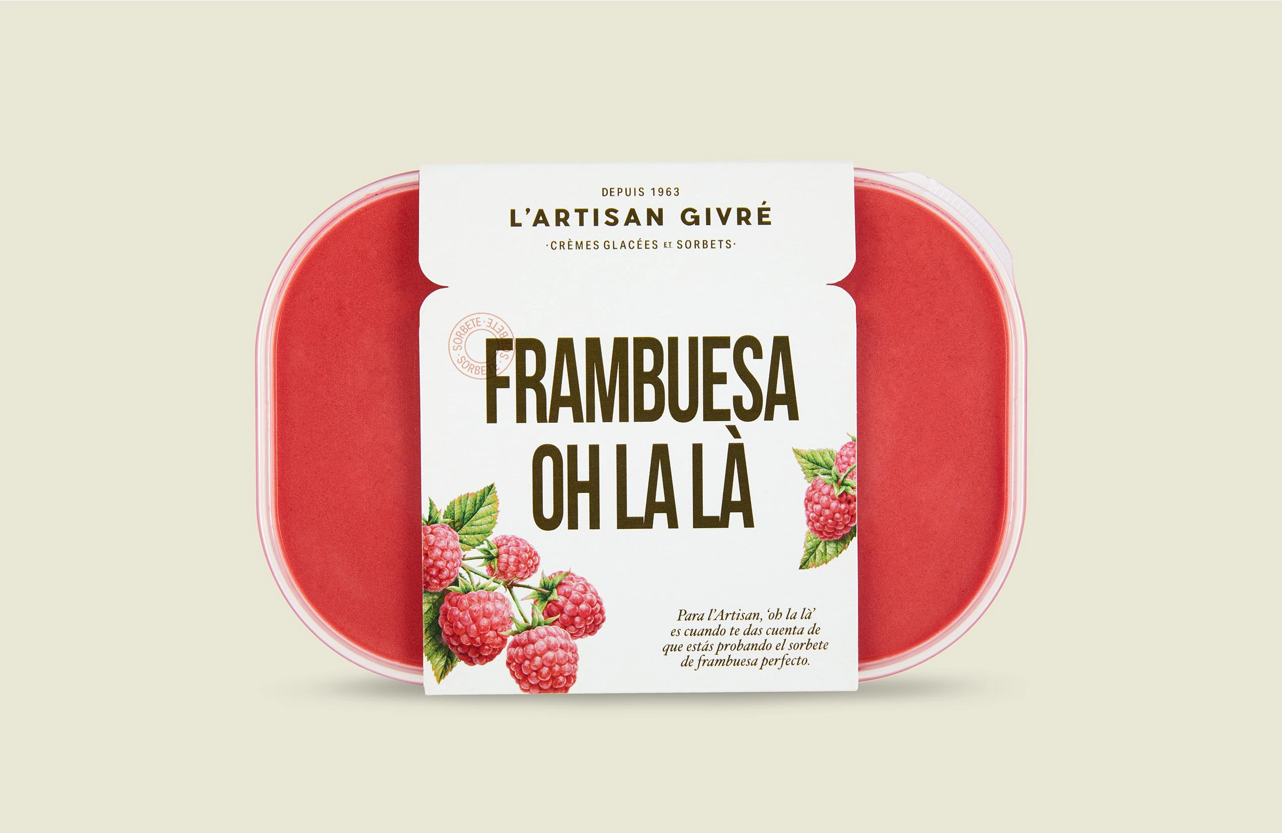
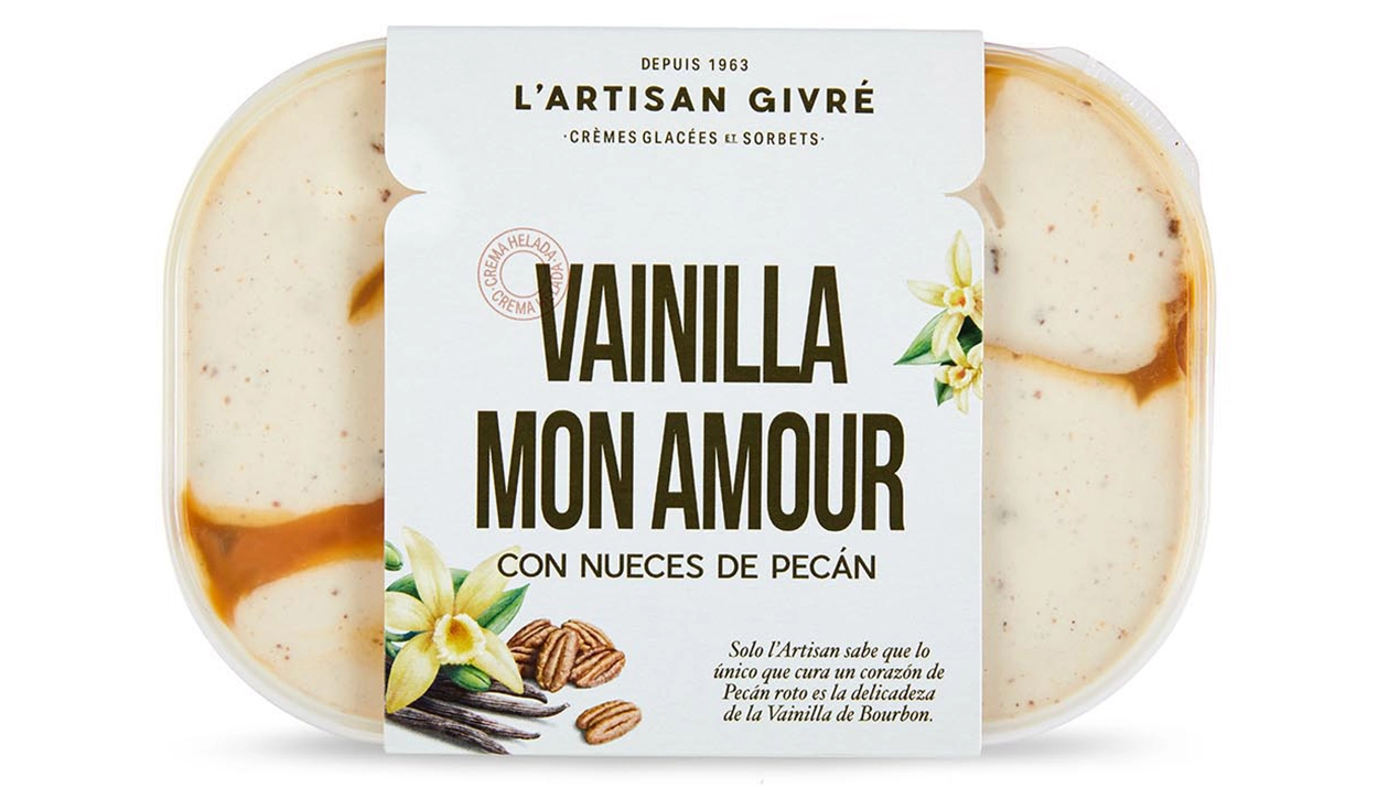
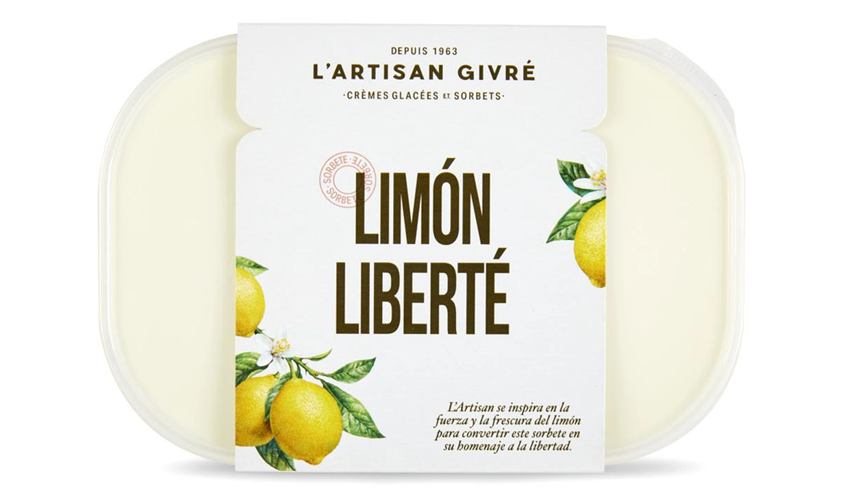
Expressing the artisan’s bond with ingredients through lyrical storytelling
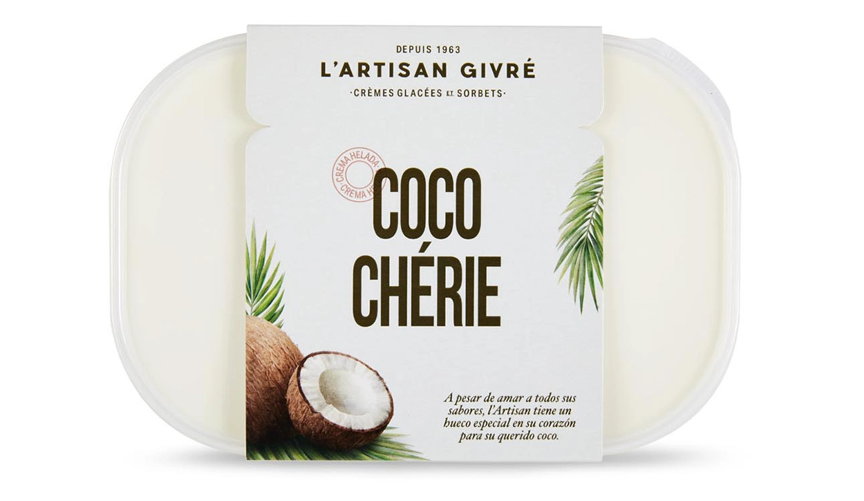
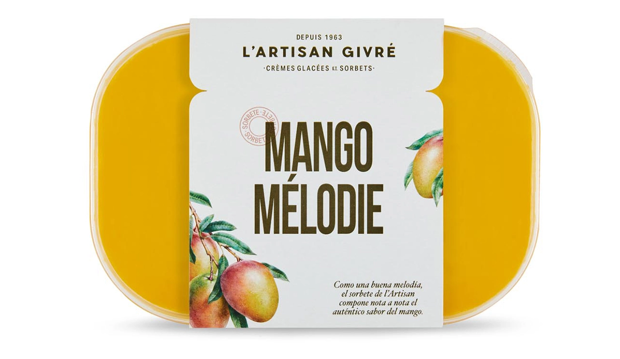
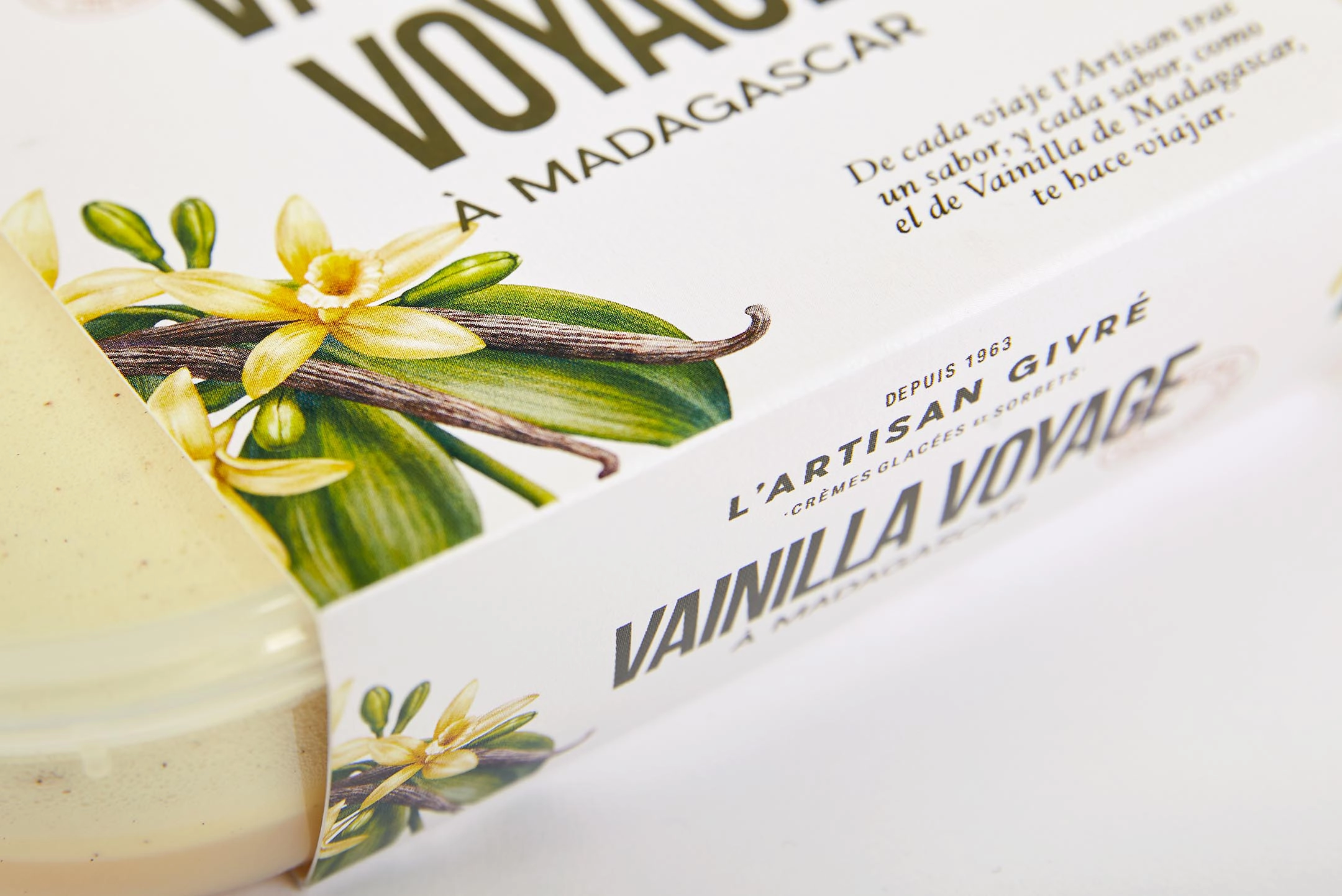
A true artisan is passionate about their craft and their relationship with ingredients; their work becomes a genuine love story. With this idea in mind, we developed a series of French names to convey the brand’s savoir faire and create a phonetic connection with each flavor. We then brought them to life through lyrical micro-stories.

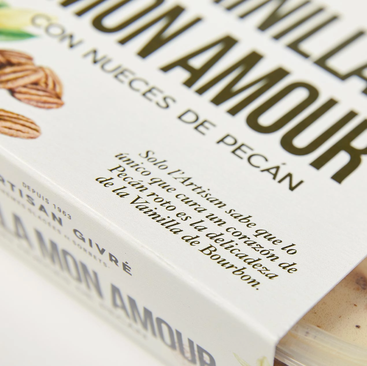

Stories and names brought to life through typography
These stories wouldn’t be the same without a typographic voice capable of giving them a romantic touch. With that in mind, we selected an italic typeface with an ornamental character, inspired by centuries-old models like Garamond or Janson, to give the micro-stories a classic and elegant atmosphere. To balance the weights, we paired it with a condensed sans-serif that harmonizes perfectly with the logotype and adapts well to limited packaging space, improving shelf impact.


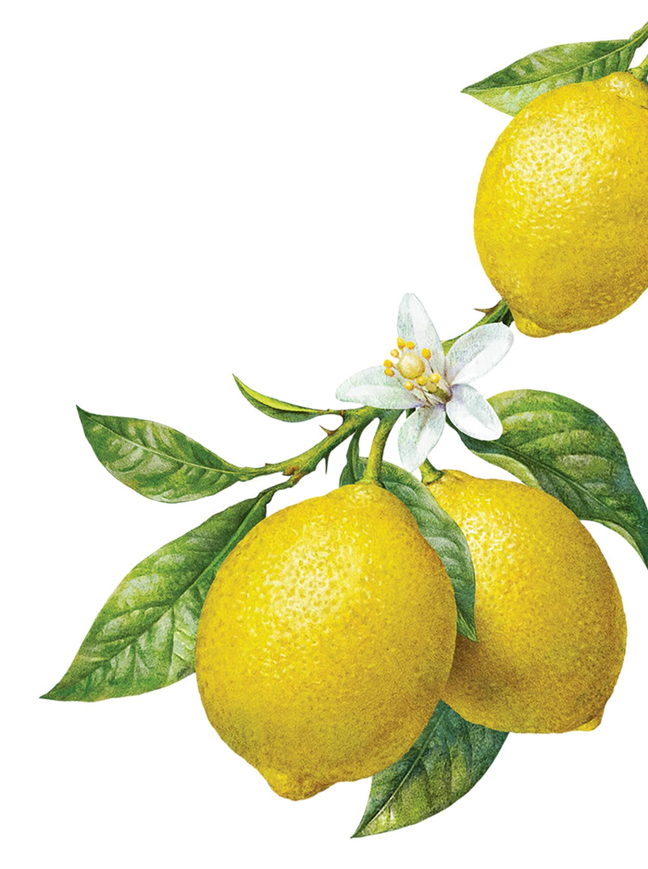
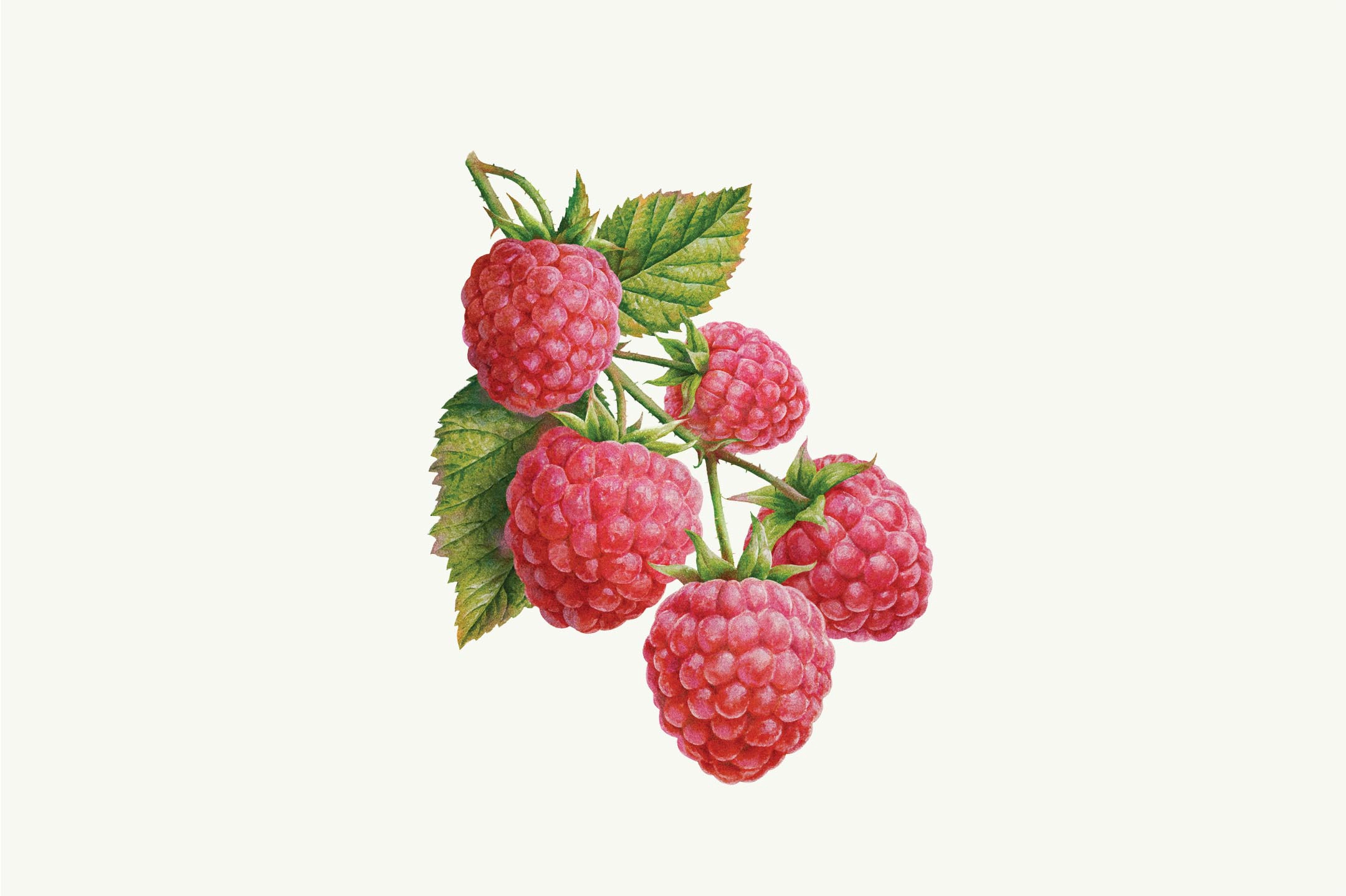
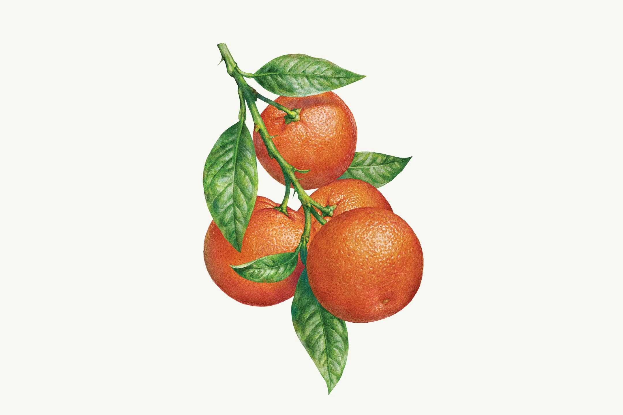
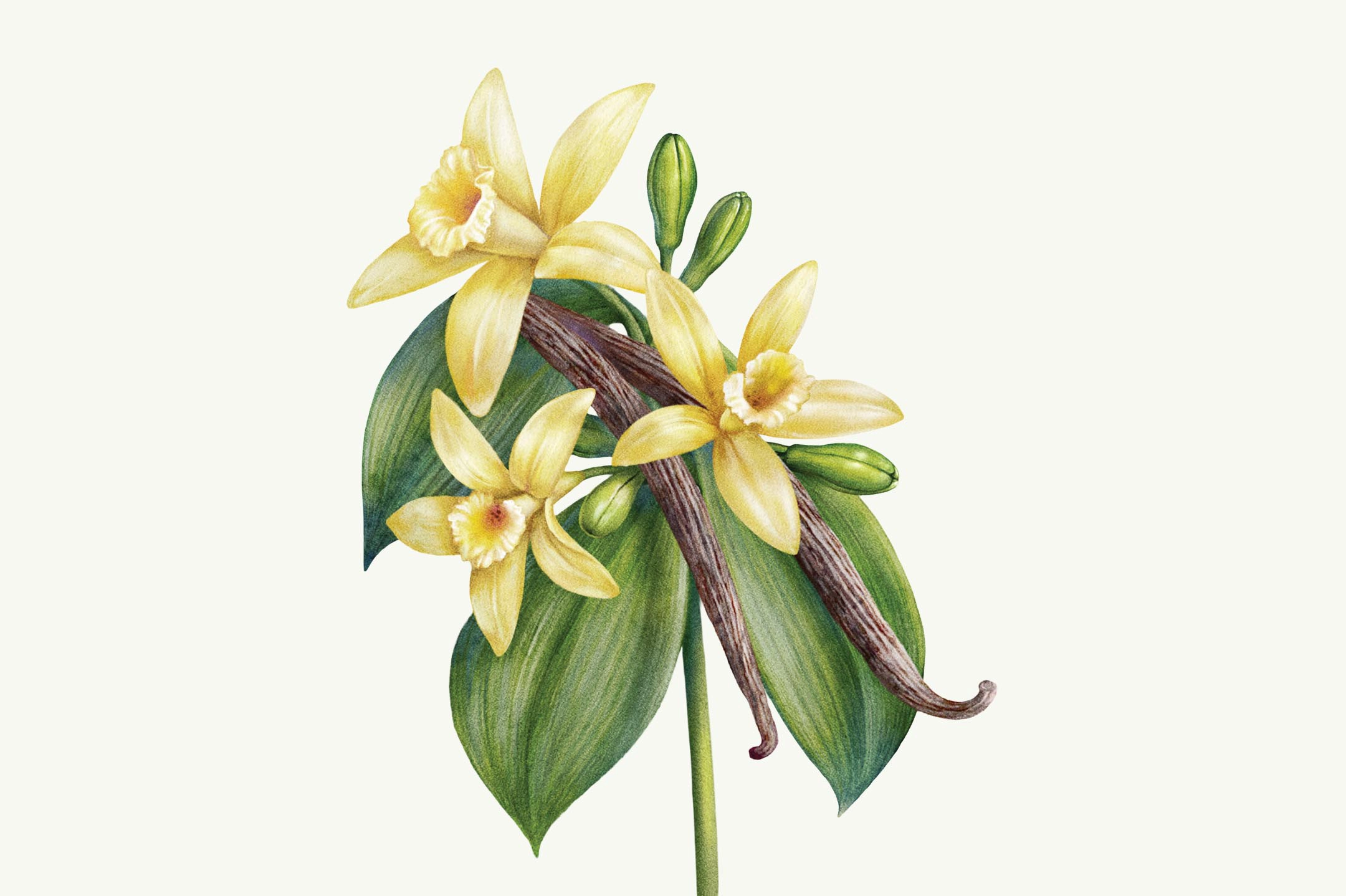
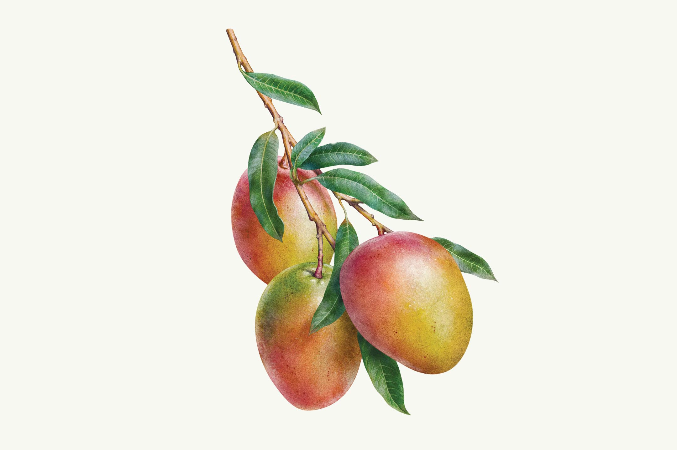
Turning ingredients into art through illustration
When showcasing the ingredients, we wanted to highlight their natural and noble qualities by presenting them in their most authentic state. To do this, we developed a realistic illustration style in collaboration with the Inorama studio, elevating the ingredients to the level of art to connect with the brand’s artisanal spirit.

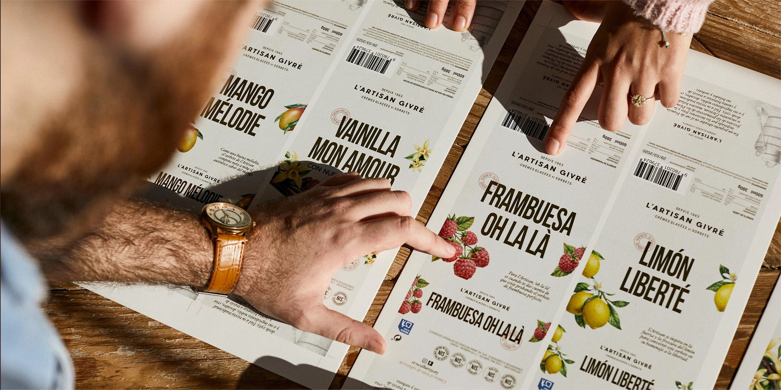
Packaging filled with great taste and savoir faire
A packaging solution that brings together all elements of the identity and connects with the insights gathered through focus groups and online surveys of more than 400 ice cream consumers. The pack allows shoppers to see the essence of the product without distorting it and offers an artisanal alternative in supermarket aisles traditionally dominated by industrial brands.
Services provided

Brand Strategy
- Brand audit
- Consumer Insights and Category Analysis
- Brand Narrative: Purpose and Positioning
Brand Experience
- Communication Strategy
Brand Identity
- Naming
- Verbal Identity
- Visual identity
- Packaging
Let's create
the right mood.