Launch
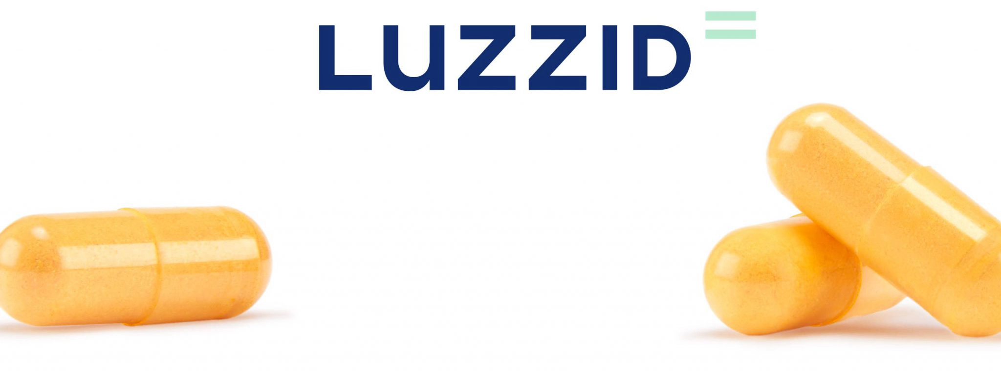
Luzzid
Creating a future without hangovers so every day can be a good day

Creating a future without hangovers so every day can be a good day
Luzzid is a line of natural dietary supplements developed and driven by a medical–scientific team. Their purpose is to counteract the harmful effects of alcohol, helping you recover your mental and physical abilities more quickly.
These innovative products needed a brand capable of faithfully conveying their mission: helping people enjoy the positive side of alcohol without dealing with the next day’s hangover. Because with Luzzid there are no lost days—only good days.

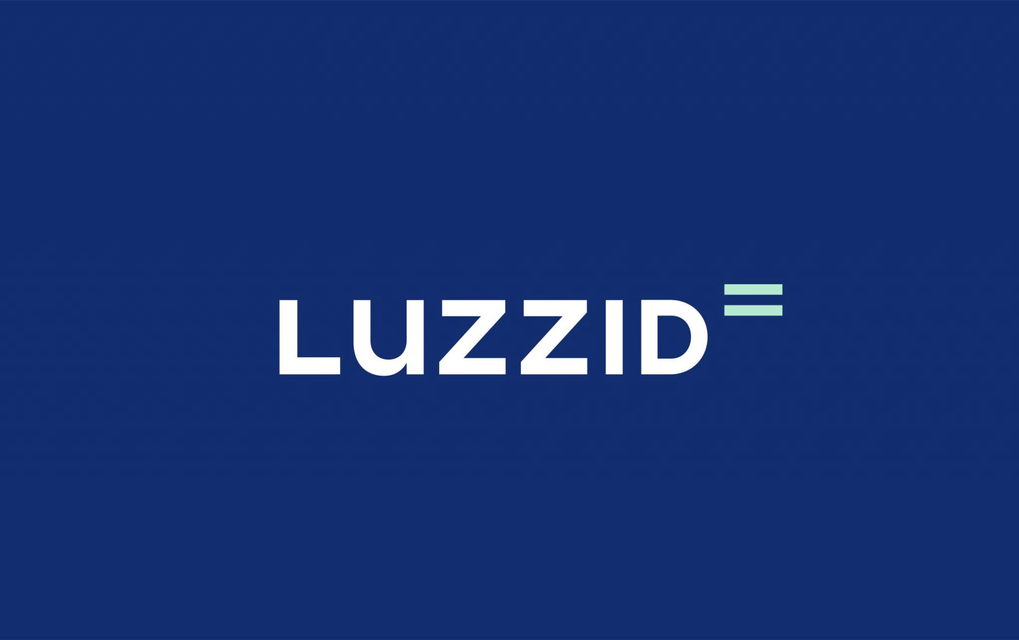
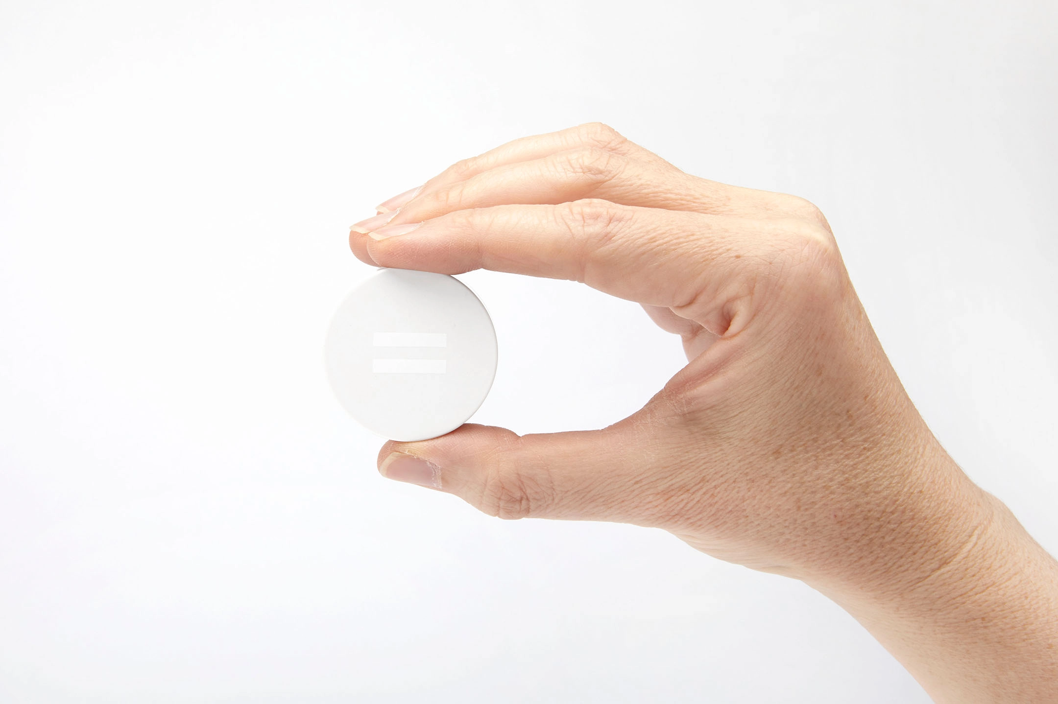
A logo that lifts you up so you can go all in
A logo inspired by the balance between credibility and freshness. On one hand, the combination of rigid uppercase letters with the softness of the lowercase “u.” On the other, the pairing of sober blue with a lively touch of green.
In addition, the equal symbol helps us communicate the idea that thanks to Luzzid, you can continue enjoying today and tomorrow in the same way.
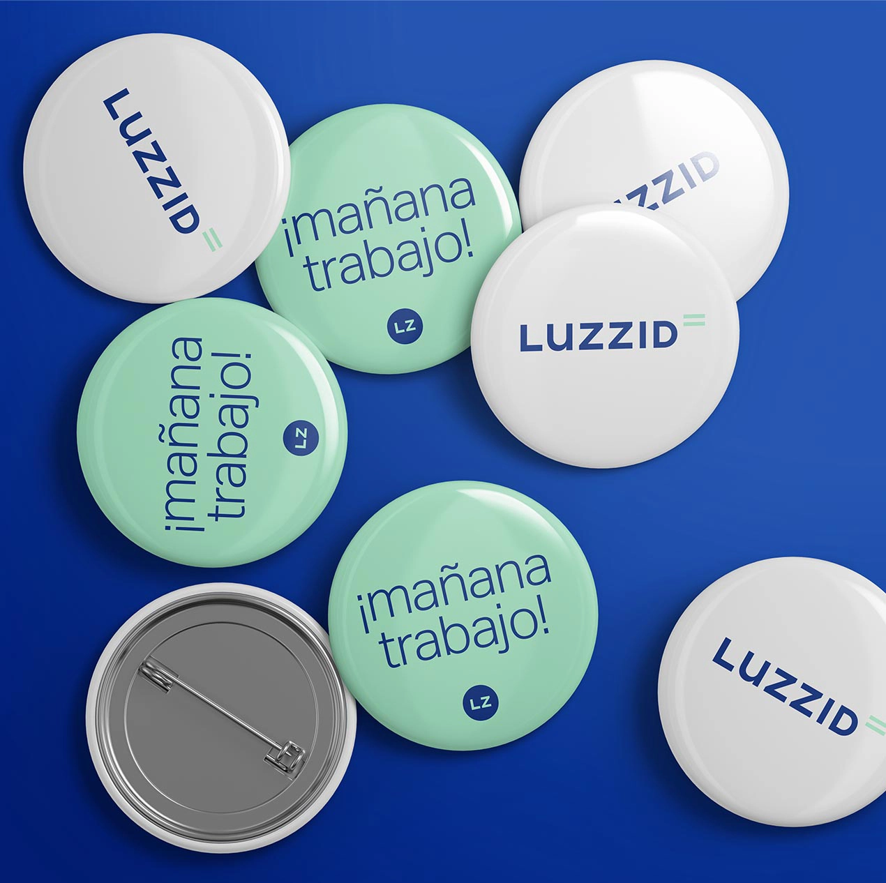
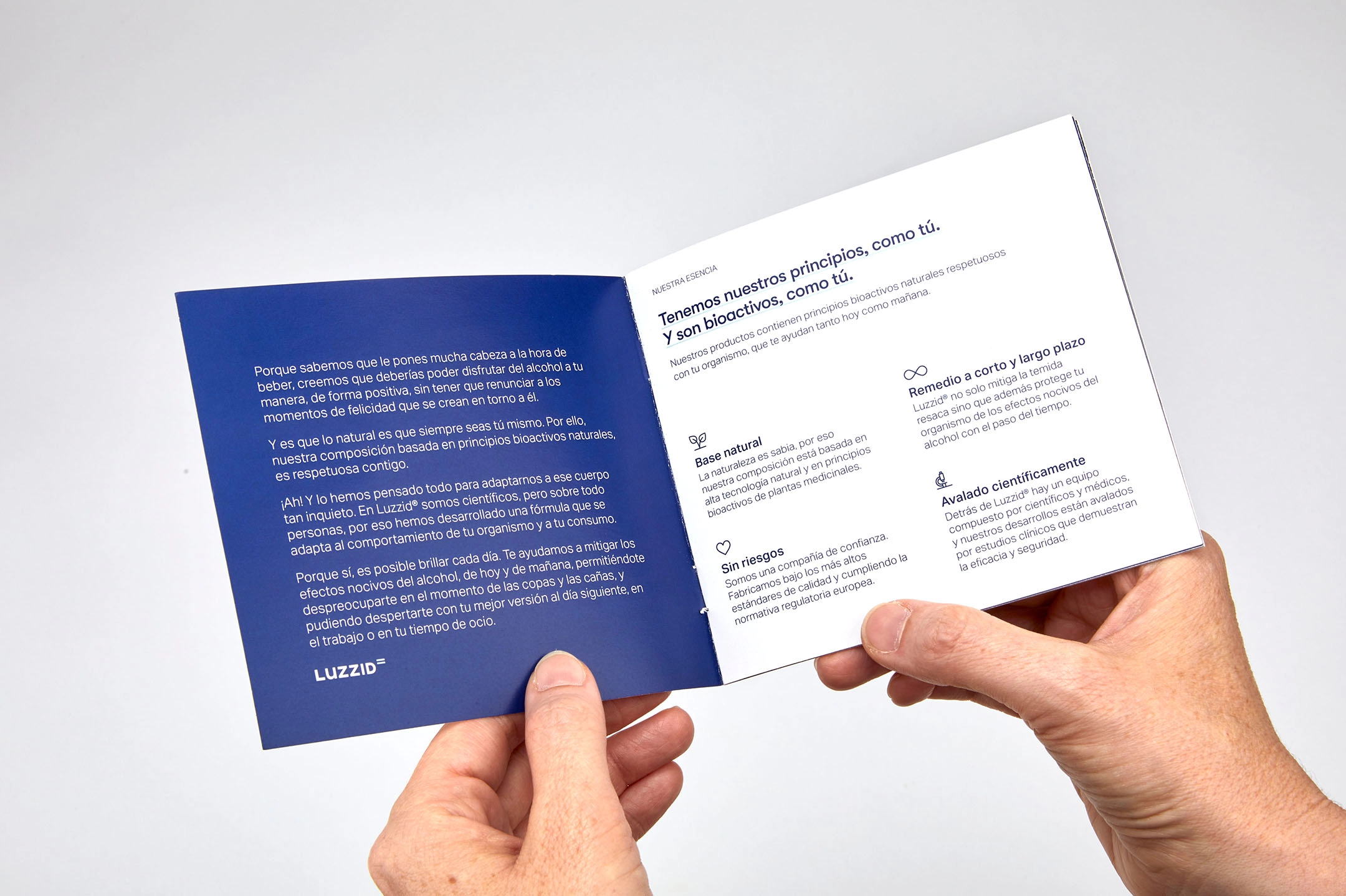
Conveying science and warmth through typefaces and visual elements
With the choice of typefaces, we were able to honor the scientific backing behind the formula without ever losing the approachable, optimistic character that defines the brand.
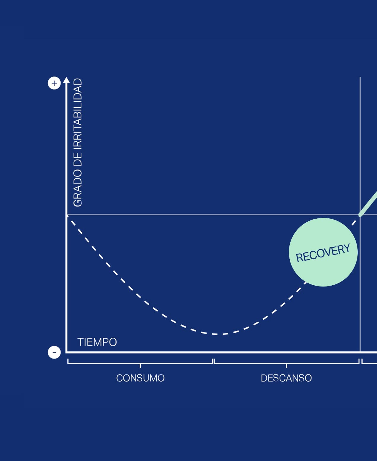
This intention also translated into how we used elements such as superscripts, charts, tables, icons, and illustrations.

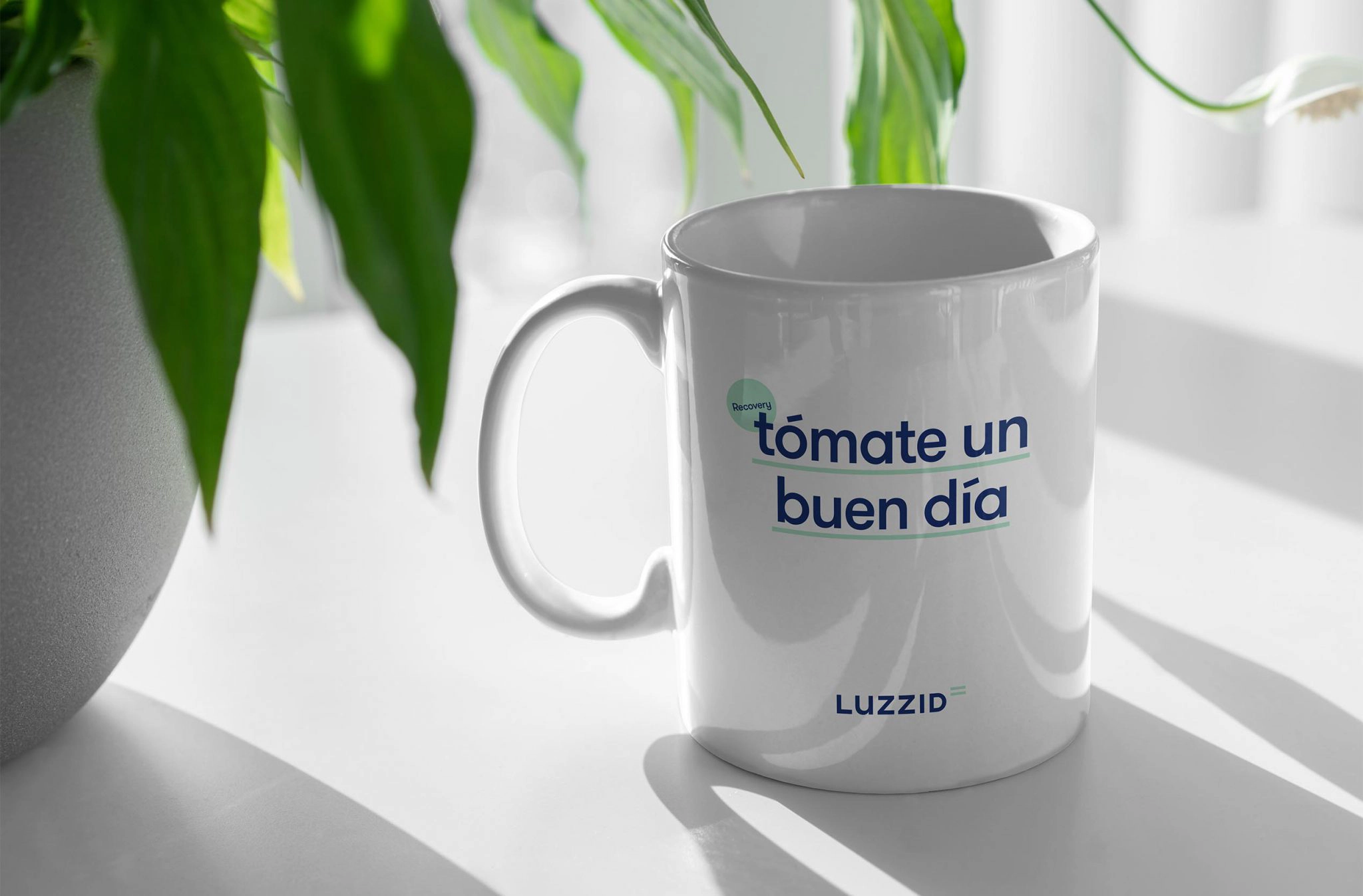
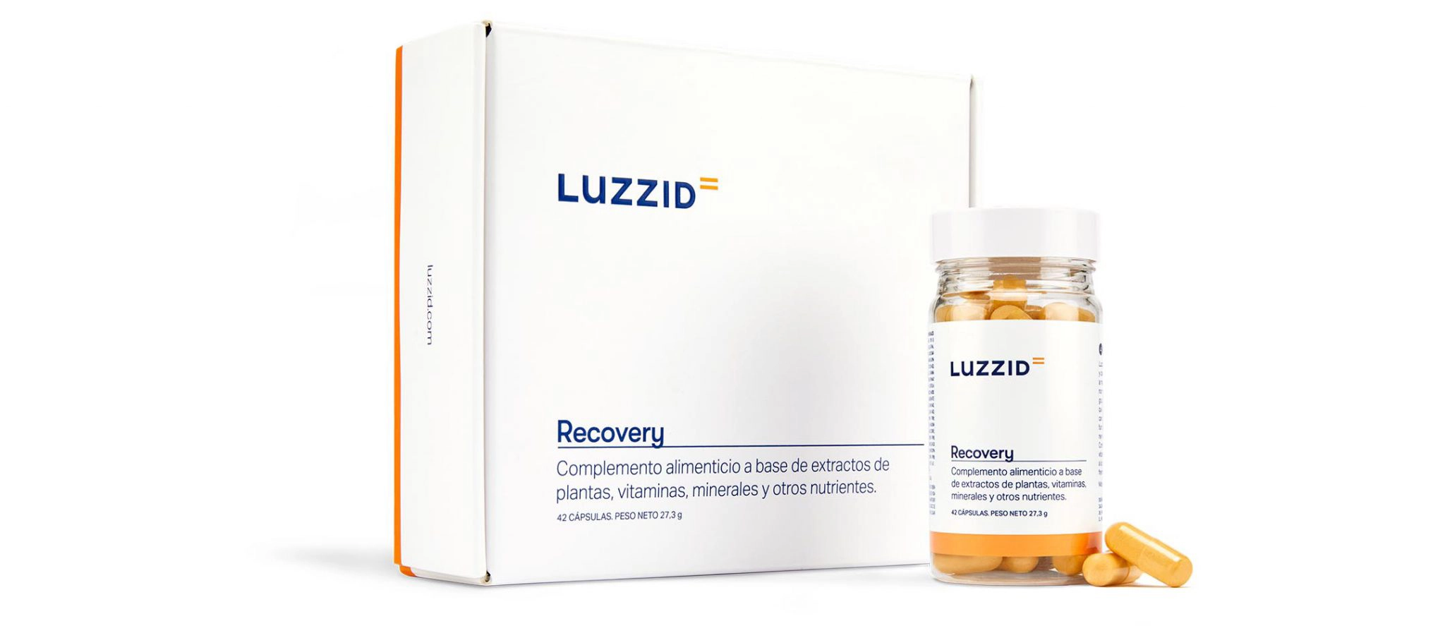
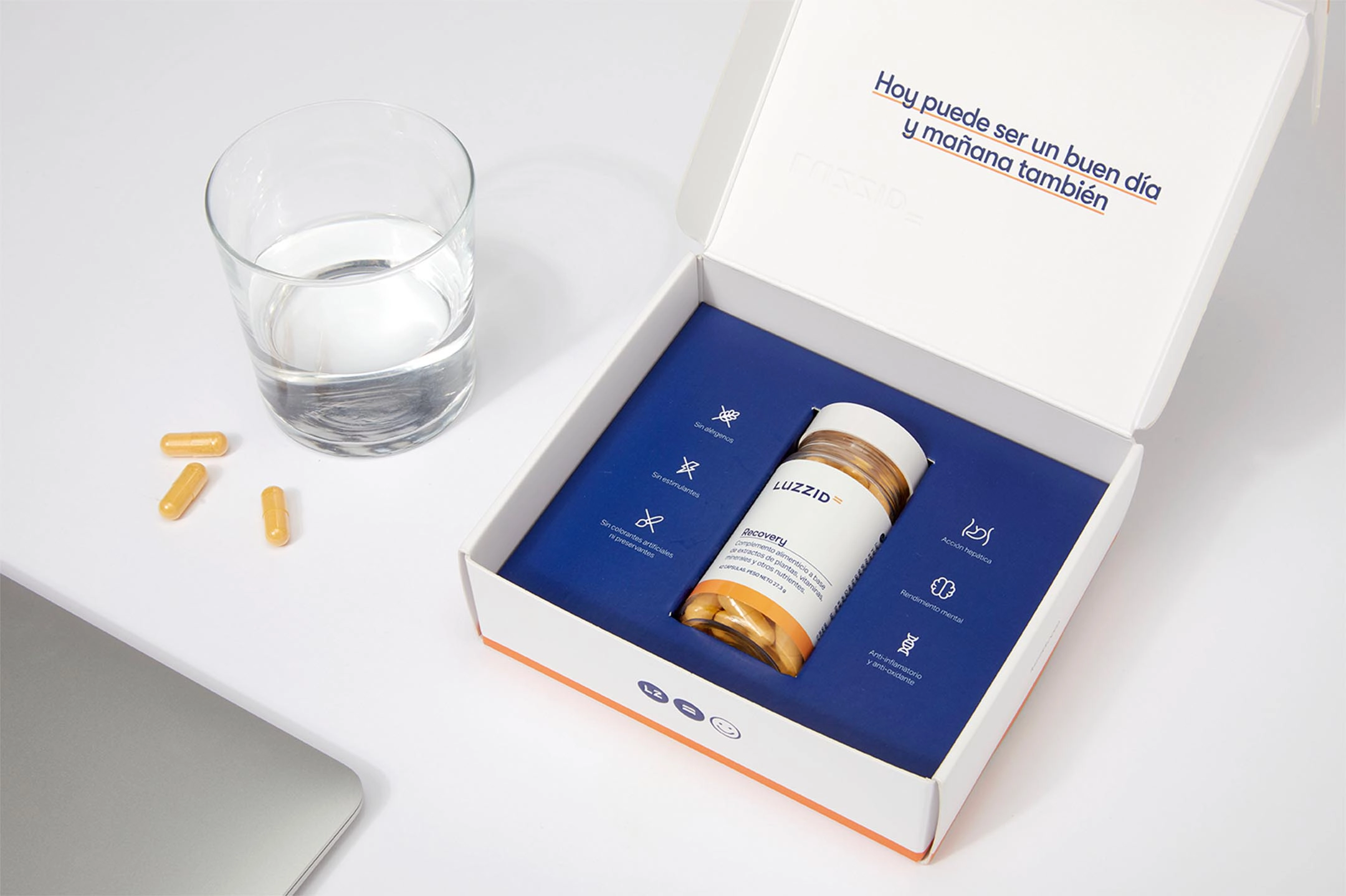
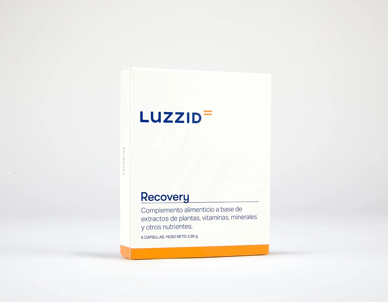
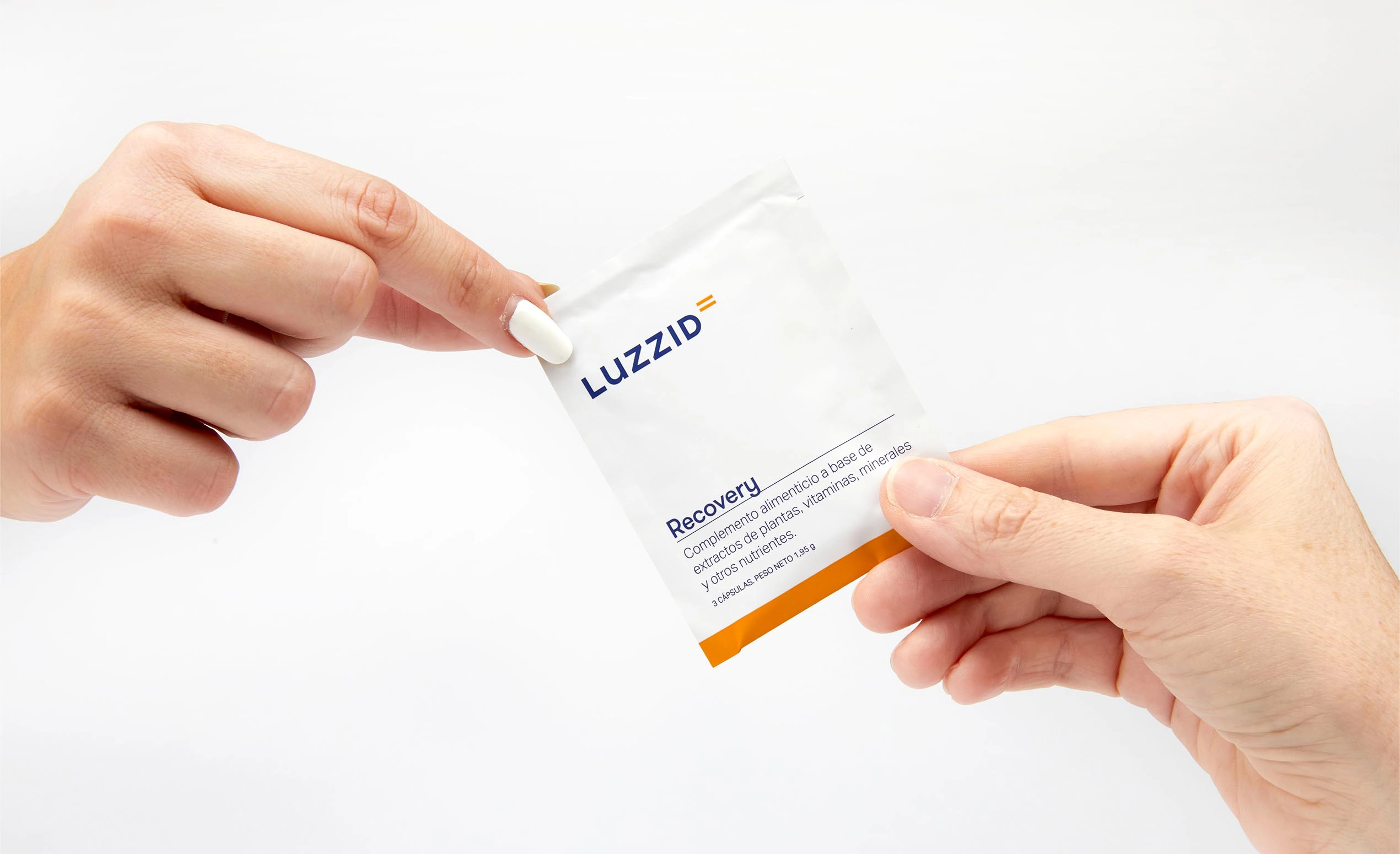
Packaging that dresses a unique formula
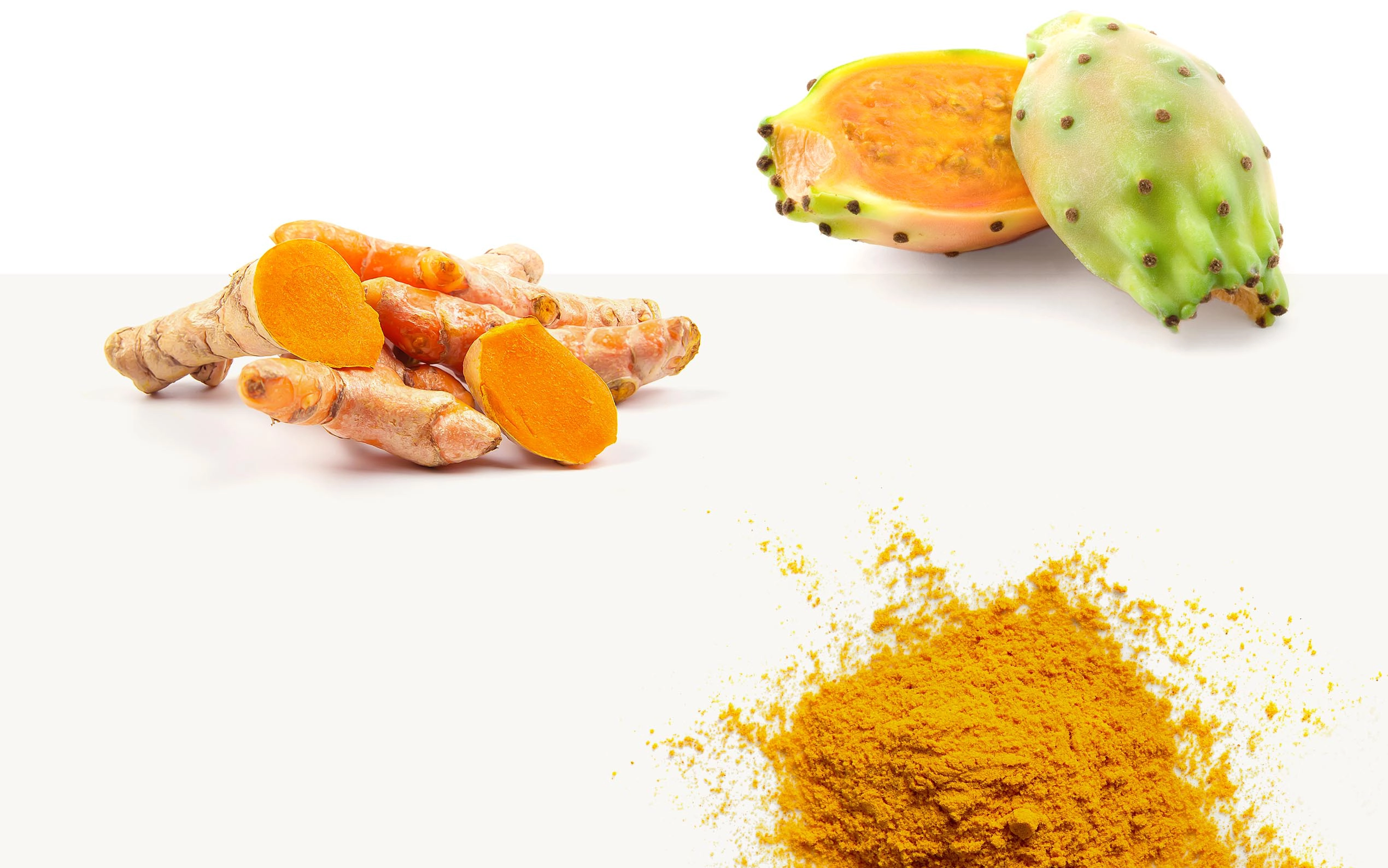
When designing the packaging for Luzzid Recovery, we brought together all the visual and verbal elements defined so far and added orange into the mix—the color found in the powder inside the capsule.
This color helps us distinguish this product from the other supplements the brand will soon add to its range: Luzzid Hydrate, which focuses on restoring hydration levels, and Luzzid Focus, centered on concentration.
Optimism and light to bring the photographic style to life
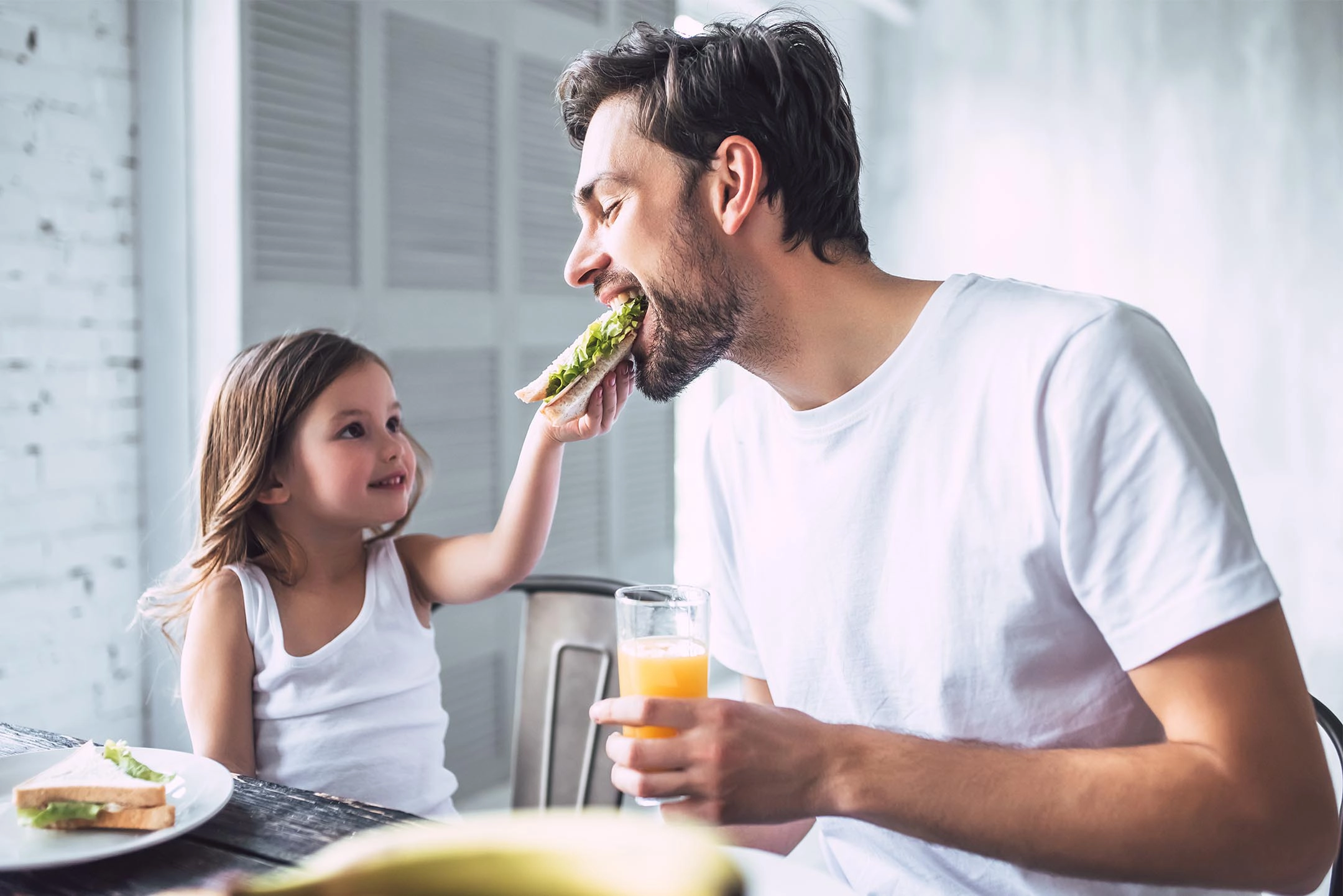
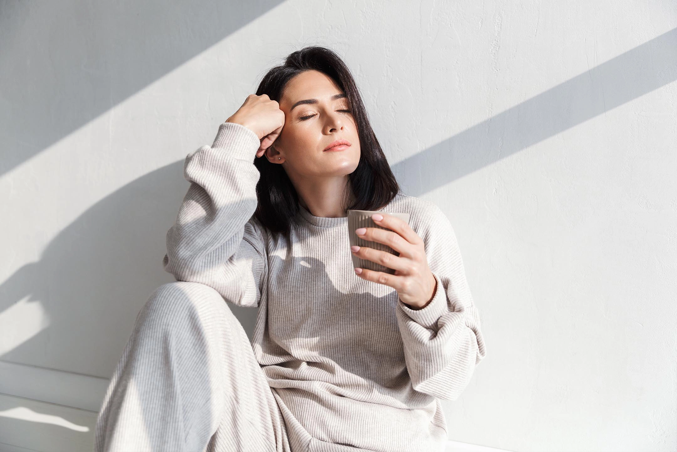
Luzzid makes you shine. And that is exactly what we wanted to convey through a photographic style focused on brightness, cleanliness, and harmony. A sea of naturalness and happiness that highlights the ingredients and benefits of the product. To bring this vision to life, we collaborated with our usual photographer: Israel Fernández.
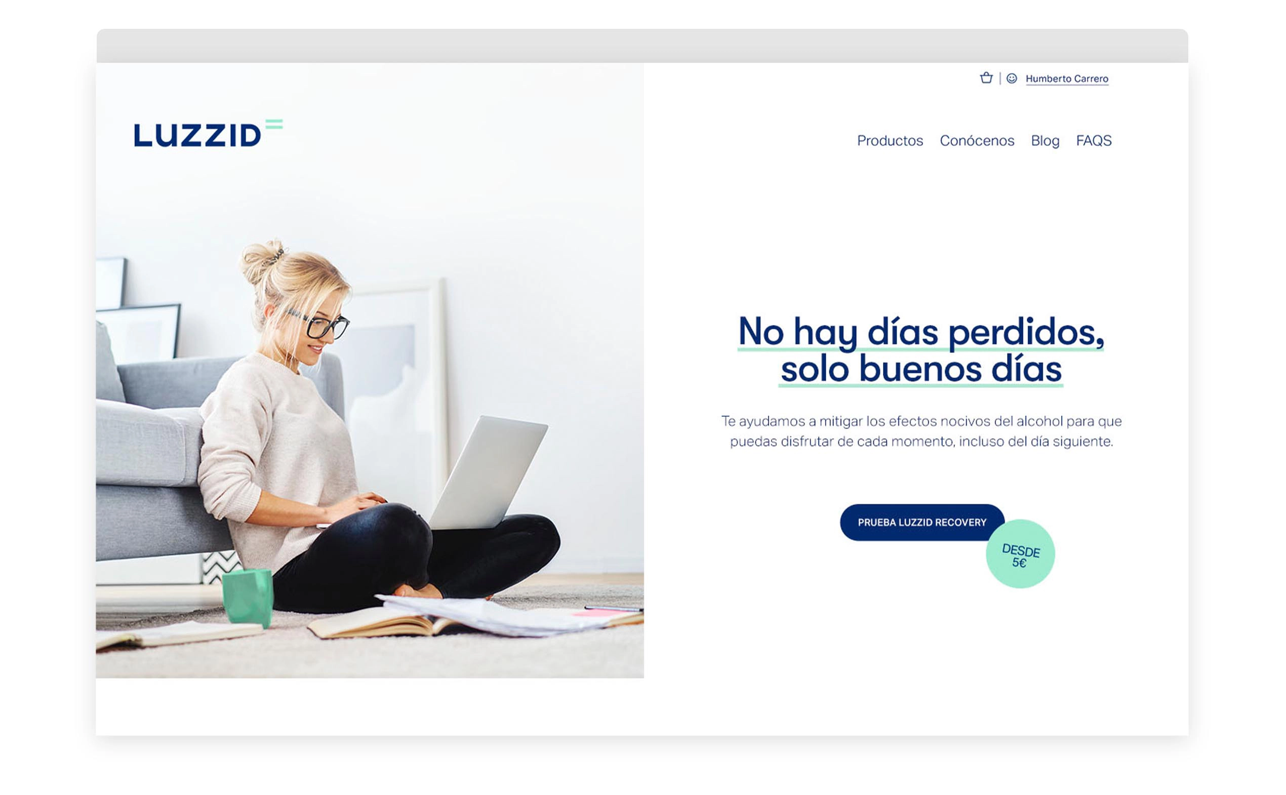
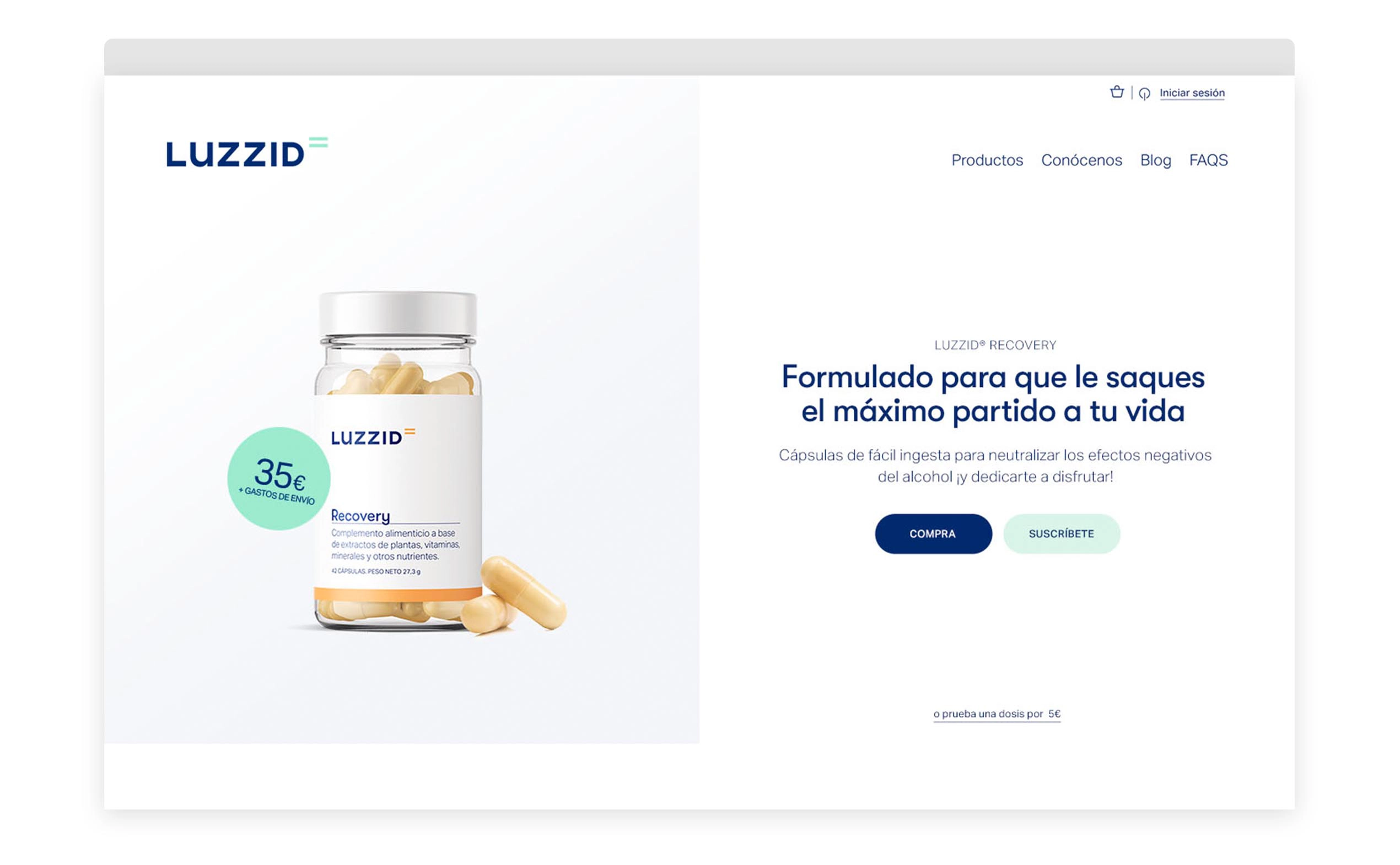
A website that becomes the main sales channel for the anti-hangover products
When shaping the structure, content, and design of the website, our challenge was to find the perfect balance between two essential goals. On one hand, showcasing the brand’s scientific side in a language that anyone can understand. On the other, maximizing the commercial dimension required from an e-commerce of this kind.

Educational and engaging communication for a new product category
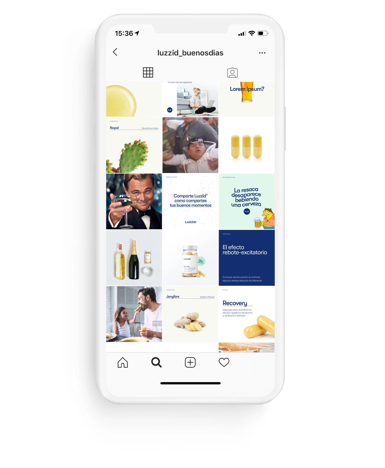
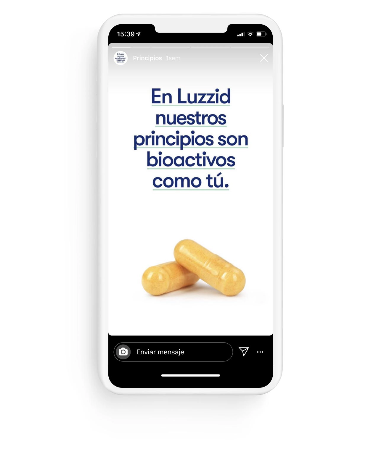
Luzzid is introducing a completely new product category to the European market—and society needs to know it.
To activate the brand and communicate the product’s benefits, we initially focused on social media. “With a clear typology of posts and various product-based formats — its active ingredients, key components, the effects of alcohol, dosage, consumption moments… — we managed to reach our target audience and interact with them. We showcased the positive effects of Luzzid while staying faithful to the brand idea ‘Good Days,’ maintaining its educational essence.”
Services provided

Brand Strategy
- Consumer Insights and Category Analysis
- Brand Narrative: Purpose and Positioning
Brand Experience
- User Experience (client/employee)
- Communication Strategy
Brand Identity
- Naming
- Verbal Identity
- Visual identity
- Packaging
Digital Branding
- Website
Brand Awareness
- Branding campaigns
Let's create
the right mood.