Differenciate
L’Artisan Givré
How a French ice cream brand won the Spanish market over
How a French ice cream brand won the Spanish market over
L’Artisan Givré has its workshop in the French Pyrenees where it mixes the purity and freshness of ingredients with its artisanal savoir-faire to make artisan ice creams of exquisite textures, colours and flavours.
All this attributes promptly secured it a place within the French market. However, once that was achieved, there was a new goal to accomplish: to reach out to the Spanish market.
L’Artisan Givré came to us so that together we identified the brand’s fundamental elements to fit and succeed in a consolidated market, brimming with well established competitors, and satisfy the needs and drives of the Spanish public.

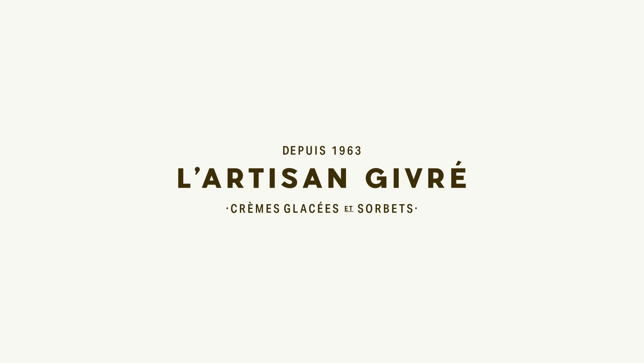
A logo inspired in the French art prints of the late 19th century
After a thorough research, we came to the conclusion that the brand’s identity had to be reshaped entirely in order to accurately convey its artisanal nature to the Spanish market. In order to profess the artisan’s love for a traditional way of creating, the care when working and highlight the brand’s origin, we found inspiration in the French posters of the late nineteenth century. We began to reshape a new identity for the brand starting with its logo.
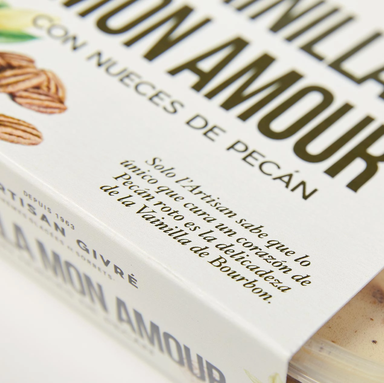
Channeling the artisan’s relationship with the ingredients using lyrical compositions
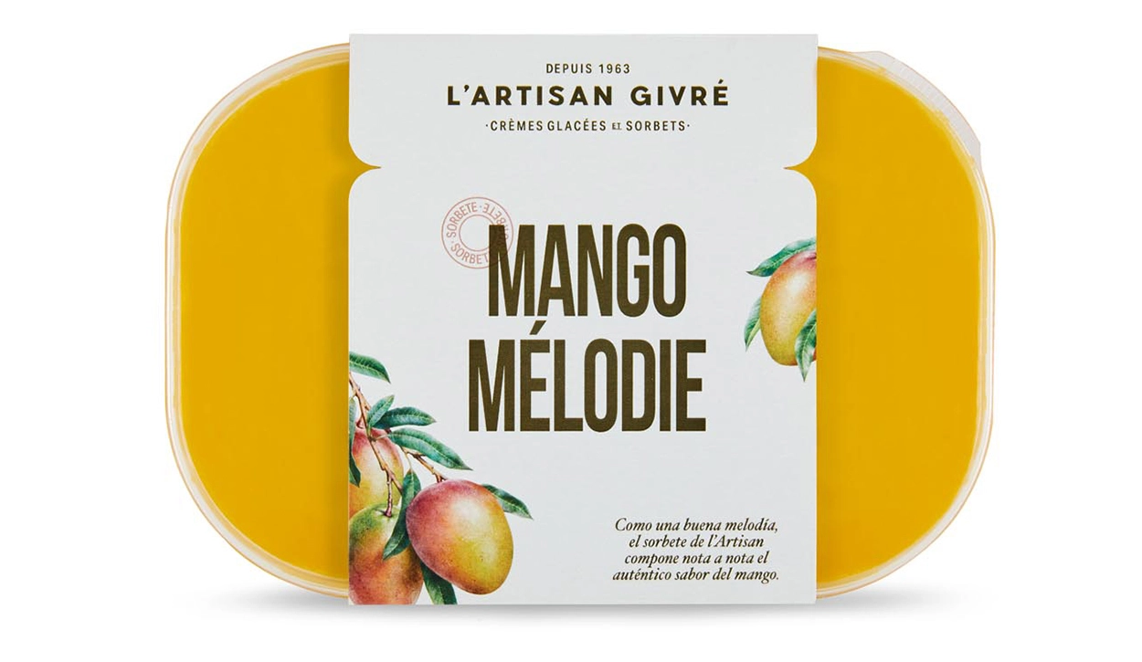
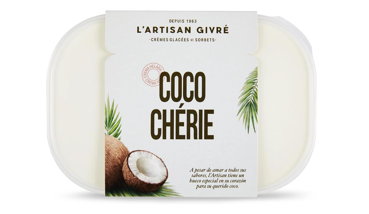
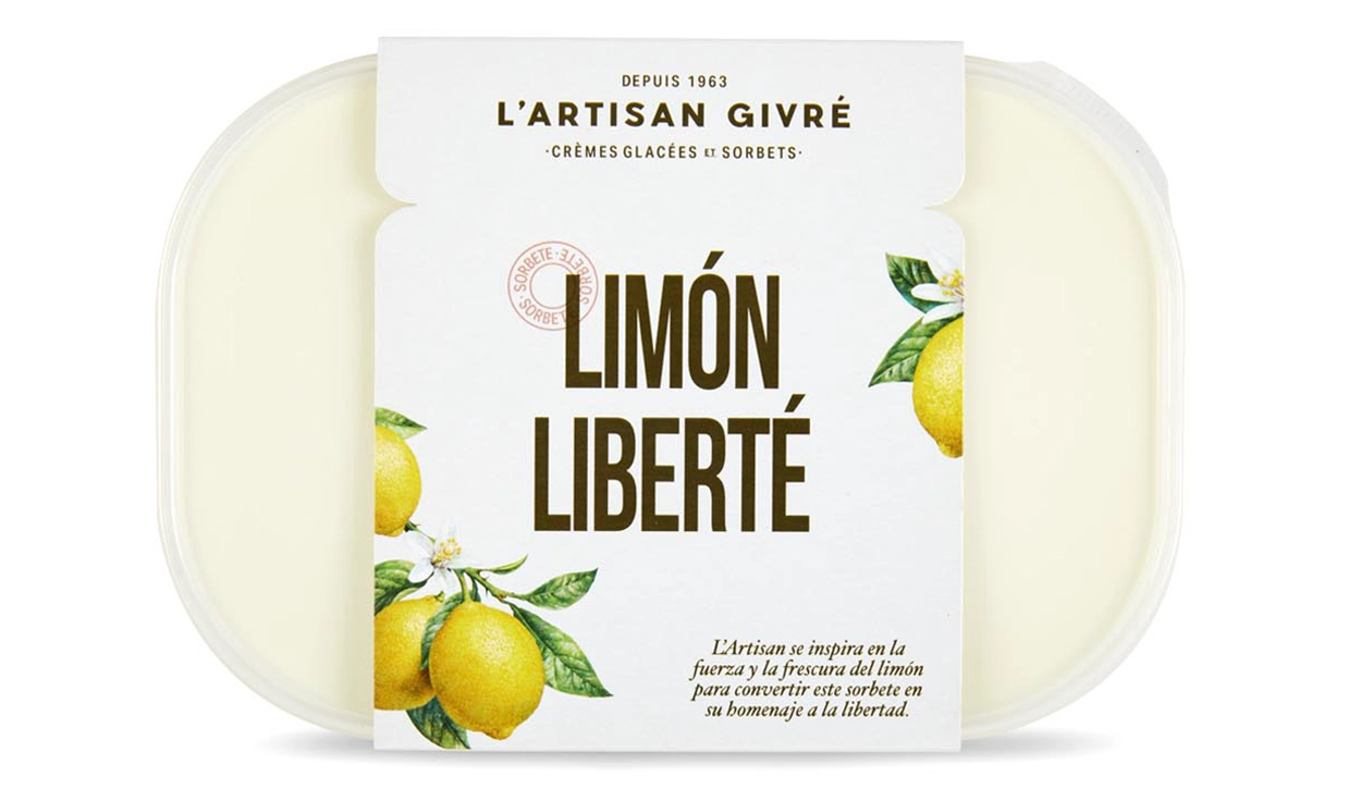
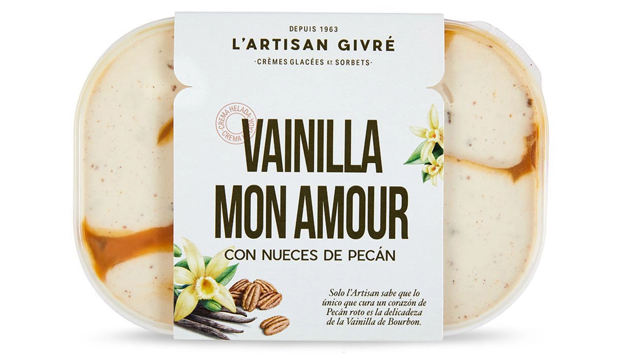
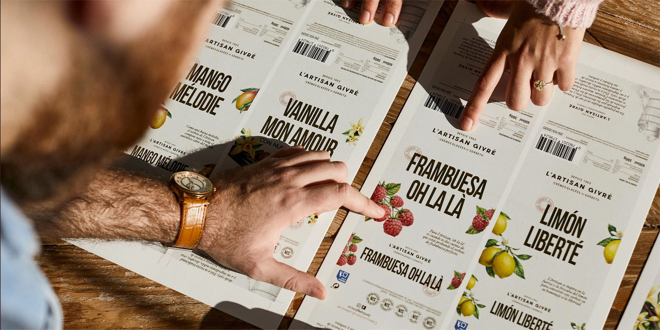
True artisans are passionate about what they do. Their way of producing becomes a love story with the elements they use. In order to show this strong connection, we developed a series of French names that would express the brand’s savoir-faire and phonetically associate these with each flavour. Then, we described them using lyrical compositions.


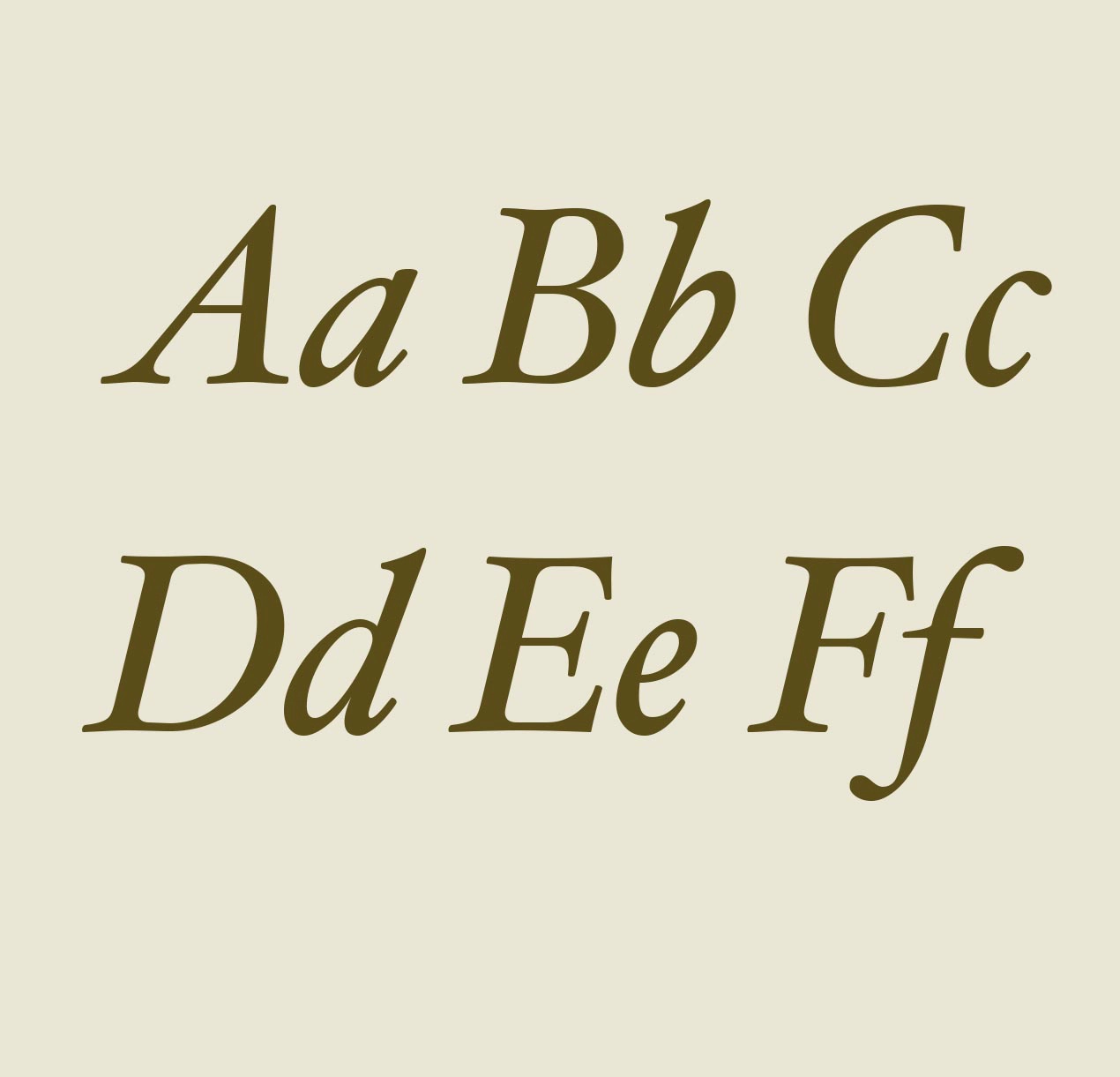
Stories and name brought to life through typography
These stories wouldn’t be the same without a typography that provided a romantic touch to the content. We chose an ornamented italic typo inspired in the Old Garamond and Janson to provide elegance and a classic touch to the micro stories. To balance the weight, we combined it with a condensed Sans Serif that blends in with the logo and adapts itself to the space available in the packaging to improve the linear impact.

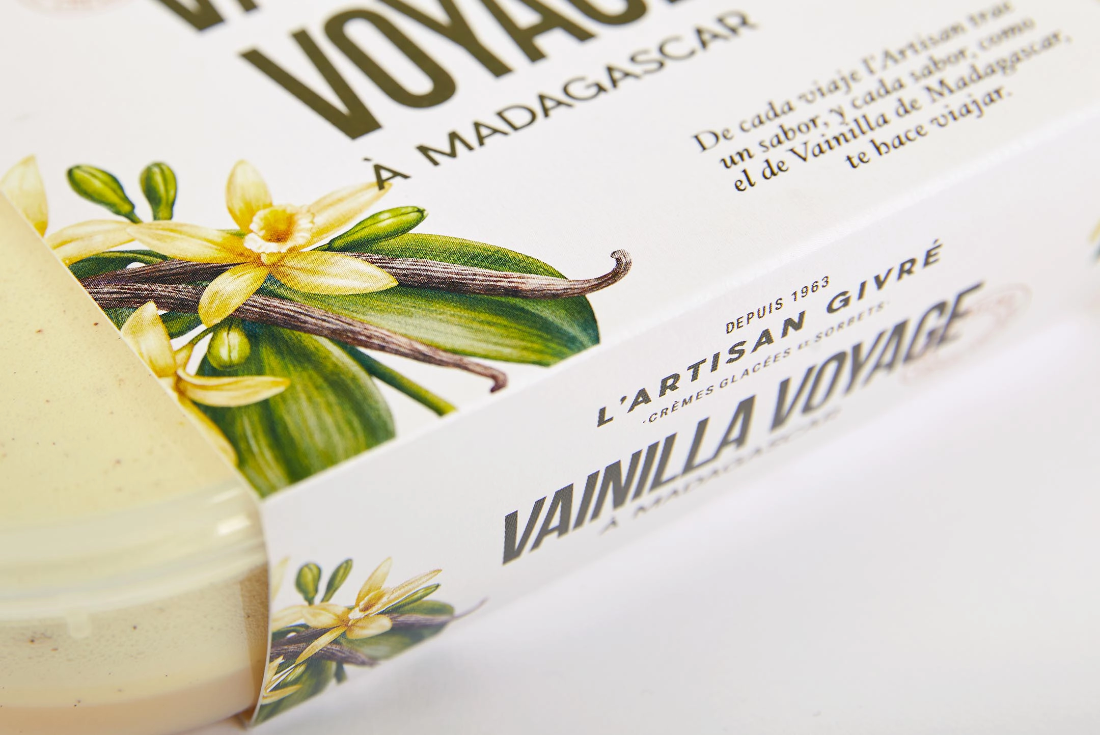
Illustrations that transform ingredients into art
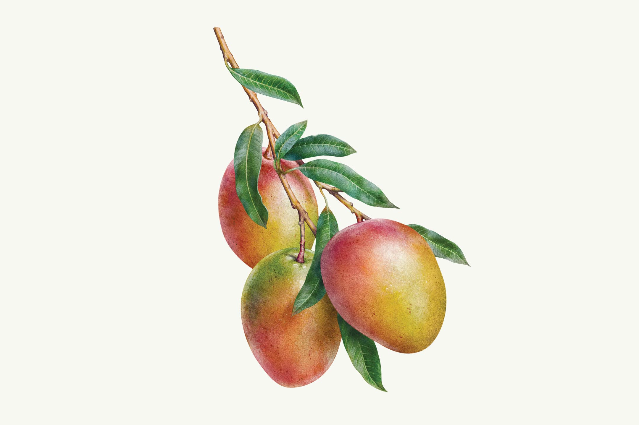
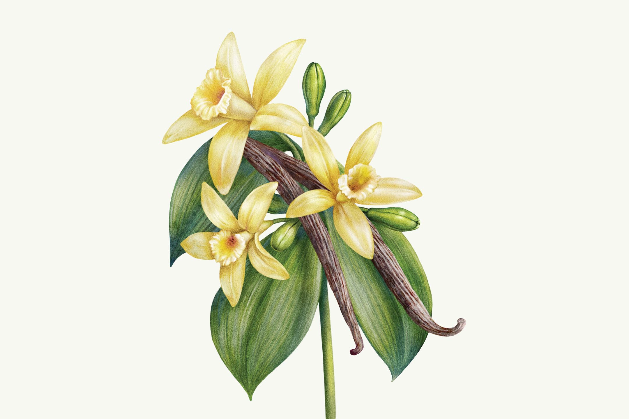
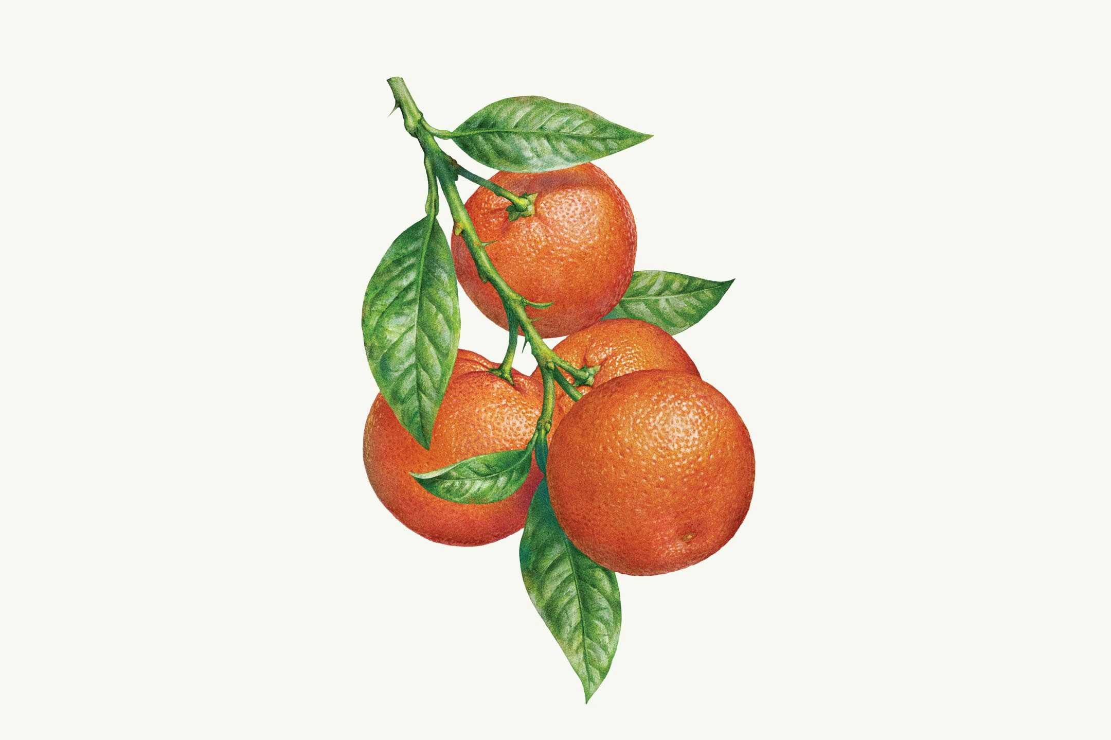
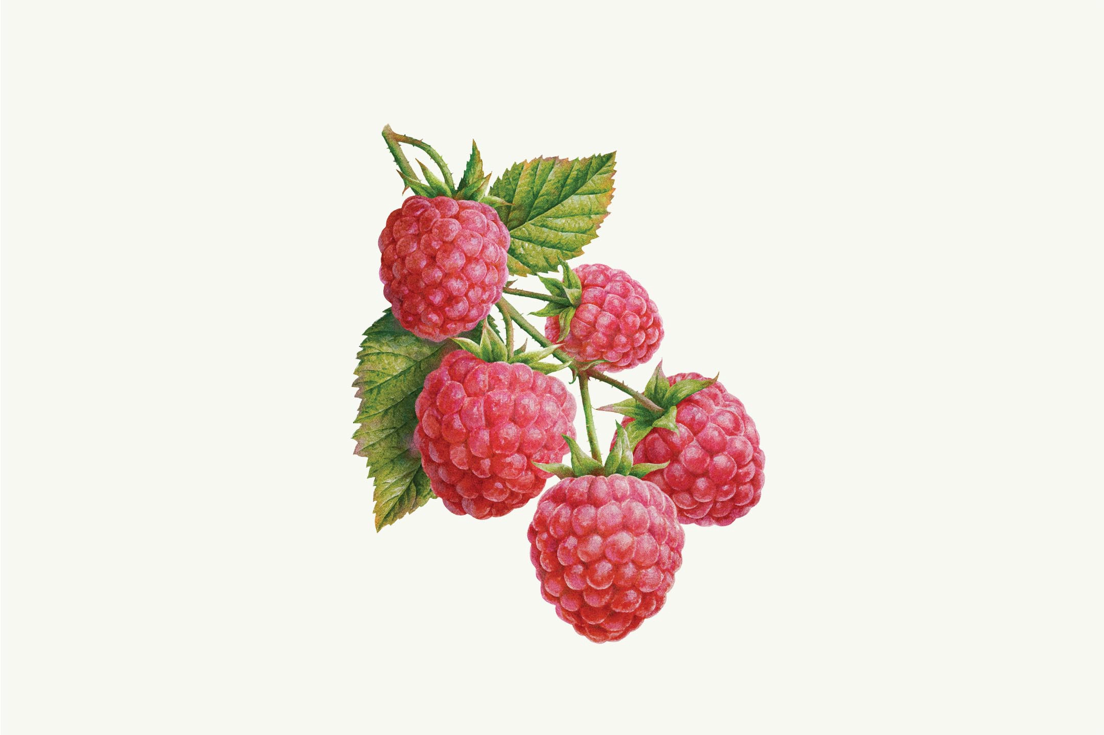
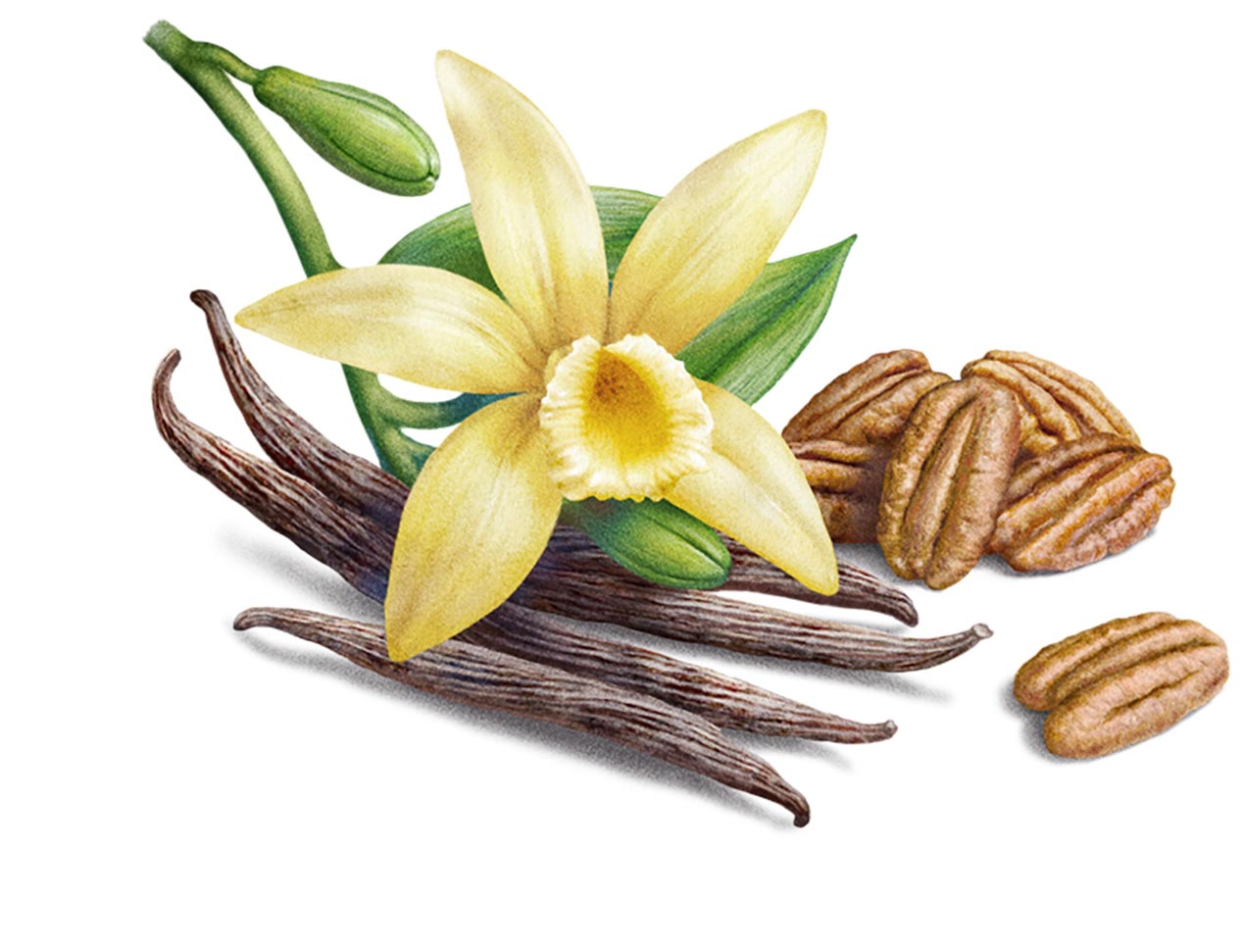
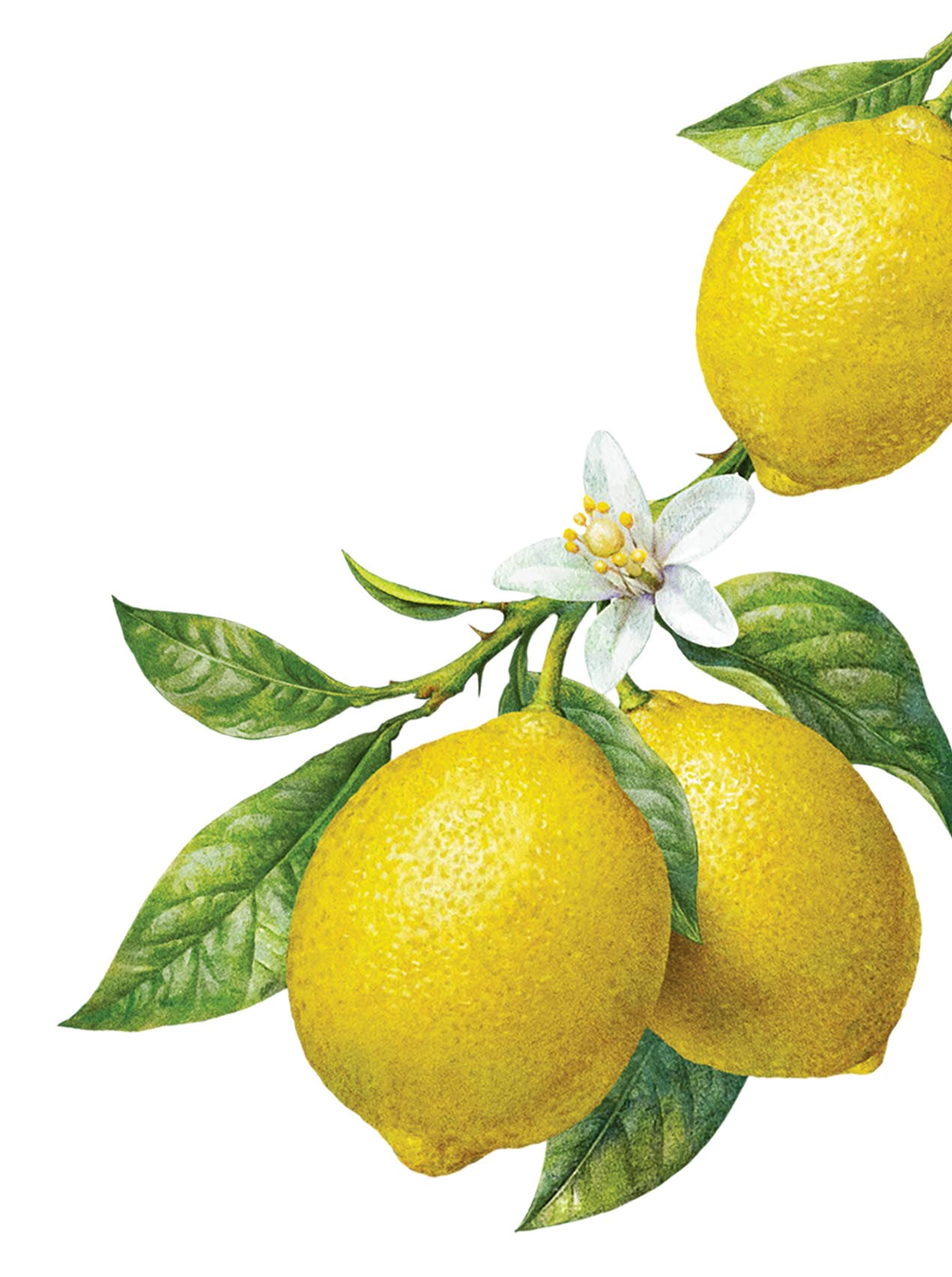
We transmitted the qualities and nature of the ingredients by highlighting their natural state. To do so, we worked with the studio Inorama and developed realistic illustrations that transformed the ingredients into art pieces, connecting them to the artistry of the brand.
A packaging full of good taste and savoir-faire
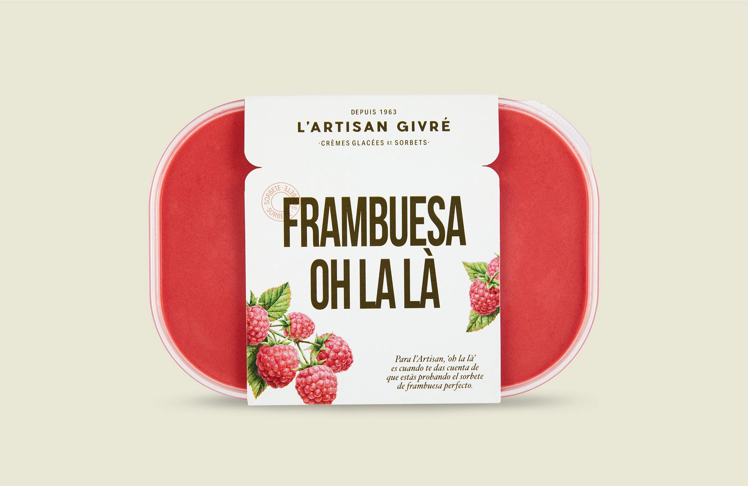
The packaging combines all the elements found in the brand’s identity. It also connects all the insights gathered from focus groups that took place throughout the process and the feedback collected from online questionaries from over 400 consumers. Therefore, the packaging allows consumers to clearly see the product’s essence and offers them an artisan alternative to the industrialised ice creams that can be generally found in supermarkets.
Performed services
Brand Strategy
- Brand Audit
- Consumer Insights and Category Analysis
- Brand Narrative: Purpose and Positioning
Brand Experience
- Communication Strategy
Brand Identity
- Naming
- Verbal Identity
- Visual Identity
- Packaging
Let's create
the right mood.
