Transform
DiNA science
Singular Genetics

Introducing a personal vision of genetics to all scientific fields
Mireia Sandalinas and Carles Giménez are founding members of Reprogenetics, a genetic laboratory specialized in reproduction. For almost twenty years, they have worked along with specialized clinics to achieve their goal: to help people have a healthy child.
Guided by their innate vocation and curiosity, they wanted to apply their holistic approach to other scientific fields. This new idea required the development of a new brand, which needed to be elastic enough to incorporate new scientific fields (nutrition, etc.) gradually. In addition, the brand had to capture the founding spirit of Reprogenetics and promote the company’s groundbreaking vision.
Genetics for every individual. Genetics from singularity.
The purpose of DiNA Science is to ensure that genetics is always at the service of people’s health and their well-being. And the best way to do this is to devise, create and facilitate solutions that continually place the genetic uniqueness of each person at the centre.
Because every clinic, doctor and patient has his or her own needs. Therefore, DINA Science adapts and truly understands the reality of each individual to provide person-to-person services that will allow for scientifically supported decisions.
i + DNA = DiNA
DiNA Science uses its own letters to tell a story. The second letter is an “i” written in lowercase, which symbolises a person (the dot for the head and stick for the body). We also have a person’s genetic code embedded in the word DNA, which symbolises the brand’s commitment to the human species and the evolution of genetics (in particular) and science (in general).
DiNA Science also stands for dynamism: movement, flexibility, adaptability. These concepts are rooted in the brand’s values. Concepts rooted in the brand's values

Searching for a visual balance between science and humanity
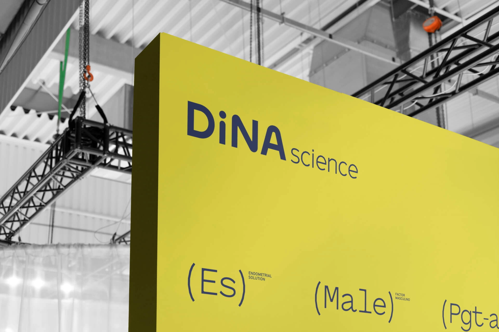
For the logo, we used a typeface that embodies technology and innovation, and rounded the edges to make it more human. We used uppercase for the “D”, “N” and “A” and lowercase for the “i” to accentuate the name’s origin.
The color palette is intended to contrasts between the yellow’s boldness and the calm, hopefulness and warmth of the grey tones. We avoided white in order to make it feel less cold and to distance ourselves from the reiterative association of this color within the health sector.
A homage to genetics and the people behind it
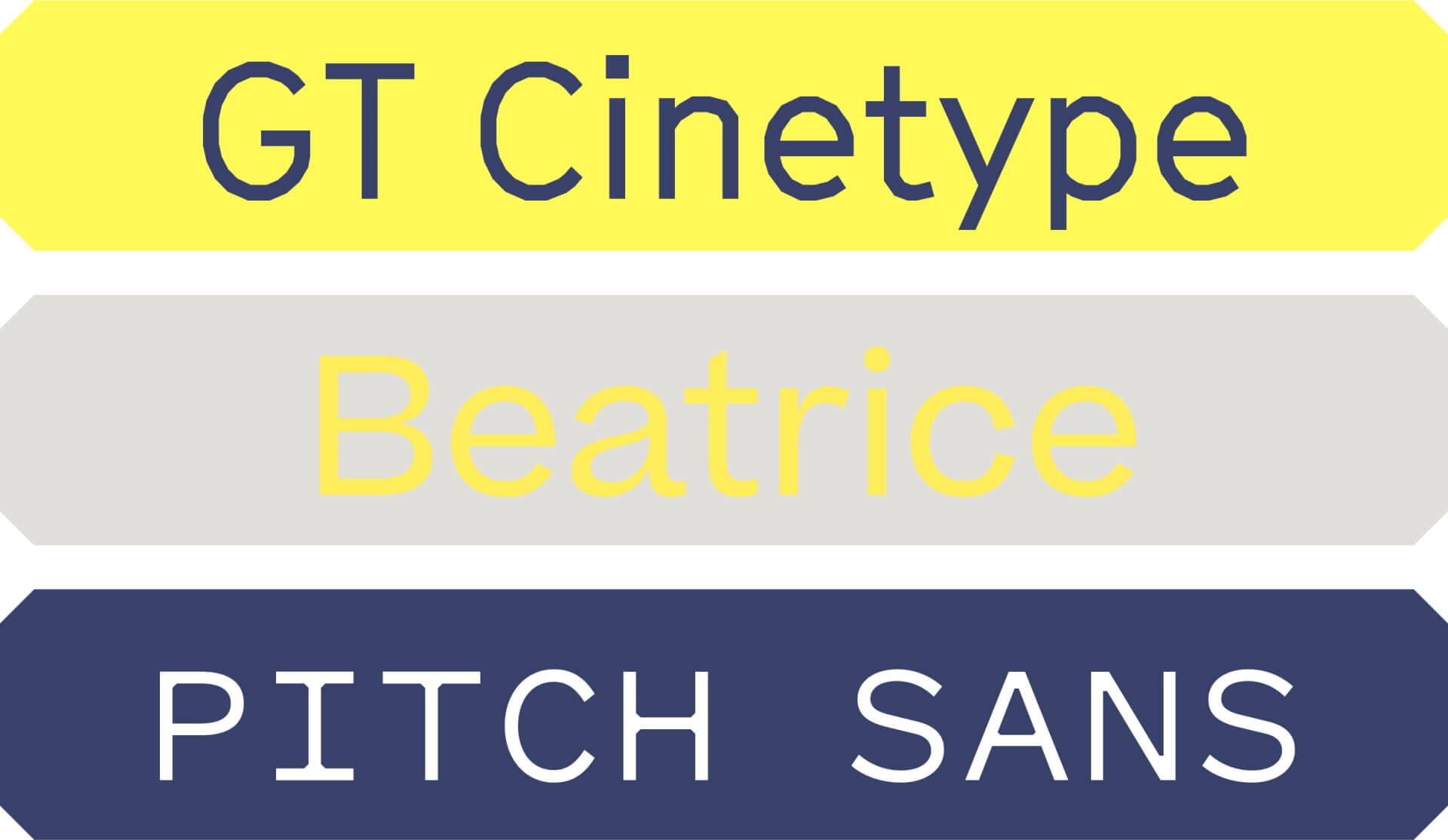
With the fonts, we were clear about our approach We not only wanted the result to connect with the audiences, but also for professionals in the sector to see themselves identified and reflected in them.
The GT Cinetype font used for headlines and text employs straight segments to construct curves that resemble the graphical representation of karyotypes. The Beatrice font, which we use for headlines when we want to lighten the technical load, brings us closer to the emotional benefits of the brand (closeness, trust, etc.). Lastly, the Pitch Sans font we use for branding solutions is monospaced, a typeface used in biochemistry to represent sequences.
Using what makes us humans to represent the truth
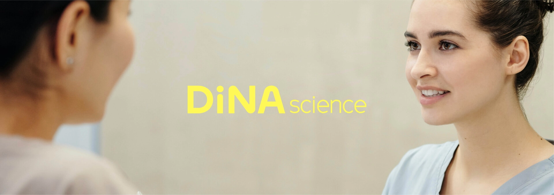
A groundbreaking brand must bring a new perspective to the category it belongs to. Therefore, in terms of photography, we wanted to avoid the usual resources, like smiling glances at the camera, and find a less superficial approach. Therefore, the brand required a proposal that was more sensitive and realistic.
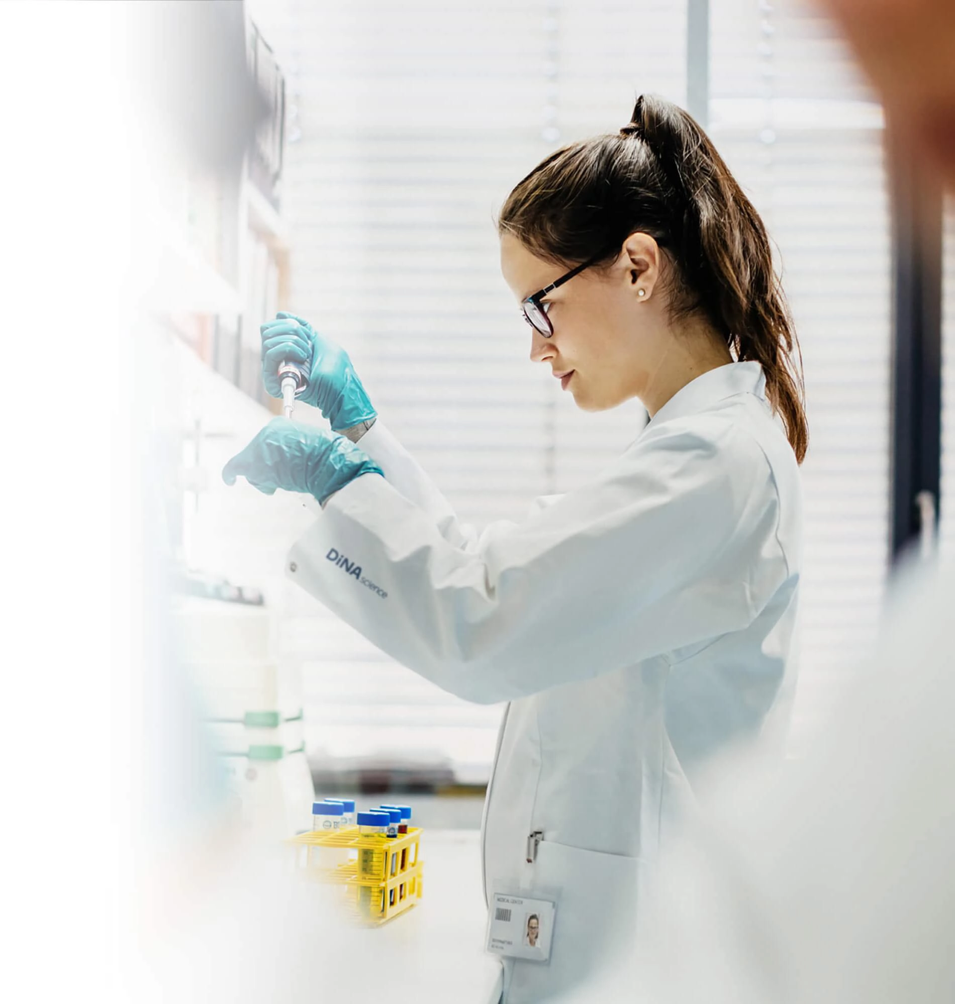
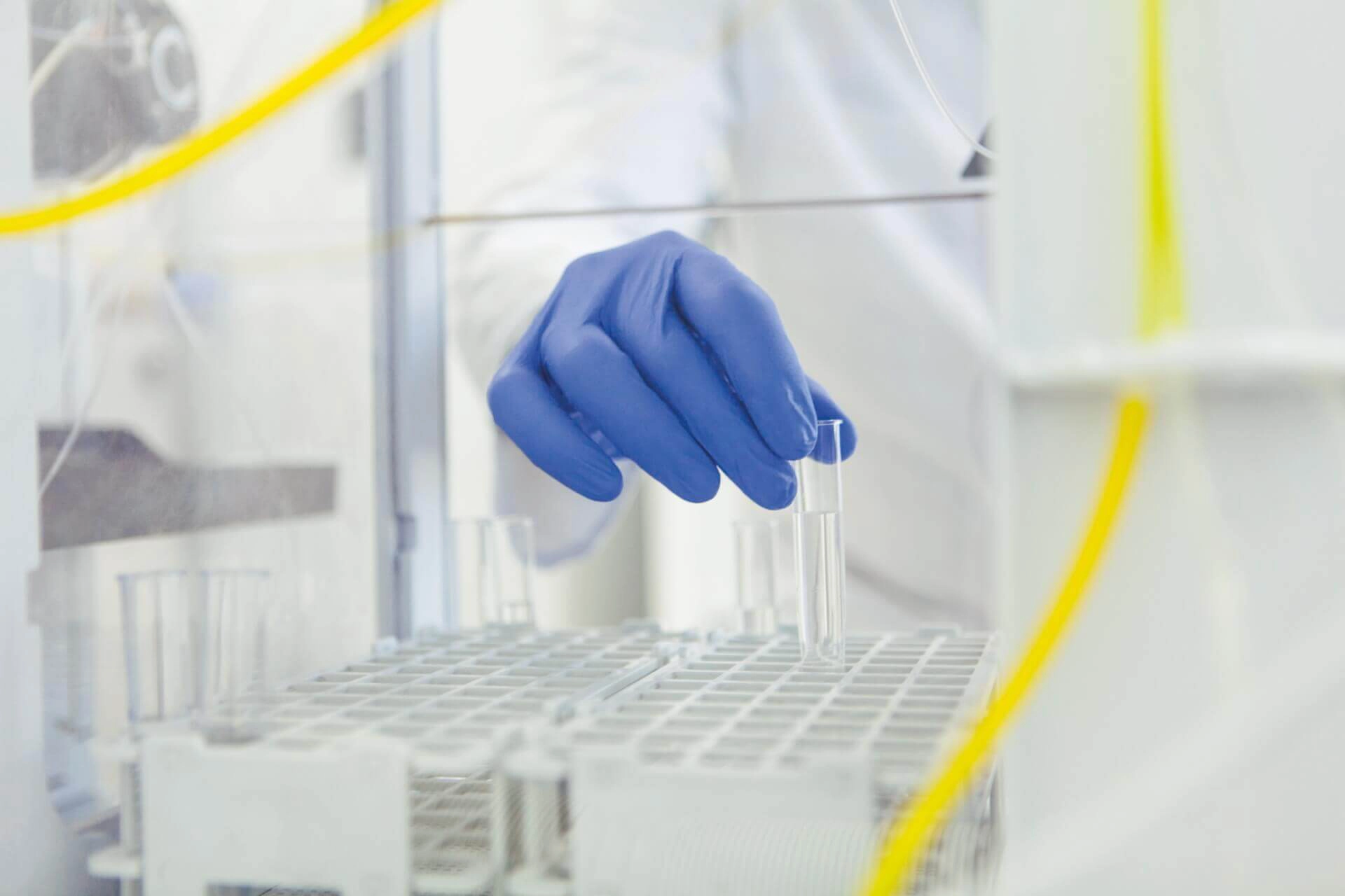
Hence, we defined a visual universe based on documentary photography which captures the moment rather than creating it. A universe that is replicated both in the lab: focus, technical work, tools and cutting-edge technology; and outside the lab: in the consulting room, emphasising the notions of attention and support; and in the daily life of patients or situations related to our field of work.


A growth model that organises today and enhances tomorrow
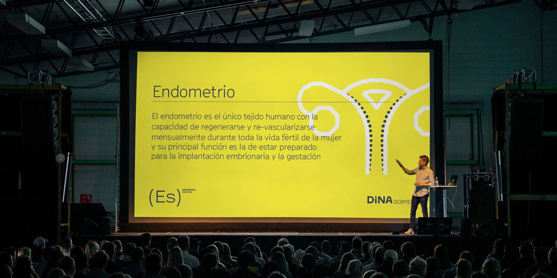
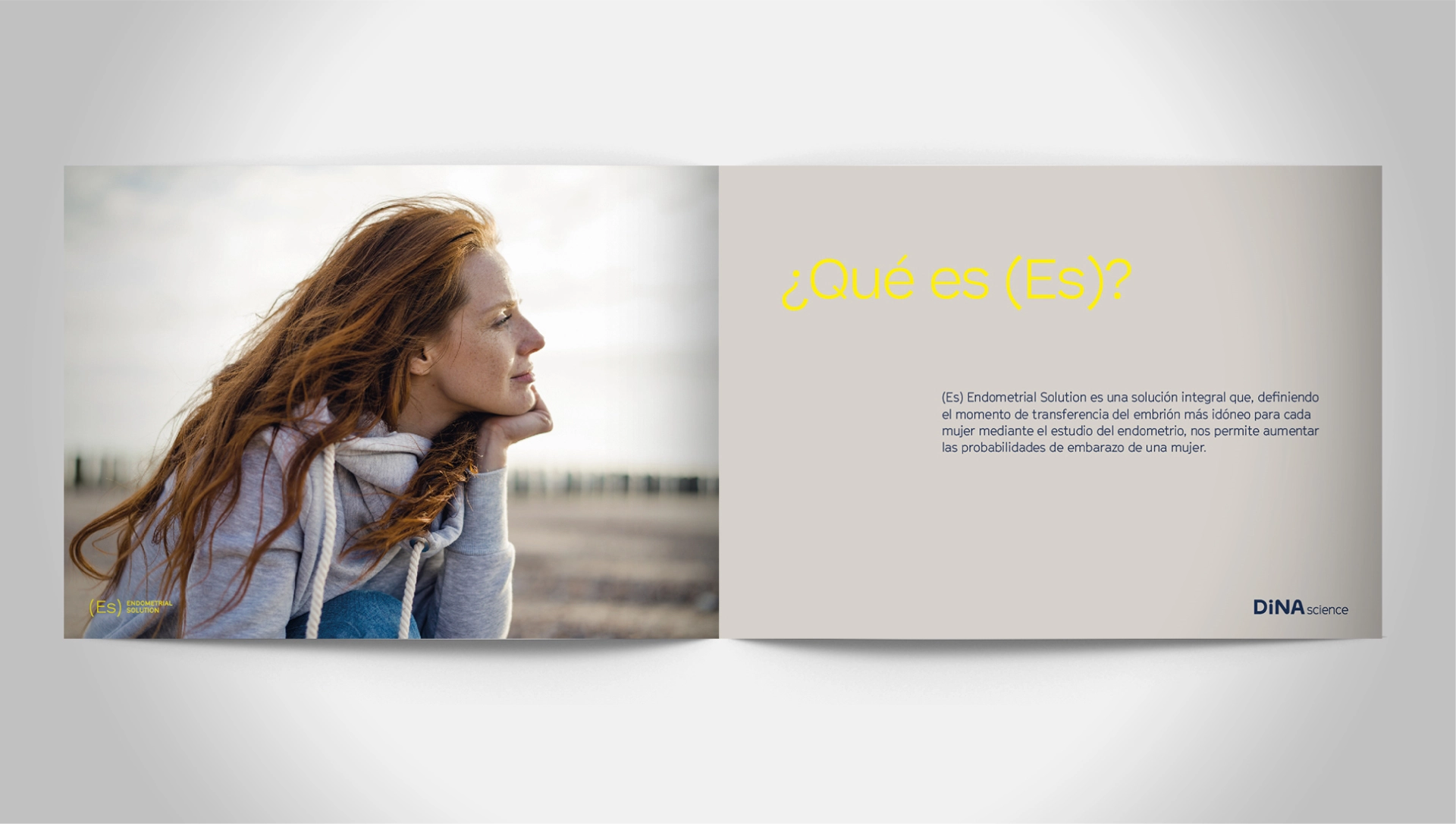
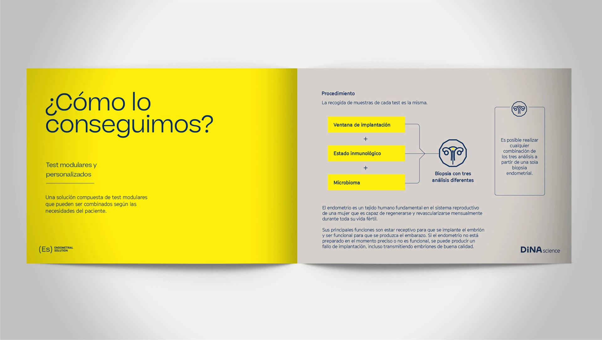
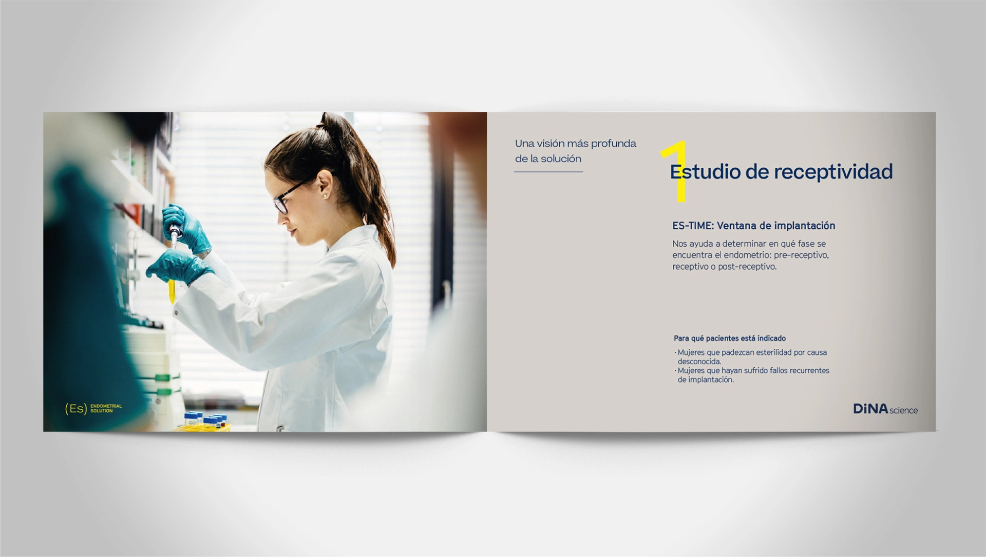
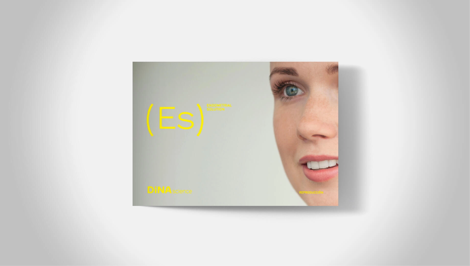
To ensure an orderly growth of the solutions that make up DiNA Science's offerings, we created a brand architecture model with its own visual system.
This universe consists of a homogeneous logo model in which, to give it a scientific visual character, we introduce the solution's name in parentheses. As an exponent, we include the description of the solution. At the photographic level, we move to a more conceptual realm to create a very stripped-down representation of who we are through minimalist images that capture carefully measured emotions. Additionally, we rely on the secondary palette to create soft backgrounds.
A website that best represents the new brand
The new website had to communicate and enhance the binomial that guides us throughout the brand’s journey: people and science.
To achieve this, we maximised the photographic elements to emphasise the brand’s visual universe. The verbal elements explain, in detail and in a user-friendly way, everything related to the brand and its philosophy: technology and humanity, innovation and proximity, knowledge and trust.
Performed services

Brand Strategy
- Consumer Insights and Category Analysis
- Brand Narrative: Purpose and Positioning
Brand Experience
- User Experience (Customer/Employee)
- Communication Strategy
Brand Identity
- Naming
- Verbal Identity
- Visual Identity
- Packaging
Digital Branding
- Website
Brand Awareness
- Branding campaigns
Let's create
the right mood.